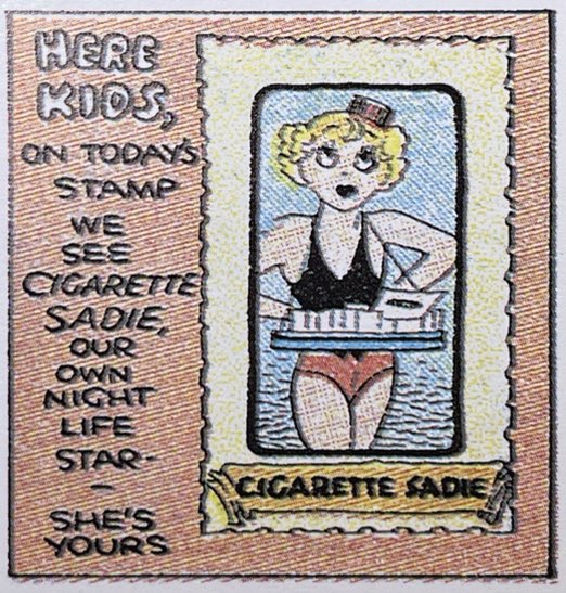
This wise-cracking cigarette girl, seemingly working in an underground speakeasy was an odd “topper” strip for this wildly popular strip. The signature on the fourth panel is the giveaway, of course.
Cigarette Sadie was the filler strip for the Sunday Dick Tracy episodes. Considering the the straight-laced righteousness of Tracy, this was a bit of a counterpoint to the strip’s buttoned-down sensibility. adie is the featured collectable “stamp” in this edition, but in other weeks the collectible usually involved a character from the Tracy strip.
What made me think harder or differently about the comics medium in the last year or so? That is my main criterion for these occasional roundups of books mainly on comic strips but also about early comics. Some of the titles here are filling in holes in our understanding about the history of the comics forms. Others are calling attention to artists or patterns in comics history that I think bear more thought. And many were just plain fun. Feel free to comment on the books you found most enlightening or entertaining about the comics history.
The Metaphysics (Huh?) of Alex Raymond’s Death
Dave Sim’s (with an assist by Carson Grubaugh) The Strange Death of Alex Raymond (Living the Line) is crazy like a fox. Sim’s ostensible exploration of the tragic death of the highly influential artist behind Flash Gordon and Rip Kirby uses a batshit conceit that some “metaphysics of comics” somehow connects everything from Margaret “Gone With the Wind” Mitchell, Milt Caniff’s quiet envy of Raymond, the wives and lovers of multiple comics artists of the 50s, a few B-movies, and whatever the hell else you can imagine to car crash that killed Raymond in 1956. It is also batshit brilliant. It gives Sim the frame in which to recall (and even redraw) a vast swathe of American pop culture and artists that drove the changing styles of 1950s comic strips. At its most lucid, the book delineates the different realisms of Hal Foster, Caniff and Raymond, the development of the photorealistic style, even the nuts ad bolts of brush and pen work. Along the way, forced me to contextualize and appreciate strips like Big Ben Bolt, Twin Earths, and the post-Raymond Kirby years. He brilliantly injects a whining Charlie Brown into the history as Schulz’s aesthetic counterforce to the short-lived photo-realist era of American comics. An he forces us to think harder about the rise and fall of different comics styles. As others like Jerry Robinson and Scott McCloud before Sim have shown, there is nothing like a fellow craftsman dissecting his colleague’s work to deepen a viewer’s appreciation of the artistry and decisions that go into those four panels on any given day. Whether you can track Sim’s idea of metaphysics connecting all of these shards and rabbit holes is beside the point. It sets him up for some deft and truly illuminating rumination on the aesthetics of comics in their historic context.
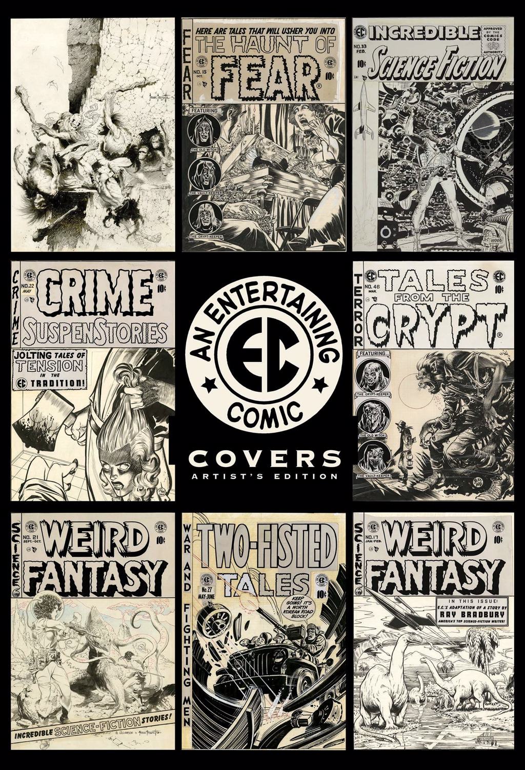
EC At Scale
I am almost embarrassed to admit how many of IDW’s massive and pricey Artist’s Editions I own. How does one justify parting with $150 for each, even though they reprint in full detail and at original scale the actual final art from some of the great craftsmen in the field? And yet I never regretted investing in Artist’s Editions of early MAD issues, Will Eisner’s The Spirit, and the EC stories of Graham Ingels. This way-oversized scale and hi-def color images of black and white line art and marginal proofing notes seem to put you on the other end of the artists’ pens and brushes. This is even more true of the EC Covers Artists Editiion (IDW), which organizes the cover art of the famed EC comics stable by artist: Johnny Craig, Graham Ingels, Wally Wood, Harvey Kurtzman, Jack Davis and more. The covers of course were meant to be expansive, immersive teases of issue content, and so we get a single image splashed across the 15X22 page. Every bit of detail feels more like a deliberate, conscious decision, forcing us to think harder about the artist’s process. This is not just another trophy for collectors (or hoarders). It is a valuable experience for anyone who wants to deepen their understanding of the art.
The Golden Age of Wolverton
Fans of the grotesque pointillism of Basil Wolverton have been treated in recent years by Greg Sadowski’s exhaustive two-volume biography and reprinting in Creeping Death from Neptune and Brain Bats of Venus (both Fantagraphics). While those two volumes focused more on Wolverton’s horror and sci-fi work, this year’s Scoop Scuttle and His Pals: The Crackpot Comics of Basil Wolverton (Fantagraphics) is a retrospective of the artist at his madcap best. Ironically, many of these screwball and slapstick series were the fruits of failure. Wolverton conceived of Scoop Scuttle, Bingeing Buster and Jumpin’ Jupiter as daily comics and repurposed them for the skyrocketing (and imaginatively less constrained) comic book industry of the late 1940s and early 50s. In each case, however, Wolverton was satirizing many of the serious genres that dominated pulp magazines, B-movies, radio and comic books themselves. Wolverton clearly is channeling the screwball tradition of Milt Gross, Rube Goldberg and Bill Holman. The zany physical antics propel the action, the wisecracking asides and slang fill most panels and the cultural stereotypes rain in hot and heavy. The foreshadowing of MAD magazine’s satirical approach is unmistakeable. This volume also has excellent annotations adding context to each reprint as well as an outrageous article by Wolverton himself on sound effects in the comics. This one is a treat.
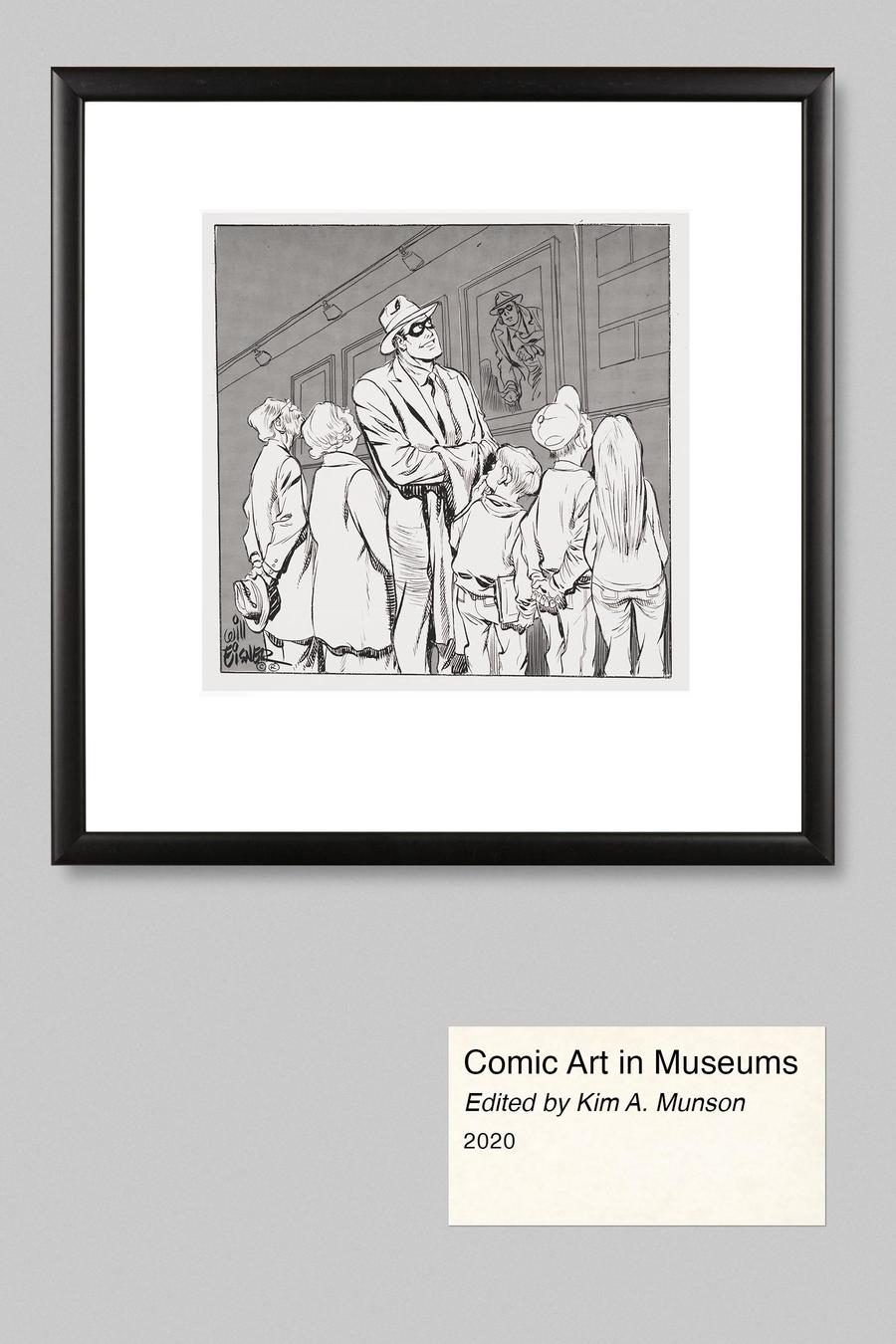
But Is It Art?: Comic Art in Museums
How “seriously” should thoughtful critics and audiences take the comic arts? That question seems to have dogged the cartoon arts since its earliest decades when pioneering pop culturists like Gilbert Seldes wrote extravagant defenses of the new medium. I confess that at this point in my five-decade run writing about mass media of all sorts, I find the relentless defensive justifications of pop culture criticism tiresome. And yet, that story of begrudging acceptance of the popular arts as “art” is its own important subject. One entryway to comic strip history is how the form has been regarded critically over the generations. Kim A. Munson’s Comic Art in Museums (University Press of Mississippi) is not as narrowly focused as its title suggests. While Muson provides a chronological framework and extensive introductory and connective matter, the book is really an anthology of writings by everyone from M.C. Gaines in 1942 to Denis Kitchen, Brian Walker, as well as multiple academics reflecting on the evolving reputation of the medium. I am still making my way through the densely packed book, but can already recommend it as a trove of insight and historical anecdote.
Johnny Hazard Sundays: Caniff Lite
All due respect to Johnny Hazard fans, it is hard to recommend Frank Robbins’ 33-year run as more than competent, middle-list comic strip fare. All of the luminaries also working at its height, Raymond, Caniff, Drake are considerably more interesting in their basic artistry, composition, storytelling. That said, this first oversized volume of Johnny Hazard Sundays does make the case for Robbins’s talents, even though his more mature work of the 1950s was obviously better. He had a strong sense of characterization, especially through facial expression. The moody use of coloring comes through even though some of the copies restored here were mediocre newsprint. And honestly I would have liked more background on Robbins and the thinking behind the strip rather than the intro pieces on his later DC Comics art. Still, Johnny Hazard Sundays Archive 1944-1946 (Hermes Press) gives us a 12X17 supersized reproduction of the Sunday adventure comics experience that is always welcome.
Kurtzman’s Wry Eye
Fantagraphics’ EC Library comes at the often-reprinted EC Comics of the early 1950s in black and white volumes organized by artist. Al the previous volumes have applied a lens onto the evolution of Wally Wood, John Severin, Johnny Craig, Al Feldstein, et. al. But this Man and Superman and Other Stories featuring Harvey Kurtzman before he took over the war titles and pioneered MAD really stands out for increasing our appreciation of this seminal comics artist. Kurtzman is among a handful of comics artists who were not just seminal within the medium but also to the general culture. The pop culture satire he codified in MAD magazine in the early 1950s applied a lens to post-WWII American mass culture that shaped generations of artists and even activists. This volume includes his earliest work for EC’s sci-fi, crime and horror stories. And they all show Kurtzman’s parodic attitude towards each of those genres. Tales like “Man and Superman,” “The Time Machine and the Schmoe!” and “Television Terror” took a light-hearted, even satirical take on the sci-fi and horror staples that drove the rest of the pages of these books. Most of these stories are written by the artist and so less wordy than over scripted tales the Feldstein foisted on most of the EC stable. These embody Kurtzman’s growing understanding of the relationship between word and text in the medium. He loves for high-minded science to go comically awry, along with the petty ambitions of everyman. The wry view of human foibles and hubris, which would inform the morality of his war stories and the satire of MAD, are all being rehearsed in these stories. Already sharp is Kurtzman’s mastery of of the comic form. He thought in panel progressions and the arc of a full page in ways far ahead of most artists. His compositions, use of foreground and background, the sense of motion as the eye moves across the panels, all are as fresh today as they were more than a half century ago.
Chester Gould Takes a Bow
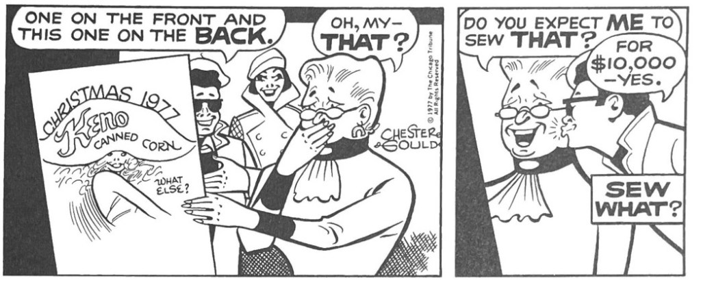
A number of ongoing reprint series had notable additions in the last year or so that call attention to the great work some publishers have been doing to keep the history of comic arts alive. In 2006 the Library of American Comics started an ambitious project to reprint Chester Gould’s full 1931-1977 run of Dick Tracy. With Volume 29 of The Complete Dick Tracy, LOAC finished one of the largest, complete comic strip reprint project, second only perhaps to Fantagraphics’ Peanuts project. I already reflected on Gould’s run and the way he ended the strip. The final volume speaks to what a canny master of comic strip art and business Gould really was. As newspapers shrank the canvas, he adjusted and rethought his signature style accordingly. And while the later years of the strip are remarkably different in look and feel than its first decade, the wild imagination, bizarre villainy, wonderfully improbable chases and escape remained central to a Dick Tracy story arc.
Many have said before me that we are enjoying the golden era of comics reprints. Perhaps. My default position is from a broader historical perspective, and myself having gathered many volumes since the early 1970s. As I look over the shelves here at decades of accumulation in the Panels and Prose library, it seems to me we are in the latest surge of publishing activity that goes back at least five decades. I still have some of the early retrospectives of Dick Tracy, Buck Rogers, EC Comics, Pogo, Bill Mauldin, Winsor McCay, Happy Hooligan, Flash Gordon and more going back many decades. In my recollection, the underground comic artists of the late 1960s helped spark more serious consideration of comic strip history, leading to many of the 70s and 80s reprints. And, of course, we can’t overstate the importance of Bill Blackbeard’s personal effort to rescue that history and kindle so much interest in his landmark 1977 Smithsonian Collection of Newspaper Comics. Publishers like Hyperion, Bonanza, NBM, Nostalgia Press, Blackthorne, Pacific and others pioneered the extensive reprinting of comics greats.
But we are enjoying an embarrassment of riches from the likes of IDW/Library of American Comics, Fantagraphics, Drawn & Quarterly, Hermes and Titan, to name just some. It is hard to keep up, and I can’t pretend being able to track, let alone, afford all that is available in the market. The curation policy here at P&P Library is to collect more in breadth than depth. I try to collect enough samples across the many comics eras and genres so that as a cultural critic I can write responsibly about select artists and capture wider trends. But every year I try to highlight the books that I feel added most to my understanding of the comics field and industry. Here are my picks for the last year…or so.
Rebirth of The English Comic Strip
Arguably the most substantial historical contribution of the last year is David Kunzle’s majestic Rebirth of the English Comic Strip: A Kaleidoscope, 1847-1870 (University Press of Mississippi). He unearths some of the great and under appreciated cartoonists of the UK humor magazines during that genre’s heyday in the mid-Nineteenth Century. In some ways an historical follow-up to his book on the previous age’s great caricaturist Rodolphe Topffer, the University of California art history scholar argues that this mid-century period represented a rebirth and establishment of the modern cartoon arts in the pages of Punch and elsewhere. He gives us both the rich context of British humor magazines in the era and their emerging lower-middle-class readers. He then does closer readings of about a half dozen exemplars like George Cruikshank, John Tenniel, John Leech and Richard Doyle (above). Kunzle’s writing is uneven. His penchant for long sentences, commas, clauses and asides, can be trying. His knowledge of the field and this historical context of the rise of comic strips is boundless, however. But best of all, this exceptionally produced tome bulges with extensive reprints. The paper and print quality are up to the task of rendering the era’s finely engraved line work in sharp relief. Kunzel’s is the indispensible comic history book of the past year.
About Time: Rediscovering Black Cartoonists
An invaluable trio of books this year started to address a woeful blind spot in American comics history, the contributions of Black artists to the growth of the field. Ken Quattro’s Invisible Men: The Trailblazing Black Artists of Comic Books (Yoe Books), Dan Nadel’s It’s Life As I See It: Black Cartoonists in Chicago, 1940-1980 (New York Review Comics) and Rebecca Wanzo’s The Content of Our Caricature: African American Comic Art and Political Belonging (NYU Press) each fill in different aspects of this ignored history. I covered Quattro’s book in my previous roundup. He focuses on unrecognized comic book artists, but a number of his cast, like Jay (Bungleton Green) Jackson and Adolphe (Sally the Sleuth) Barreax had their roots in Black newspapers and the pulp magazines.
Wanzo’s is an academic exploration of the uses of Black caricature going back to slave depictions through superheroes. She pulls apart in detail the ways in which visual tropes emerged for Black men, women, children and families that served to marginalize them politically and socially in both subtle and grotesquely obvious ways. She spends much of her time focusing on Black artists and the ways some appropriated and perpetuated these visual themes, while others took creative control of them. The book is especially effective at thinking differently about the topic of stereotype and seeing it as both a bludgeon and a tool.
For comic strip reprint fans, however, Nadel’s collection is the must-get in this welcome trio. He gives us some of the biggest tranches of work from the great Black newspapers and magazines ever reprinted. Jackson’s wildly provocative time travel episode of Bungleton Green is mind boggling. The Jackie Ormes episodes of Patt-Jo ‘n’ Ginger really underscore her wit. And the reprinted selections from Tom Floyd’s 1969 workplace send up of white notions of “integration” (“Integration Is a Bitch!” above) really drive home how much of American cultural history we missed by overlooking this history for so long. My hope is that this is just a start. Nancy Goldstein’s bio of Jackie Ormes is now out in paperback and has a generous selection from the First Lady of Black cartoonists. But I would love to see a retrospective of Bungleton Green sometime soon.
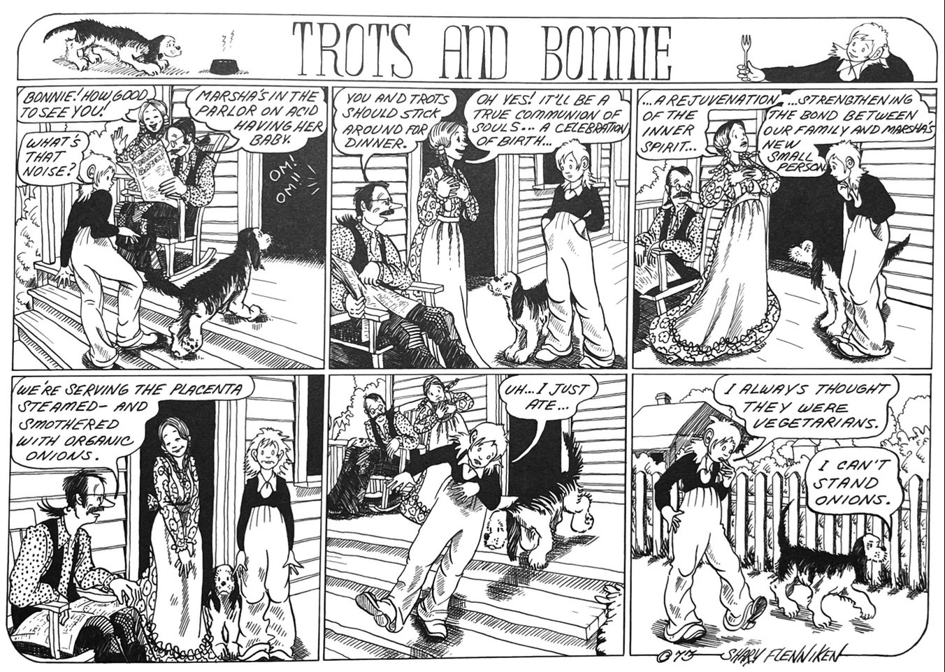
Trots and Bonnie/The Appletons
In my formative years of comics appreciation (early 1970s) National Lampoon’s comics section was nothing less than a revelation. Gahan Wilson’s Nuts, Vaughn Bode’s Cheech Wizard, Bobby London’s Dirty Duck, B. K. Taylor’s The Appletons, and anything by Rick Geary, Stan Mack and Charles Rodrigues truly blew this kid’s mind wide open to the possibilities of the form. But no one jangled my adolescent male sensibilities as much as Shary Flenniken’s truly pioneering Trots and Bonnie. The adolescent innocent Bonnie, her wry and ironic pup Trots and totally liberated friend Pepsi decimated my suburban 70s notion of feminine propriety, in the best ways. Flenniken’s candor about the female body, resentment of the patriarchy, and dark, dark sense of humor put nothing off limits. And her fine, controlled line work, thoughtful panel compositions only amplified the satire through contrast. A scathing humorous sensibility had the look and feel of children’s book illustrations and it is finally collected with the size and precision it deserves in New York Review Comics’ Trots and Bonnie. B.K. Taylor’s Appletons and Timberland Tales followed a similar rule of contrasts. He cloaked his descent into the perverse, murderous, incestuous vision of American family in cartoony stylings of apple-cheeked, smiley happy characters. Think Mark Trail meets… . Well, hell, I am not sure I can come up with an analogue for Taylor’s ink black perversity. Buckle up, because this year’s I Think He’s Crazy: The Comics of B.K. Taylor (Fantagraphics) is a twisted ride.
Popeye…Again
Like Krazy Kat, Little Nemo, Terry and the Pirates, Dick Tracy and Li’l Abner, E.C. Segar’s Popeye/Thimble Theatre has long been recognized among the pantheon, and so it has been reprinted several times over the last decades. A decade ago, Fantagraphics finished a six volume compendium of all Popeye-era dailies and Sundays in oversized formats with generous supporting material. With Popeye Volume 1: Olive Oyl and Her Sweety (Fantagraphics) the publisher shrinks the format, scope and price into a manageable paperback of just the Sundays. It has an imaginative slipcase design with cutout. But most of all it makes those wonderful color weeklies more accessible. Segar maintained a separate storyline in the Sundays, which usually used larger panels and more action. In this first volume we get both the early romance between Popeye and Olive as well as an extended story about Popeye’s short boxing career. Whether with words, schemes or fists, Segar had a pugilistic vision of human relations that comes through no matter the scenario. For those who already have the last reprinting, this series is unnecessary. But it is well worth the affordable price to anyone else.
Hank Ketcham made it look so easy…and that was the trick. His loose, thick cartoony line seemed to skate across the page. A Dennis the Menace daily feels so comfortable and easy to take in at a glance, as if we are in the flow of Ketcham’s relaxed line. And his imagery is equally easy, almost as abstract as a UPA cartoon (Gerald McBoing Boing, Mr. MaGoo). But unlike the jazzy cartoon aesthetic of the 50s, Dennis the Menace was firmly situated, perhaps petrified, in the iconography post-WWII white suburbia. And Ketcham himself said he aspired for his art not to call attention to itself and almost look not there.
But of course, this kind of easy transparent style was the result of tremendous skill and care. Take for instance this otherwise anodyne daily of Dennis making yet another disastrous assault on his perennial target, the cookie jar. Ketchum’s loose, flowing pen line was much admired by fellow cartoonists because it was at once light in spirit and cartoony but also controlled and precise. He credits Noel Sickles with teaching him how to use a pen more like a brush and relax his line so it seemed to flow so effortlessly.
Consider the sheer economy of this scene, how so few lines establish his figures and setting. He establishes his modern suburban kitchen setting with such selective specificity – refrigerator and cabinet handles are sparse and abstract, but the three storage jars on the counter embody the post-war mid-century modern style. And yet the broken cookie jar is detailed and minute, pulling the eye to the center of the chaos.
I have read some fellow artists praise Ketcham’s mastery of drapery, and here is a great example of using that detail to carry the weight of mother Alice’s reaction. Henry and Alice Mitchell only speak for themselves on occasion in Dennisworld. Most often they are reacting graphically to Dennis’s transgressions in minute details – the positioning of an eyebrow line, body posture, slightly splayed feet. In this panel, we don’t even need Alice’s facial expression to complete the scene. Ketcham positions us at kid level and uses the drape of her skirt and flying kerchief to render the reaction shot.
Hank Ketcham mapped mid-century American suburbia so simply and beautifully. He was a perfectionist with establishing perspective that made you part of the scene. In this early 50s panel, his composition and staging of characters is everything. It establishes the dynamic among characters and separates Dennis from the group in just the way he is emotionally. And Ketcham’s Disney training comes through in the ways each of the adults is animated and characterized individually. Every person in the scene is laughing in a particular way that suggests their own character and backstory. And it was all told visually with that signature loose and flowing pen work that makes a well-planned panel feel effortless. No wonder so many of his contemporaries envied his artistry.
Perspective was critical to Ketcham. He often finds ways to place us in the scene that also involves us in the flow of the action or in relation to a character’s perspective. The panel above underscores his thoughtful use of point of view to heighten meaning. Here Dennis and the gang’s boyish conspiracy feels more intense, intimate, secretive by being set back from the action.
The aesthetic of Dennis the Menace is centered in the brilliant design of Dennis himself of course. First it is important note that Dennis is impossibly small. Compared to the adults around him, this five-year-old is considerably smaller than his age, barely reaches the knees of his distinctly lanky parents. His bunched, oversized coveralls keep him even more grounded and often give him the appearance of a cannonball in motion.. Dennis rarely trips, falls or loses control. It is the physical and human world around Dennis that loses its footing. Adults grimace, recoil in shock or just scatter and lie akimbo in his wake. Ketcham describes Dennis as innocent. But the power of this strip is the way Ketcham embodies that innocence visually. Dennis is pure innocent determination embodied in physics. Either his low center of gravity keeps him steadfast in his attitude or momentum expresses the conviction of his chase or escape.
In earlier stints at the Lantz and Disney animation studios, Ketcham absorbed his strong sense of animated motion and rich characterization. But he also found at Disney and his work on many Donald Duck shorts the visual model for Dennis himself. With his butt sticking out, legs angled back to balance a cantilevered belly out front, Ketcham describes Dennis in one of his model sheets as “not unlike D. Duck.”
Nudism is one of Dennis’s favored modes of expression…and Kaetcham’s. He flees his dreaded bath by careening bare-assed and in flight into the neighborhood. He is not just unselfconscious but truly free. When he stands principled against clothing, butt to the viewer, the open arms and declarative mouth dramatize obliviousness, not shame. The otherwise buttoned down Ketcham somehow finds in nude Dennis a way to celebrate visually a sense of liberation in nakedness that in an unlikely way anticipates counter-cultural ideas a decade in advance.
Which is to say that Dennis the Menace exemplifies what makes the comic strip medium distinct. In its best hands, cartooning is not just an illustrated or dramatized punch line. The artwork embodies and deepens the meaning of the idea.