Jimmy Swinnerton’s adorable cartoon bears are generally considered the first recurring daily newspaper comic character. More than that, however, he may have been smarter than the average bear. He may also be an important bridge across traditional newspaper illustrated reporting and editorial cartooning that spawned the very different conventions of comic strips as we came to know them.
Getting nervous about the prospect of an AI oligarchy, a kind of anti-democratic sensibility that the Tech Bros finally say out loud? That they see in their own machines the prospects of a “post-human” future where rational engineers like themselves finally get the respect, authority and control they think they deserve? That compassion, democracy, maybe humanity itself are only for the weak willed? That this could be a better world if only pesky governments and, you know, people, would just leave them alone?
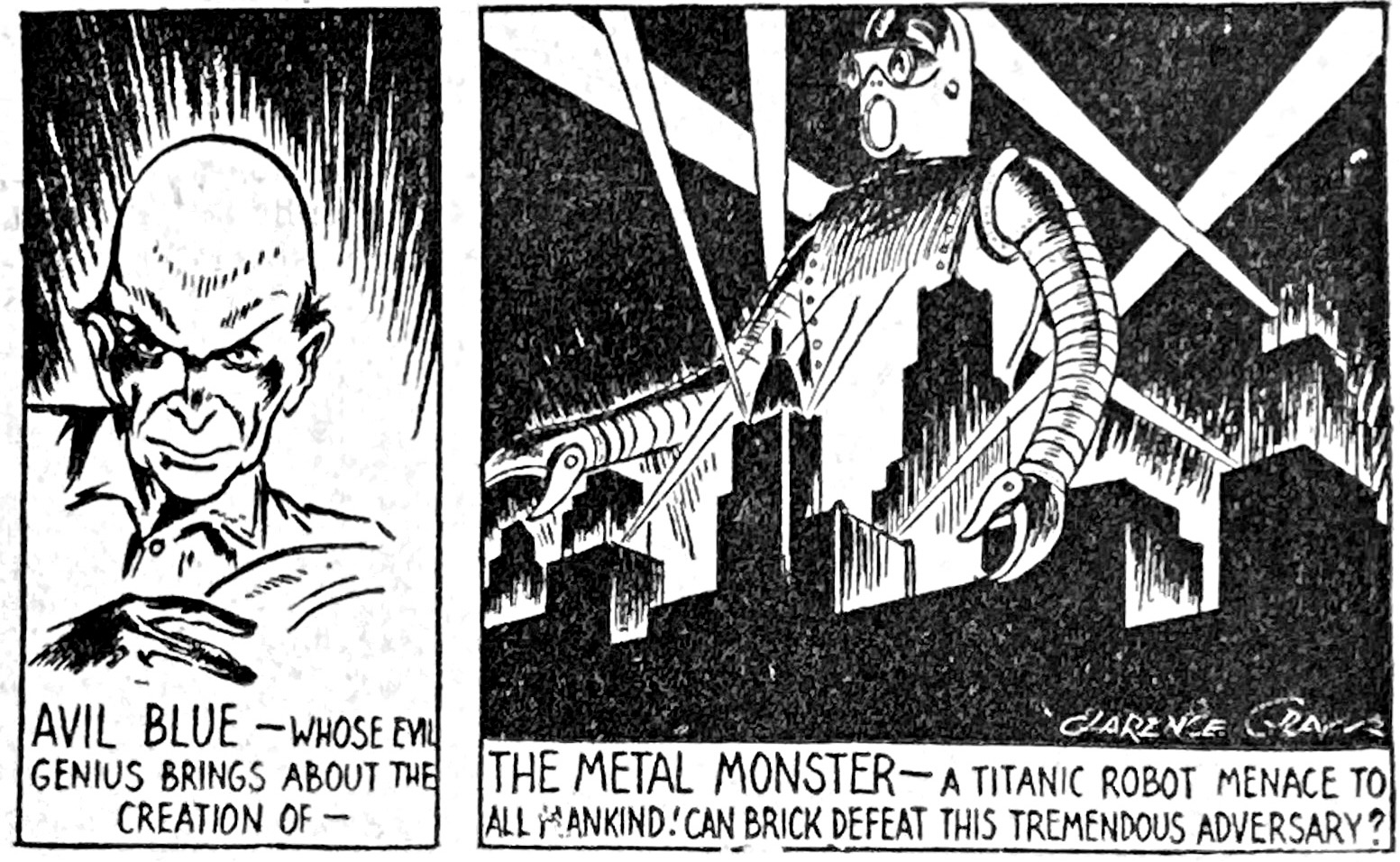
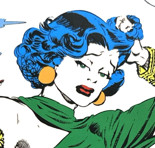
As the 1930s progressed, comic strip adventuring matured its visions of villainy. And the times were changing, as world war was becoming a reality rather than a distant rumble. As we saw in Part 1 and Part 2 of our favorite comic strip badasses, the thuggish, petty, and naturally mean antangonists of the 20s and early 30s (Bull Dawson, Sea Hag, etc.) had given way to the world-eating maniacs like Ming and The Cobra. By the late 30s, villainy becomes a bit more real and local – often focused on espionage or just personal greed. And the characters are evolving as well, more conniving and cerebral, less tied to gangsterism and power-madness than to cool demeanors and low-key malevolence. Evil was no longer wearing crowns, medieval cloaks or mustaches. They were well-dressed and brainy – the villain next door.
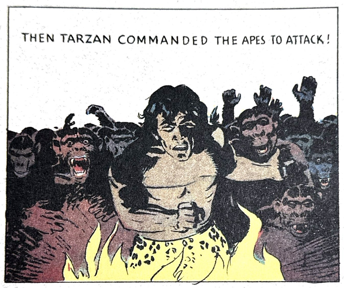
We could easily frame Hal Foster’s 1931-1937 run of Tarzan Sunday comics merely as a pleasant preamble to his magnum opus, Prince Valiant. By his own admission, Foster was a reluctant cartoonist. The successful magazine and commercial artist carried that world’s condescension towards the comic strip. Famously, he quipped in 1984 that being invited to replace Rex Maxon on the Tarzan Sundays was “To be asked to sell my birthright for a mess of pottage.” But the Great Depression had hit advertising and print media hard, so Foster took the life raft. But as TASCHEN’s new and definitive reprint of his Tarzan years shows, Foster was doing more than warming up. Others like Frank Godwin and Nell Brinkley had already started to introduce less cartoony, more illustrative styles to comics pages. But Foster brought into the mix dynamic, realistic figure art, a remarkable attention to color, and an appreciation for spectacle that newspaper Sunday pages hadn’t seen since the earliest years of experimentation by the likes of McCay and Feininger.
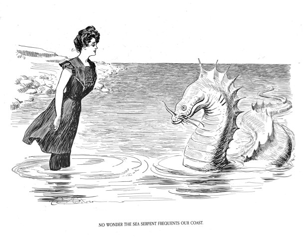
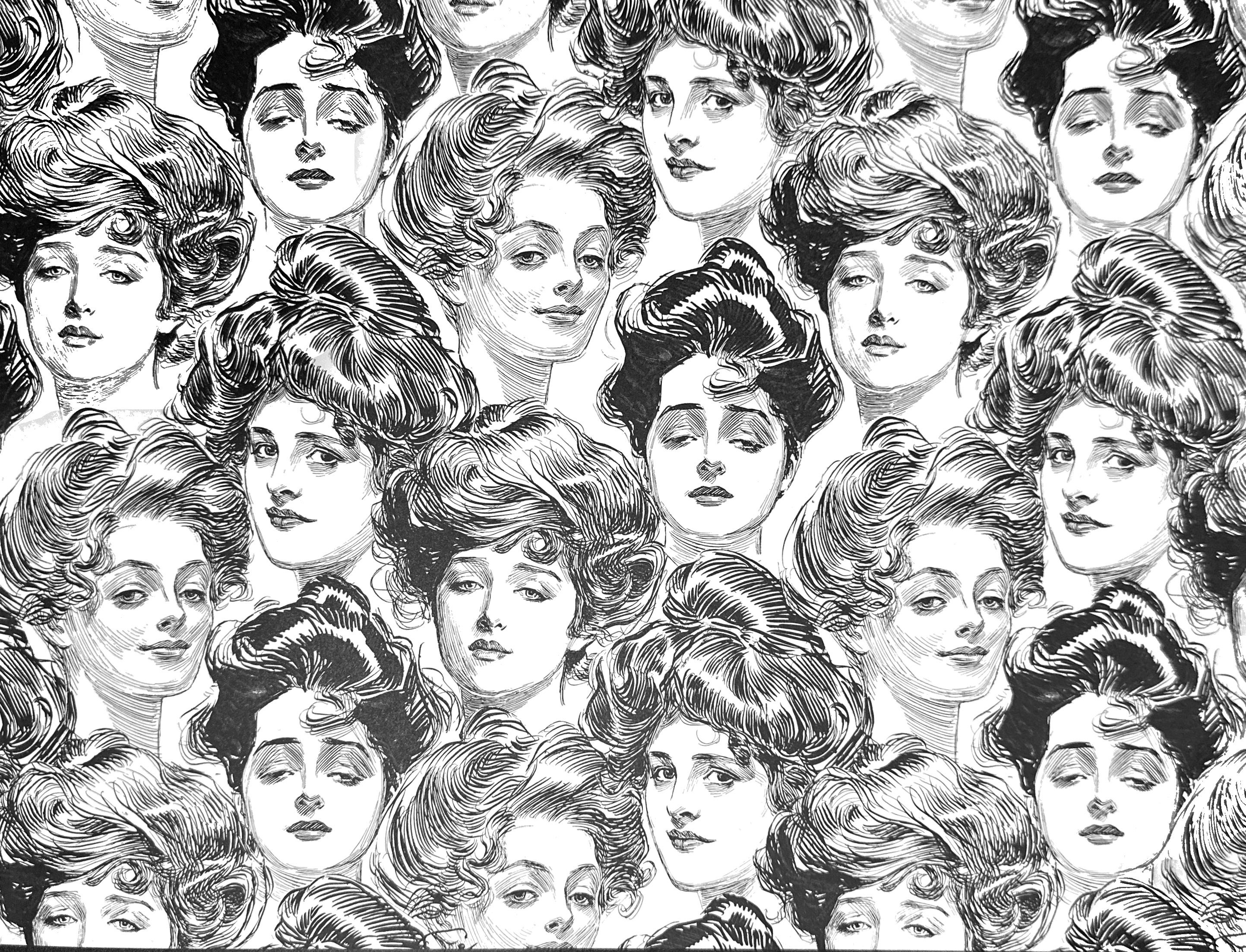
This is a good time for modern comic strip fans to recall Charles Dana Gibson’s role in late Victorian American culture. The most famous illustrator of his day had a calming, languid line and upscale focus that contrasted sharply with everything the early newspaper comic strip represented. Just as a tsunami of recent comic strip reprints celebrate the raucousness of 20th Century cartooning, Gibson’s epoch-defining artistry reminds us of what the “vulgar” new medium was disrupting. It also suggests why the scions of civility found the Sunday supplements so offensive and magazine illustrators like Gibson so engaging.
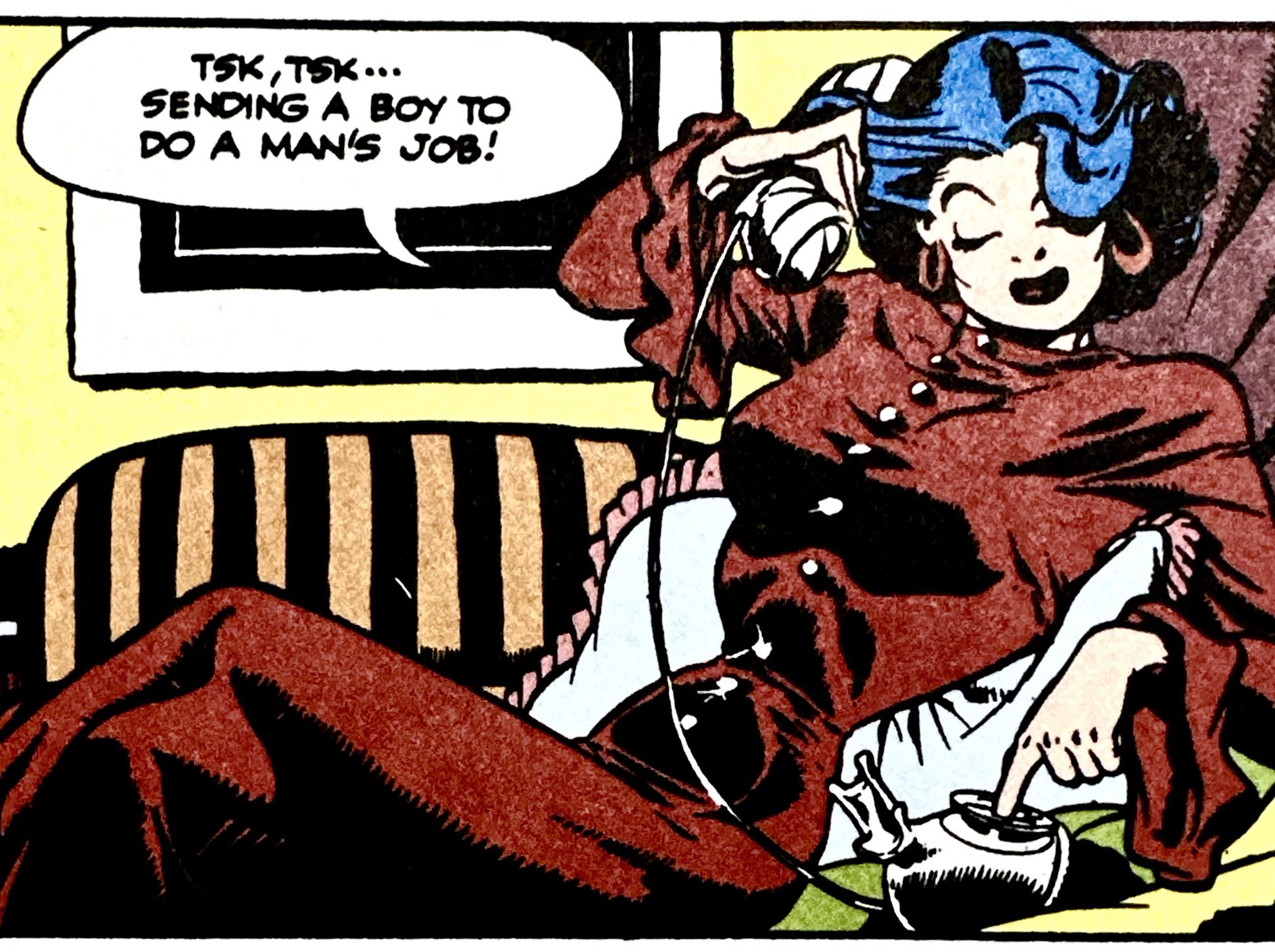
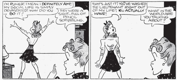
Like all American mass media of the last century, demographics and market forces provide the frame within which trends in comic strip content lived. Harry Haenigsen’s Penny launched in 1943 directly out of the intersection of two new social realities – gal power and the “invention of the teenager.” It is not surprising, then, that Haenigsen took an almost sociological approach to portraying two things he certainly was not – young nor a girl. Like any good cartoon anthropologist, he decided to go native. The Oct. 6 1946 Philadelphia Inquirer reports how the New Hope artist researched Penny by eavesdropping on soda shop conversations and even hosting cookouts for the local high schoolers.
The new generation of print-on-demand (POD) platforms, most notably Lulu, has inspired several ambitious strip aficionados to become one-man reprint publishers. And so, our cup runneth over. In just the last six months the zone is flooded with all manner of lost, obscure or woefully overlooked strips of old. I find it hard to keep up with what is available, let alone decide how much of this largesse I want, need or can afford. But in the video below I share just a taste from this ever-expanding buffet of cartoon treats.