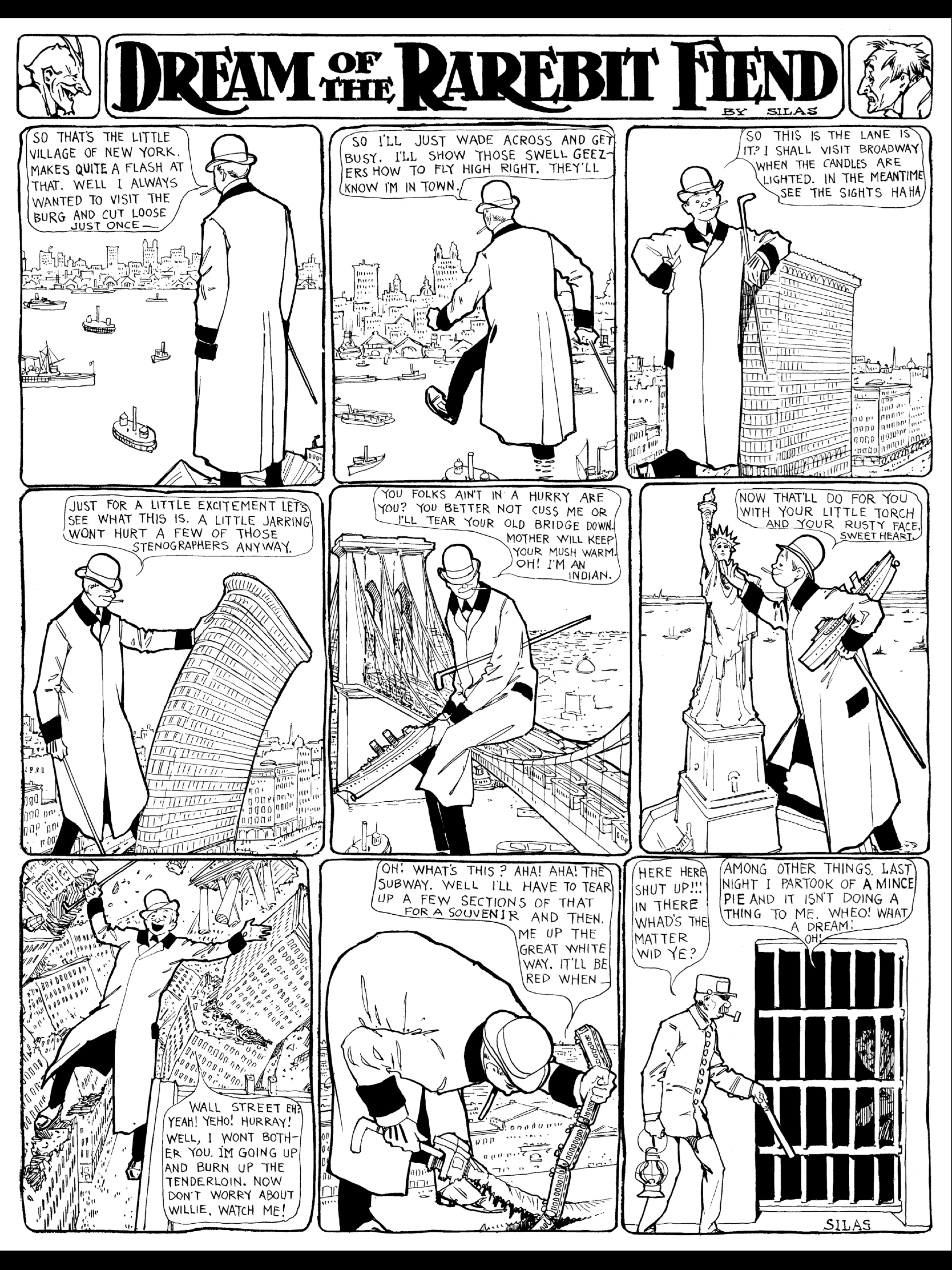
The teeming, always moving, mechanized, bureaucratic, dwarfing city was the the most striking new reality pushing on American in just those very years the comic pages emerged in the late 19th and early 20th Century. Many of the leading artists of the day like Outcault, Opper and McCay were themselves midwestern rural transplants for whom the big city and its humbling scale must have been disorienting environments. Outcault was known to walk the streets of the city picking up inspiration and ambience for his Hogan’s Alley/Yellow Kid vision of tenement life. McCay lavished the city skyline with his obsessively detailed line work in both Dream of the Rarebit Fiend and Little Nemo in Slumberland.
That is why I am fascinated by the ways in which these artists visually depicted this new reality in the first decades of the newspaper comics. In the two examples here, Windsor McCay and Jimmy Swinnerton use dream sequences to reimagine the landscape. In the first from the Rarebit Fiend series, McCay has his character master the scale of the modern city by becoming a giant himself and reducing the skyline to so many toys, some of which even can be bent. Swinnerton’s is the newcomer’s surreal nightmare of all the ways in which the city masters him.
The daunting urban world becomes malleable, subject to human reimagination in the comic pages, offering readers alternative ways of thinking about the disorienting spaces they occupy.
The city was among the pressing new realities facing Americans at the turn of the 20th Century, and the comics medium was uniquely equipped to express sensations around a novel environment. Walt McDougall (1858-1938) was among the pioneers of American cartooning who took special interest in this historic shift. His “Familiar Sights of a Great City – No. 1 The Cop Is Coming” (New York Journal, Sunday, Jan. 9, 1898) is among my favorite one-offs of the era.
Much like R.F Outcault’s visions of urban chaotic action in The Yellow Kid that I commented about earlier, McDougall signifies city life with images of antic physical energy but a highly individuate view of that crowd. Visually, this frantic flight of street vendors (presumably unlicensed) from a strolling cop is a delicious explosion. The mere presence of a virtually inert cop in the far background produces this lurch into the foreground of scurrying limbs and panicked visages.
McDougall’s cartoon stylings are so much more sophisticated than many of his peers here. The cantilevered limbs of all his fleeing vendors are all frozen perfectly at the apogee of their panic. He has a sharp sense of each character’s weight and stance, momentum and facial expression. All of these qualities foreshadow in my mind post-WWII master Jack Davis in particular. There is some wonderful detail in here as well, like the shadows cast by wagon wheels and fruit. The one newspaper reader in the right foreground is an oblivious counterpoint to the onrush, which only enhances the sense of movement and fear in the rest of the crowd.
McDougall’s reading of the city here is much like Outcault’s in that he never lets the crowd be a “crowd.” He personalizes the cityscape. It is a collection of highly distinct individuals rather than the crowd as faceless horde. The emerging medium of film, however, would soon reinterpret the crowd more as a mass.
That said, McDougall exercises ethnic stereotyping as broadly as his comrades often did in newspaper comics of the day. I presume that the handlebar mustaches, beards, fruit, figs and statuettes signify an early Italian-American neighborhood. The great migration of Italians to the US spanned 1880 to 1924 and settled principally in Manhattan, where they often occupied street vendor and dayworker jobs.
I like this image because it is a great example of the uniqueness of comic art in America. Of course many formal critics wrote extensively about the city, pro and con. Their skyscraping buildings, mass transport and increasingly organized city governments were considered icons of progress, the triumph of industry, the genius of science. At the same time angst over crime, disease, xenophobic responses to emigrees, dislocation from nature all proliferated. But illustration, especially comics that took the crowd and the skyscraper as its subject, could express and interpret the sensations of urban life. The cultural role of modern visual media like comics and film often were to help make sense of these feelings with nuance that eludes written prose.
We revere Milt Caniff’s Terry and the Pirates quite rightfully as the apex of the adventure strips. His evocative use of frame, staging, rhythms, ink and line (or blobs), setting, landscape, story arc – all set new and high standards for comic art in the 1930s and 40s that define the form. But as I read through the strip from its beginning I am struck by the pop psychological dimension of the strip. So much time is spent on characters musing on one another’s motives, gaming one another’s psychology, and especially mapping the contours of ideal manhood and the war of the sexes.
Terry the amateur psychologist – decoding adult relationships and the male ego in the first adventure with eternal Pat Ryan love interest Normandie Drake.
The basic psychological dynamic of Terry and the Pirates is father and son. In most places we are taking the perspective of teen Terry Lee who follows and tries to decipher ersatz dad vagabond Pat Ryan as his model male. In the very first story arch of the daily strip society gal Normandie Drake draws Pat’s eye. Here we get the first of many male/female cat and mouse games between Pat and a love interest. At one point Pat leaves Normandie because he doesn’t feel he could fit into her high society. She tries to retrieve him by falsely charging Pat with forgery. And the game is on.
Terry Lee is in the role of son actively trying to decipher the male role that stand-in father Pat is modeling. Connie is his sounding board, which lets Terry voice his readings of Pat without breaking the fourth wall and talking directly to us. And for all of the terrible stereotyping Connie himself endures at Caniff’s hand, he too engages in the pop psychologizing of men and women that quickly becomes one of the sub-themes of the strip.
For his part, Pat is less often an interpreter of human emotional signals than the classic American stoic, the isolato who spends more time silently staring out windows and having his actions and unspoken gestures read by others.
And Caniff’s world of men and women is one of deception, scheming and misdirection. As Terry understands above, a man or woman’s words or actions often run opposite their real meaning. Pat and romantic interests like Normandie, Burma and the Dragon Lady snub and reject one another regularly as ploys to intrigue and attract the other. Per below, Burma rages at Pat labeling him a coward to successfully challenge their stoic to declare his passion for her.
In a rare moment of vocalized reflection, Pat ponders the motives of Burma and his own worthiness as a suitor.
Pat often takes the paternal role to Terry, filling in the blanks on this great mystery that seems to be woman. Heart-to-hearts abound in this strip. Above Caniff invokes the familiar father/son exchange over “Dad” shaving. Caniff portrays the scheming and counter-scheming between men and women with the pointed curiosity of a boy’s view. The interpersonal plots in TATP take up at least as much panel time as the unfolding adventures as the two conceits of the strip run in parallel. And character introspection plays a large role in the day to day content of the strip. Typically the pulp adventure genre is about action, heroic characters who are fully externalized and use violence to express usually male emotion. In TATP, almost every character is capable of being at turns self-deprecating, introspective, analytical.
For and adventure genre usually focused on externalization, Terry and the Pirates uses character introspection to a remarkable degree. Here, Burma reflects own her own motives.
In putting Caniff’s masterpiece in its context of the 30s and 40s, we would do well to understand this dimension to the strip’s appeal. As pure adventure and graphic storytelling, the strip is unmatched. But Caniff clearly is also exploring with his readers human behavior, psychology, the layers of motive and delusion in human interaction. The basic insight of modern psychology, that humans are not always fully aware of their own motives and that actions are not always clear reflections of thought and feeling, are remarkably featured in this strip. It may be Caniff’s unique blend of external physical action with internal introspection that made the strip so rich and appealing during its very popular run.
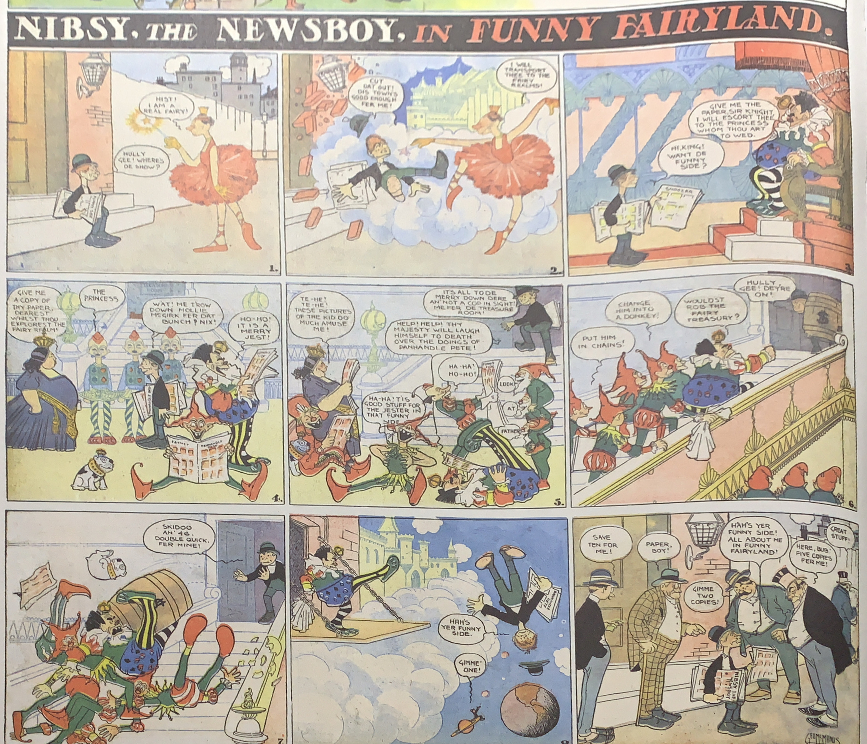
Many years before inventing Jiggs and Maggie in “Bringing Up Father,” George McManus offered this mild sendup of his friend Winsor McCay’s wildly popular “Little Nemo in Slumberland.” “Nibsy the Newsboy in Funny Fairyland” ran in Pulitzer’s New York World for just two months in 1906, but it remains one of the best attempts to mimic McCay’s dreamscapes. T
This works so well because McManus upends most of McCay’s conventions. While Nemo is a privileged middle-class boy with doting parents who serves mainly as spectator, Nibsy is an Irish street urchin who peddles papers to survive and wise-cracks and schemes his way through the fantasy sequences. McCay’s Slumberland royalty are majestic, aloof, empowered. McManus’s are foppish, inept, centers of the comic sequences. And yet McManus reverses all of Nemo’s conventions while replicating McCay’s precise, Deco line work and lush architectures. It is a great example of how self aware the comic strip and its artists could be this early in their history.
R.F. Outcault (1863-1928) institutionalized a number of modern conventions in comic strip history. His Yellow Kid was the first widely recognized recurring character in the newspaper comics of the mid 1890s. And as such he absorbed a key aspect of the emerging modern consumer culture by becoming the first merchandising and advertising juggernaut from the comics medium. And as Bill Blackbeard argues in his exhaustive history of the character, R.F. Outcault’s The Yellow Kid: A Centennial Celebration of the Kid Who Started the Comics (Kitchen Sink, 1993), he inadvertently brought together the fundamental elements of the future comic strip format with his October 25, 1896 half page comic in Hearst’s New York Journal, “The Yellow Kid and His New Phonograph.” (below). Each piece had been seen before. Others had used sequential panel action to depict a temporal narrative. Despite some myth to the contrary, the Kid was not the first recurring newspaper comic strip character of note. The Ting Ling Kids and Brownies both preceded him. And several artists had already used speech balloons to bring speech and image into closer proximity and simultaneity for the reader. But this 1896 strip brings all of those elements together into a compelling synchronous mode of expression.
Comic strip historians have chronicled and argued over Outcault’s role in many innovations in the form, as well as when and where the Kid himself first appeared. Blackbeard’s book is the most comprehensive view I have found. David Westbrook’s analysis of the Kid’s ties to commercial culture are also valuable. Also, R.C. Harvey’s recent piece in Comics Journal.
Richard Marshall’s portrait (1989) is a deft synopsis of Outcault’s bio and contributes a few key insights. First, the Yellow Kid character himself made eye contact with his newspaper audience and became their cypher in a way that was unique and innovative for the form (28). Outcault used the same conceit in his next big blockbuster hit, Buster Brown. Buster’s dog Tighe talks to the reader in wry commentary on Buster’s antics. In both cases Outcault is breaking the fictional omniscience of the reader with a direct address. This both brings the reader into the strip and at once distances them from fully identifying with the action. It constructs the reader not only as spectator but offers a wry, knowing, often skeptical voice to that reader.
Marshall also makes the good point that with the Yellow Kid Outcault started a pattern for the funny pages – kid characters that appealed to both young and old. The comics often allowed for children to identify with the action and let adults observe and enjoy it at once. The comics are singular among popular art forms in their ability to speak across generations and age groups (38).
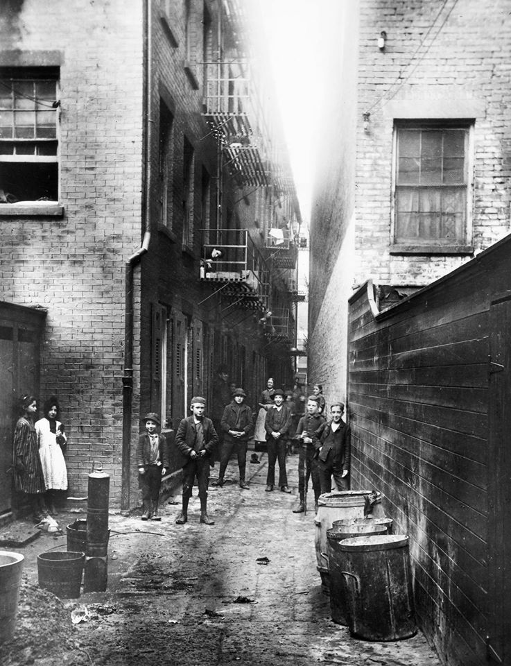
For my part, I am particularly interested in the way Outcault envisioned the relatively new and quickly growing urban landscape in The Yellow Kid. This represents an important intersection of cultural history and the comic strip in a number of ways. Foremost, the unique qualities of the emerging comic art rendered and interpreted a new reality for America itself – the growth of the major and minor cities, their population by waves of European immigration and migration from shrinking rural areas. The predominantly Irish tenement sections of Manhattan Outcault caricatures in the Hogan’s Alley series for the World and the McFadden Flats/Yellow Kid series in the Journal between 1896 and 1898 were in fact some of the most populous neighborhoods on the planet at the time. Outcault was giving us some of the first visions of crowdedness and the crowd itself we get in American popular culture. Industrialization had helped aggregate people into “crowds” and “masses,” two terms we see coming to prominance at the time. These aggregations of people were easily and often denigrated as “mobs” especially by an anxious middle class and ruling class media in response to collective action, labor strikes and protests. The power and peril of people collected en masse was a persistent anxiety of a rapidly urbanizing America.
It is in this context where I think Outcault’s Yellow Kid tableaux of immigrant class urban childhood achieved their cultural resonance, and perhaps explains some of the comic’s massive if fleeting popularity. Outcault had a way of caricaturing the crowd and the sensations of the city in a nuanced way that both expressed and resolved many anxieties about the new urban reality.
Outcault was not the first to focus on underclass children. During these same years, Stephen Crane wrote and self-published Maggie: A Girl of the Streets, which dove into the violence, class resentment and desperation of the New York Irish working class. In fact this novel begins with a gang beating that was unsparing in depicting child-gangs as fully adult in their capacity for malevolence.
“Howls of renewed wrath went up from Devil’s Row throats. Tattered gamins on the right made a furious assault on the gravel heap. On their small, convulsed faces there shone the grins of true assassins. As they charged, they threw stones and cursed in shrill chorus.”
Journalist and photographer Jacob Riis most famously depicted these neighborhoods as oppressive dens of sadness and scandalous inequity in How the Other Half Lives (1890).
And years before Hogan’s Alley and The Yellow Kid, the urchins of New York’s Hell’s Kitchen were turned into light satire in the pages of the middle class humor magazine Puck by M.A. Woolf. Indeed, Outcault mimicked Woolf’s conceit of depicting impoverished children comically aping the rituals of middle class society.
It is in this context of rapid social change, class anxiety, and new urban organization of human beings that Outcault burst onto the scene with a unique creative response to these tensions. Outcault envisioned the urban masses very differently from some peers. He idealized the crowd as a kind of organized, ambiguous chaos – a mass of similar people who coexist in clusters of separate action within the action. And that action is at once violent, resentful, sometimes tender and more all at once.
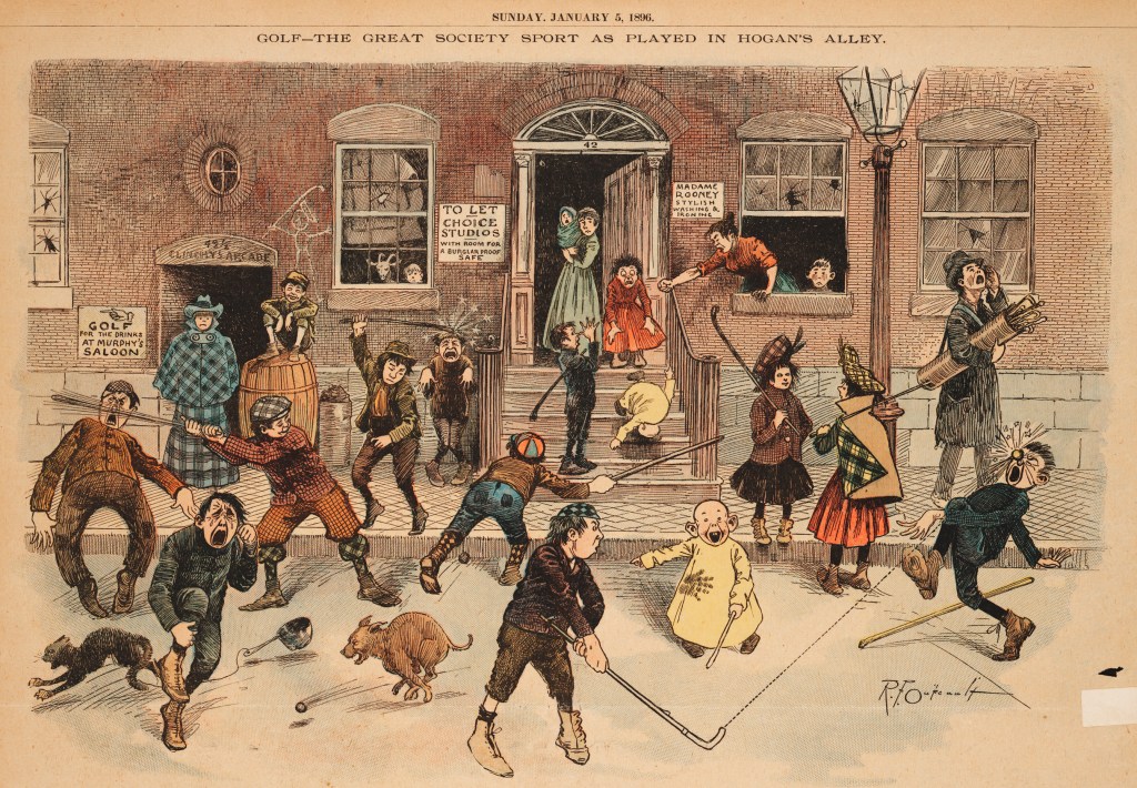
Look at the range of action, emotion and moods that co-exist in this simple “Golf- The Great Society Sport As Played In Hogan’s Alley” (World, Jan. 5 1896). the tableaux is the sum total of many individual set pieces. Stray balls and sticks comically assault urchins. Meanwhile on the stoop alone there are multiple planes of action. A girl fumbles a toddler, echoing the accidental violence from the street. Likewise, a boy taunts one of the enraged or saddened Irish mothers (also on this same stoop) that often populate Outcault’s tenement backgrounds. Right before this stoop we get two calm girls conversing, while to the side an older urchin tries to sell golf clubs for the affair. And this describes just a portion of what goes on across multiple planes of action in most Outcault Yellow Kid tableaux.
There are many ways potentially to depict the city and the crowd. So Outcault’s choices are important because the way he did it likely resonated with viewer-readers. The immediate appeal of Outcault’s vision of the urban crowd is not accidental. It is a particularly appealing way of seeing the urban landscape because it addresses and salves specific anxieties about the social change Americans were experiencing at the time. He sees the urban crowd as a collection of loosely organized clusters of pairs and set pieces of independent action happening within this larger joint occasion. They are all organized by a single occasion that is the site for satire – the horse race, the mock political convention, the beauty pageant, etc. But within this group ritual are all of these small gatherings of others, engaged in bickering, side jokes, little pomposities, etc.
This is a strikingly different way of envisioning the urban setting and group from Jacob Riis’s images of oppressive environments. It is at once grim and joyous. It is also distinct from what most filmmakers would devise in just the next decade. Griffith’s crowds are waves of anonymous people punctuated perhaps by just a couple of heroes. Film envisioned crowds as undifferentiated masses, often threatening physical forces – battle scenes, protest mobs, rat race city streets and commuters. Outcault by contrast refuses to let the crowd be a mob. Instead he breaks this crowd ritual down into a loose conglomerate of family, friends, rivals, accidental sub-groups. This is mass seen as community where individual characters still thrive and assert themselves, where they aren’t anonymized and dehumanized by their environment.
Outcault depicts the city as a rich pastiche. In a single panel he can show the new city as oppressive, beating down the choices and spirit of Hogan’s Alley denizens (generally the adults on the periphery of the action). But an inch away, his raucous urchins are asserting their creative, satiric energies against their environment. He sees where many different realities co-exist. Arthur Asa Berge captured this ambiguity when he described the Yellow Kid’s city aesthetic as “nihilistic exuberance in a strip that is at once comic and menacing (32).”
Outcault is also giving new urbanites an idealized way of seeing their own environment. It is a freeze frame of urban chaos. It stills the chaos in a way that lets us examine it, break it down into humanized pieces, see it within a larger coherence. The Yellow Kid not only depicts the city but also offers middle class and rising class readers a way of seeing it, containing and controlling some of its most anxiety-producing elements.
It is worth noting that the height of Outcault’s complex vision of urban life occurred fleetingly in the history of the strip, roughly in the last half of 1896 in the months leading up to his October departure from Pultizer’s World to join Hearst’s rival Journal. Under the more conservative Hearst, Outcault’s work was demonstrably less edgy, with much less tugging at class tensions and physical violence. And when the Kid and gang ventured off for a world tour of comics depicting their visit to foreign lands, the former grim, dark humor and ambiguity were gone forever.
What They Did to the Dog-Catcher in Hogan’s Alley, Word, Sept. 20, 1896
The Sept. 20, 1896 thrashing of the local dogcatcher (“What They Did to the Dog-Catcher in Hogan’s Alley”) is one of Outcault’s final Hogan’s Alley pieces for Pulitzer before the move, but it is about the darkest in the series. It registers the depth of inner city resentment and distrust of institutional authority. Outcault’s urchins are not mocking society airs but taking sticks, feet, rocks and even the threat of an axe to a city worker. They even light their official wagon on fire. The shawled mothers at the doorway and windows respond to their kids’ own violence with a sort of sad resignation. Interestingly, Outcault keeps the two objects of this gleeful sadism anonymized. The Dog Catcher in the foreground
It was an extension of the newspaper itself, a medium that exploded and transformed in these decades as a necessary map of this challenging new urban environment for working and middle classes. Outcault offers a way of seeing the city. It’s genius is in organizing the clutter and chaos of the new social reality without fully romanticizing it.
#1 Screwball: The Cartoonists Who Made the Funnies Funny, by Paul Tumey. IDW/LOAC, $59.99
In my mind, this is the most important contribution to comic strip history published this year. Tumey’s excellent research validates and revives a dominant style of comics of the first four decades of the medium’s history that may seem shallow, silly or just unfunny to modern sensibilities. The imaginative verve is timeless, however. This book fills a real void in our historical sense of comic strips and leads to important questions about how the medium related to the times.
Nonsense, slapstick, harmless anarchy formed a kind of lightly transgressive response to modern times in both early comics and film. But even if we don’t quite get the humor anymore, the antic visual energy of overlooked figures like Walter R. Bradford, Eugene Zimmerman and Clare Dwiggins is irresistible. Tumey takes a biographical approach to the screwball style, highlighting fifteen artists. But along the way he also references scores of others to create a rich overview of a lost style of popular art.
#3 Madness in Crowds: The Teeming Mind of Harrison Cady (Beehive Books, $100)
Harrison Cady (1877-1970) may be the most prolific magazine illustrator you never heard of…until now. But his signature crowd scenes and nature fantasies were found in the pages of LIFE (where he was a staff illustrator) as well as Saturday Evening Post, Ladies Home Journal, Good Housekeeping, among many others, across seven decades. He was also known for his progressive politics, children’s book images and long-running Peter Rabbit comic strip. The small publisher Beehive has nobly revived this wonderfully imaginative mind in one of the most beautifully designed and printed books of the year. Underground comics artist and publisher Denis Kitchen provides an appreciation. But just fall into these thick pages of crisp, oversized images that Beehive has produced. This is what bookmaking is all about, where design enriches substance. You just want to hug it.
In his magazine and book work Cady was renowned for his detailed, teeming crowd scenes. These enormous tableaux recall Outcault’s Hogan’s Alley in a couple of respects. Cady shared Outcault’s vision of of the modern crowd as a collection of discrete interpersonal worlds. But he also flattens perspective to give the comic audience a privileged, unnatural view of the social scene.