Past Tomorrows: Back to the Buck Rogers Future

The 1969 moonwalk sparked both a wider interest and new respect for the science-fiction genre and tons of reflection on the ways speculative fiction anticipated contemporary tech. References to our realizing a “Buck Rogers” future flooded the media zone, and Chelsea House published in late ’69 one of the earliest oversized reprints of classic comics, The Collected Works of Buck Rogers in the 25th Century, introduced by Ray Bradbury writing about “Buck Rogers in Apollo Year 1.”

I was age 11 at the time, and had my own fleeting dalliance with sci-fi that drew me to this Chelsea volume at the local library and helped start a much deeper, longer love affair with newspaper comic strips. But an unusual source of comics fandom came into my house at the same time – a trade advertisement for high quality paper stock from the Warren Paper company. Some background. My father was a commercial artist with his own small ad agency in Northern New Jersey. We received at the home office a ton of trade magazines and ads. The S.D. Warren Paper Company promotions were far and away the smartest, most alluring trade marketing I have seen, then or since. To demo the print effect of their premium paper stocks, they created these lush, deeply researched pieces of content marketing that dug into topics like magic or the history of the circus, etc. I recently came upon the one Warren promote that remains etched in my memory – the 1970 celebration of how the Buck Rogers strip imagined accurately the gadgetry and transformative technology of the future.

The one-piece fold-out opened first onto that gorgeous splash above, with the classic Dick Calkins portrait of Buck in mid battle. These are the kinds of magnified newspaper comics images that helped the 12-year-old me into a love of the form. The line art of Calkns, Chester Gould, Will Eisner are among the first classic artists to captivate me. The art style of Buck Rogers felt at once primitive and technical. Calkins did not have a strong of perspective or even anatomy. Most of his figure positions look stiff rather than dynamic. And yet he brought to ray guns and flying ships a dreamy precision that made them live, perhaps even more than his humans.

The Warren promo folds out above to a panorama of comparing old Rogers panels to modern innovations like instant cameras, jet packs, surveillance satellites, monorails and more.

This wonderful look back to how the past imagined its future was all in the service of showing off S.D. Warren’s “Lustro Offset Enamel” paper stock, a product name that itself sounded a bit like a cartoon invention. Still, you can’t argue with a content marketing campaign so well done that an 11-year-old remembers it fondly 50 years later.

Dick Tracy 1932: The Glorious Weirdness of Chester Gould

Chester Gould’s imagination was as relentless as it was strange and even strangely mundane. His four decade run of Dick Tracy was distinguished by his signature villain grotesques, striking graphic violence and often arch-conservative politics. Reviewing Tracy’s first year of strips lately, I was struck by a few scenes that both veered from the strip’s eventual form but also practiced many of its regular notes. In the image above, for instance, Tracy pumps himself up for the coming challenge of bringing down his first major nemesis, Big Boy, and rescuing a kidnapped boy. The later Tracy would of course become a rock of resolve that wouldn’t have admitted even this kind of self-encouragement. At this point, even for Gould, Tracy is still human and not yet iconic.

And yet the two-fisted and eccentric manliness of Tracy and many of his pulp fiction counterparts was central to the character from the beginning. And Gould’s politics clearly were already set as early as 1932. Tracy was conceived as a lawman who necessarily had one foot outside police institutions. In fact, before the murder of fiancee Tess Trueheart’s father Emil, Dick was a civilian who had not yet found his calling. He swears upon Emil’s dead body that he will avenge the murder, which sets him on a quick path to becoming a leader among the “plainclothes” unit of the city police department. But his impatience with the bureaucracy is apparent in his unconventional methods and capacity for personal revenge and violence upon his villains. When he finally corners Big Boy, we get a crescendo of police brutality that stretches across several days. It ends with Tracy sending Big Boy crashing through a ships’ cabin door.

The twisted genius of Gould was in having it both ways with Tracy. He professed a deep respect for the law, and Tracy’s straight-backed uprightness was a feature of the strip’s characterization as well as it’s blocky noir style. And yet vigilante justice was meted out both by Tracy and Gould alike. Indeed, his colleagues in the force like Pat Patton and subsequent colleagues are seen as relatively timid and even feminized by their institution in a way that the indomitable masculinity of Dick is not. And the overall violence of the strip is clearly an extension of Tracy’s own vengefulness. The protracted chase of villains on the lam became a part of the Dick Tracy formula, and it was punctuated by the villain’s gruesome torture by nature along the way, often ending in grisly death. Violence for Gould always seemed to be the ultimate social purifier.

By Gould’s own admission, he often made it up as he went along, rarely knowing where his plots were headed and how he would get Tracy out of a jam. And so from its early days the plotting and devices often feel ham-handed, implausible or genuinely weird. His pursuit of Big Boy onto an ocean liner leads Tracy to knock out an innocent staffer to don his uniform and to dress in drag just to get onto the boat and get close to the kidnappers. Less tortured paths clearly are available to his characters, but Gould’s love of novel, unlikely story paths usually wins out.

By 1942, a decade after its launch, Gould’s visual signature for Tracy is fully established. His hawklike nose, perpendicular chin and straight lips are as much a statue as a figure, more chiseled from stone than drawn in ink. And in this self-portrait Gould himself sweats under Tracy’s command. He has created a caricature of law and order, authority and masculinity that would become a lodestone. Al Capp soon would mock his violence and surreal story and villainy. His love of authority and violence, impatience with countercultural trends would make him seem a relic by the end of the run. Yet, as much as Gould himself seemed a straight arrow defender of formal institutions, Dick Tracy itself was grounded in a surreal imagination that eschewed simple realism, broke violently with the propriety of the comics page and took us into very strange places.

Bobo Baxter: Rube Goldberg’s Bleak Screwball

Rube Goldberg (1883-1970) is best remembered for his cartoon inventions, ridiculously intricate mechanical solutions for common activities. These send-ups of modern technology and the romance of engineering appeared under multiple titles and formats across his career, but took most regular form in Collier’s Weekly between 1929 and 1931 as The Inventions of Professor Lucifer Gorgonzola Butts, A.K. His Foolish Question panels ran from the teens in various forms for decades. And his best-known continuous character strip of hapless failure Boob McNutt ran for more than a decade in the 1920a.

But it is in his forgotten small masterpiece Bobo Baxter (1927-1928() that I think we see Goldberg’s array of talents for satirizing the modern world come together into a persistent and satisfying whole. And at the same time Bobo shows how a sad note of alienation often lurks beneath the surface of many slapstick characters.

As godfather of comics historians Bill Blackbeard points pout in the intro to a 1970s reprint of the complete (Hyperion Press, 1977) run of strips, Bobo Baxter represented Goldberg moving (or being forced by trends) away from the gag-a-day format to the continuous characters and situations of other 20s strips like Little Orphan Annie, Bringing Up Father, The Gumps, Polly and Her Pals, etc. He had already made his Boob McNutt Sunday strip into a major hit by introducing recurring characters and continuing storylines. In 1927 he sent the form into a daily new creation, Bobo Baxter. 

We meet Bobo as an unsuccessful dreamer, envious of the fame and fortune of well-publicized explorers like Admiral Byrd and aviator Charles Lindbergh. So he builds a flying machine out of a two-seater bicycle, prop,  wing and some balloons. He seems as surprised as anyone that it flies, and he dubs the contraption “The Demi’Tasse”, bound for glory by flying across the Canadian border.

Bobo’s fixation on fame, celebrity and the press course through the strip. He is forever courting journalists and dreaming for the headlines he thinks his oddball journey will merit.

The discipline of storyline and continuity seemed to inspire Goldberg’s satiric sensibilities. In many ways the story becomes a picaresque journey through modern American social types and institutions – all of from which Bobo himself seems woefully alienated. 

Bobo himself is pathetically friendless, and a bit of a comic nebbish. At one point early in the strip he mistakenly reserves a table for his entourage at  the pricey Cafe Du high Hat. When Bobo can’t recruit anyone to come with him, he ends up animating a group of mannequins. 

Likewise, Bobo spends the first months of the strip simply in search of a passenger to bring with him. But it is the haplessness of Bobo’s plan that brings him into contact with a pastiche of American types. There is the desperate henpecked husband who would do anything to escape his onerous wife. There is the jewelry thief who is looking to escape with a pilfered pearl necklace. And there is Bobo’s own assistant Nosedive Kelly who is both too obese and anxious to make the flight but proves to be a self-promoting braggart.

Bobo’s encounters with a cast of American characters produces some wonderful moments where Goldberg’s native visual silliness, satiric eye, and critique of mechanisms both technical and social merge beautifully. Among my favorite moments comes when a Nosedive goes for an insurance checkup. “Your blood pressure is 5 pounds over the legal limit,” “Your ears a very badly designed” and “the hinges of your backbone squeak” he is told.

This is prime Rube. “Goldberg is a satirist not of fads and fanciest of rationality,” wrote Gerald W. Johnson in his 1958 review of political cartooning between the World Wars. 

The hapless comic outsider is a feature of modern comedy that deserves further thought. We see this anti-hero (and it is almost always male) in vaudeville, certainly the silent film clowns and in comic duos like Laurel and Hardy, Abbott and Costello.

But the comic strip turns the figure into a genre. Consider Happy Hooligan, Simon Simple, Moon Mullins, Jiggs, Andy Gump, A. Mutt, Baron Bean, Boob McNutt, among others.

In fact for the first two years of Goldberg’s Boob McN tut, each Sunday strip finds Boob trying to off himself 

In his recent, indispensable history of screwball comics, Paul Tumey characterizes Boob McNutt’s early years as black humor that reflected the post-WWI disillusionment of 20s America.

Maybe. I am more inclined to put Boob’s suicidal comedy and Bobo’s desperation for modern celebrity part of a longer tradition of modern comedy and especially the comic strip – the alienated clown. So many of the comic strip’s comedy fops feel themselves somehow on the curb as the great parade of American life goes by.

Indeed it is arguable that the comic strip itself carves this curbside role for us. On a daily basis, we are invited to look over the shoulder of Jiggs, Happy, Boob, Barney, Jeff, Popeye, Abner, et.al at a main cast of characters of which we are bemused – part of but slightly apart from.

In future posts I hope to explore further this idea that the daily comic strip often created for us a light satire of modern American life and styles, types and trends that registered and leveraged a sense of middle class alienation from the very world they were creating.

Just Kids – A Bridge to Peanuts

The suburban kid gang strip Just Kids by August Daniel “Ad” Carter ran 1923-1956, initially as a knock-off of Gene Byrnes’ Reg’lar Fellers. But it evolved into a more contemplative, nuanced projection of adult sensibilities into child characters that anticipated Charles Schulz’s Peanuts. Preceded by earlier iterations, Our Friend Mush, Mush Stebbins, and Just Kids in the teens, it was picked up by Hearst in the 1920s and it remained a bit of a beloved back bencher through much of its run.

Born in Baltimore, the maker of this long-lived strip that depicted kids as thoughtful, precocious adults was himself a victim of childhood trauma. He not only lost his mother at a young age, but was present when she was struck and killed by a streetcar. As a reporter at the Brooklyn Reporter he met Clare Briggs, who encouraged him to submit a strip proposal to a syndicate. Carter finally caught their attention in 1916.

The kid trio centered on Mush Stebbins, Fatso Dolan and Pat Chan represented and interesting multicultural group situated in the new city-suburban setting. It was a direct copy of Gene Byrnes Reg’lar Fellers, which focused on a gang of kids who like much of America migrated outside of urban centers during these post-war years but retained their inner city dialect. These strips were capturing a cultural moment, the growth of city suburbs in the first half of the 20th Century. The migration of city-kid toughness and ethnic diversity to the more sprawling neighborhoods of standalone homes, parks and relative affluence was one of the signal social trends of the modern era and helped reshape ideas of childhood. Interestingly and uniquely, the Pat Chan member of the gang is stereotyped in cartoonish Chinese garb but given a voice that is pure city street.

Nostalgia for a simpler, more innocent era of childhood was a longstanding American trope that found a welcome home in the modern mass medium of comic strips almost from its beginning. Clare Briggs’ countless iterations of one-panel childhood nostalgic sentiment in The Days of Real Sport and When a Feller Needs a Friend in the teens helped establish the light, observational tone of the comic strip genre.

Reg’lar Fellers was more of a gag a day strip with little character development and often cruder art.

But at least in the limited strips I have seen, Carter’s iteration of the suburban kid gang theme was both more story-driven and more introspective and thoughtful than most. In the Nostalgia Press reprint of a 1935 story arc (scanned below), several weeks of cartoons follow the implications of the truant officer breaking his leg. The ramifications and unintended consequences take several turns and the kids come to regret what they started by celebrating.

Not quite as adult-like and philosophical as Peanuts, the Just Kids gang had sparks of disarming maturity and complex feeling, insight and woe. One strip ends with the trio sitting on a log surrounded by inflated exclamation marks, Mush saying, “Let’s just sit here and worry.” In the next strip his mother asks him what he seems so worried about and he replies in a voice that clearly foreshadows Charlie Brown himself by more than a decade, “I guess I’m jes’ worried about LIFE IN GENERAL!”

Not a widely or prominently distributed strip, you can see in Ad Carter’s Just Kids a tone and insight about childhood that bridged the toughs of early comics with the gentle suburban Peanuts after the war. He used short story arcs in the way Schulz did and moved his kid characters towards more adult voices. Schulz, of course, had the brilliantly understood that eliminating adults entirely was key to depicting the maturity of his kid characters, but Carter seems to be on a similar path.

Just Kids had an engaging visual voice. It was more precise than big foot comic style, and had some of the deco stylings of 20s illustration. It looks a bit like Cliff Sterritt (Polly and Her Pals) and Chic Young (Blondie) as if done with straighter lines. He gives his characters an angularity, stooped posture that is established in just a few thin lines. Visually, it feels more refined and light than many of the comics that would have surrounded it on the page. In that sense Carter was moving in the opposite direction from Schulz. He used visual sophistication to suggest the seriousness of child consciousness by removing it from big-foot slapstick stylings. Schulz used a less stylized palette of basic shapes and deliberate minimalism to enhance the contemplative seriousness of Peanuts.

Gould’s Dick Tracy, 1931- 1977

Nearly 25 years ago IDW’s Library of American Comics began reprinting the full run of Chester Gould’s Dick Tracy, starting with the strip’s premiere in late 1931. This week, with the release of Volume 29, the series reached its end, marking Gould’s retirement in 1977. I had been planning to mark this occasion by posting the very first 1931 strips alongside the very last 1977 strips to illustrate the evolution of Gould’s style as well as the decade’s long consistency of his vision. Little did I know that Gould himself would beat me to it. See below.

The first week or so of Tracy locates the origin of Dick’s moral commitment to fighting gangsters in the robbery/murder of Emil Trueheart, father of his new fiancé Tess. Tracy was not a cop by trade, but a young man still finding his way. In the sort of surrealistic moment that would typify Gould’s storytelling and visual style for the next 4 decades, Tracy not only finds his moral mission but becomes a “plainclothes” detective as well as a natural leader for the force within weeks of the strip’s launch. The moment of moral truth is captured in the featured panel at the top of this post.

And here are the final three days of Gould’s reign on Tracy 46 years later.

Between 1931 and 1977 Gould’s style had gove through several evolutionary stages. By 1977, Gould’s ink lines had grown thicker and a bit rounder. His more extensive use of close-ups and medium frames were a begrudging accommodation to the shrinking space allotted to strip artists even by the late 1970s.

Gould invented his hero as “Plainclothes Tracy” in a series of spec strips he sent to legendary publisher Joseph Patterson, who was in the process of building the New York Daily News into a pioneer of tabloid newspapers. Patterson suggested the change of name to the simpler “Dick Tracy” and seemed to understand that Gould’s penchant for violence, grotesque villainy and even sadism mapped well against his vision of the tabloid style. The gorgeously colored Tracy Sunday strip would be the cover wrapper for the Sunday Daily News for decades.

Famous for the brutality of his cartoon vision of crime and punishment, it is revealing that the first panel of the Plainclothes Tracy spec strip is a scene of bondage and torture among thugs.

By the mid 1930s, his signature thick outlines, highly abstracted iconography, extensive use of fields of blacks, and series of bizarre villains were all fully established. The Sunday page below is from 1937 and The Blank adventure.

Dick Tracy holds a special place in my own journey into comic strips. The lush reprint of classic adventures, The Celebrated Cases of Dick Tracy by Bonanza Books in 1970 was one of a trio of reprints that captivated me with the form. It was around that time that I first got hold of Jules Feiffer’s The Great Comic Book Heroes and a Chelsea House oversized reprint of early Buck Rogers strips.

But it was Gould’s starkness in style and story, the extremity of art and character, that pulled me in then and still does decades later. I can think of no other comic strip artist that had such a singular vision. There has always been a peculiar geometry to Gould’s art. His panels alternated between use of deep perspective and no perspective, a weird penchant for flatness and depth. The stances of his characters, especially Tracy and his long inky black columnar legs, was so eccentric and physically improbable. Even though Gould became famous for his love of procedural detail in detection, gadgetry and eventually sci-fi crime-fighting inventions (i.e. the two-way wrist radio), his visual language was minimalist and abstract. His daily strip truly popped from the page of his fellow and able artists because it felt like being dropped into an expressionist daydream.

Gould was as famous for the brutal simplicity of his moral vision as he was for the violence of the action in his strips. The villains were not only surreal grotesques, but they met their end in grisly ways that suggested nature (or God) itself was meting final judgment. The impaling of wartime spy The Brow on an American war memorial flagpole is the best known. But Gould followed a formula with every adventure that moved towards a protracted manhunt and chase of the villain, which usually ended with the rogue’s end often via some strange knot of fate and chance.

Gould himself met a more peaceful end in 1985. The strip’s writer Max Collins and artist (ands former Gould assistant) Dick Locher memorialized him in the same simple, declarative style for which the master himself was known for decades.

Great Moments: The Phantom’s Origin (1936)

Hot on the heels of his first comic strip success, Mandrake the Magician, author, Lee Falk crafted a second and arguably more important bridge between dime novel and pulp heroism and the “super” heroes soon to dominate the American pop culture scene. Falk recalled later he had originally conceived of The Phantom having an alter ego as a millionaire playboy, echoing pulp heroes The Shadow and The Spider. Within the first months of the strip’s premiere in 1936, however, he changed course. “I became intrigued with the whole mythical notion about 400 years and 20 generations of Phantoms in the jungle. The more I got into that, I keep adding to the background.

Here The Phantom relays in thumbnail form to his perennial love interest Diana Palmer, the origin of The Phantom legend. It is a 400 year-old revenge fantasy, in which generations of Phantoms avenge the treachery of Singh pirates. The first-born son of each generation of Phantom must dedicate himself to fighting “all forms of piracy.”

Among jungle natives, of course, The Phantom is known as “The Ghost Who Walks.” Like much of pulp adventure fiction of the day, The Phantom was colonialist fantasy writ large, complete with ignorant or naive native cultures championed by this white (in purple wrapping) savior.

While The Phantom had no super powers, he was the first hero to don the skintight costume that would soon become standard for comic book super heroes with the arrival of Superman several year’s later. The strip was drawn by Ray Moore, following an Alex Raymond style that King Features encouraged across its adventure line of strips.

Like the spicy pulps of the era, The Phantom always had an erotic and sadomasochistic undercurrent that provided more titillation for young and old male readers than usual. Falk and Moore seemed devoted to depicting women in various states of undress and with gossamer thin gowns that were as skintight and revealing as The Phantom’s own outfit.

In fact the series begins with Diana Palmer in short shorts, low-slung tank top and boxing gloves pummeling her male opponent. This set the subtext for the series. For a 400-year-old Ghost, The Phantom finds himself bound and tortured more than you would think possible. And the female love interests and villains alternate between being damsels in need of saving or dominatrixes asking for a slap-down. The second major adventure cycle in the series is about a band of female pirates, the Sky Band, which quickly becomes a figurative S&M orgy of women alternately endangering The Phantom and falling in love with him.

The series has been enduring, however, thriving in comic strip form for these many decades and in comic books as well. Falk continued to author the strip until his death in 1999.

Great Moments: Ring Lardner’s “You Know Me, Al” Launches

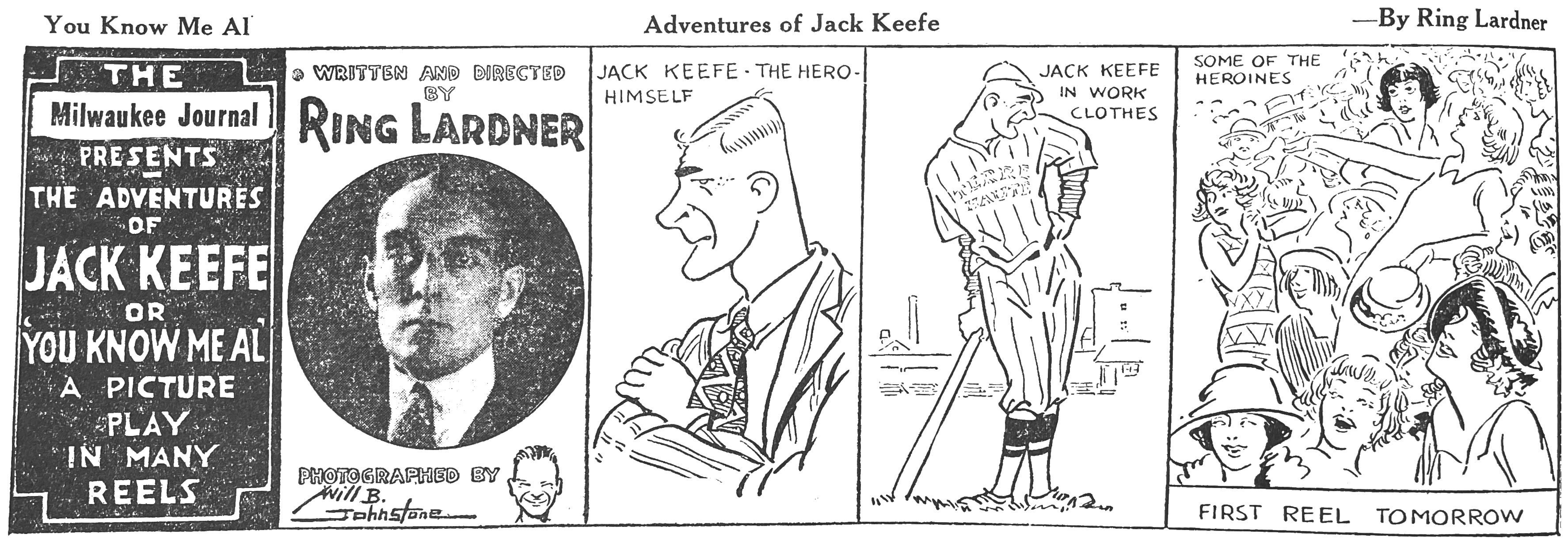
American humorist, sportswriter, magazine columnist Ring Lardner had already been writing the “You Know Me, Al” series of humor pieces for The Saturday Evening Post since 1914 when a comic strip version launched in 1922. The format was epistolary, ongoing letters that bush league pitcher Jack Keefe wrote to his friend Al back in his old small town. Keefe is a rube in the city, often clueless in the face of urban pretensions and jaded attitudes. 

Keefe is dropped into the real life Chicago White Sox organization, called up from the minors as the team was struggling back from the infamous Black Sox scandal of the previous decade. Real life owner Charles Comiskey is off stage but forever keeping Keefe in his place. Larder makes reference to a host of actual sports figures and rivalries throughout the strip, but baseball play itself is only occasionally depicted.

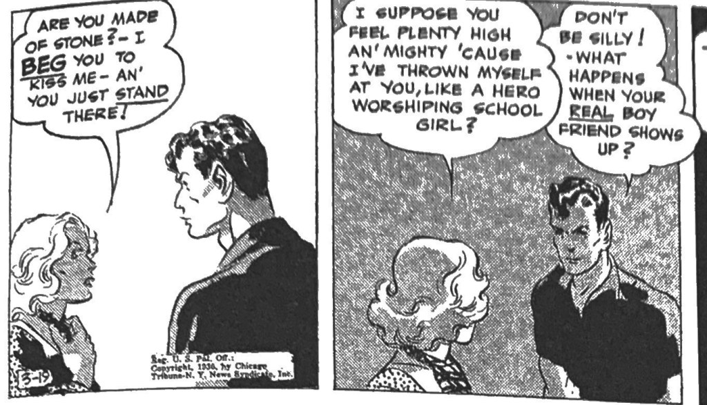
The basic action of the strips are Keefer’s everyday interactions with the women who often pursue him, sportswriters who cover him, and team owner Comiskey. The humor of the strip came from Jack’s mildly inflated sense of his own talent and attractiveness.

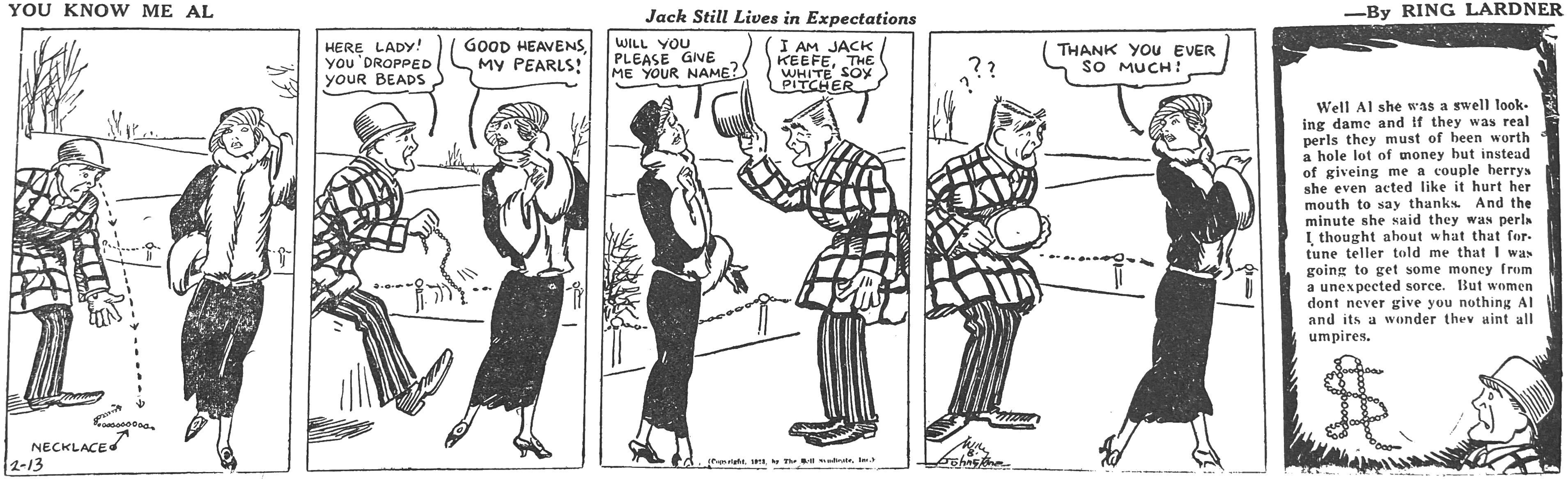
The country vs. city meme had been central to American comic strips since its earliest years. The transformation of American society and culture from an agrarian, rural sensibility to an urban, industrial one was still echoing throughout mass media and literature in the American 20s. More so than most cartoonists, who tended to lionize the plain spoken, morally upright mythology of small town America, Lardner poked fun at Keefer’s naïveté both to the world and to himself. He is forever fooled or easily outsmarted by city ladies, competing suitors and Comiskey. Keefe goes into the main office pumped up to demand a $500 advance, quickly retreats to $50 and then leaves satisfied when told to come back for his “advance” on pay day. 

The strip continuities were outlined by Lardner, who was overworked at the time with magazine articles, columns, and even dramas bearing his name. The artwork was done by popular sports illustrator Dick Dorgan, who lived near Lardner in the New York suburbs and had been illustrating Lardner books and columns for years. Dorgan was also brother to more famous cartoonist TAD. After a few years, Lardner stopped writing for the strip, though it retained his name for a while.

I find Dorgan’s drawing style attractive in its looseness. The lines seem ready to fall apart at any moment, and yet they communicate character more through posture than expression. He keeps most frames visually interesting by working with angles, body leanings, competing head hangs and positions. In some of the best strips it feels as if there is a storyline apparent just in body attitudes. Perhaps this is the attribute of a good sports illustrator, always sensitive to the physicality of character, momentum, stance.