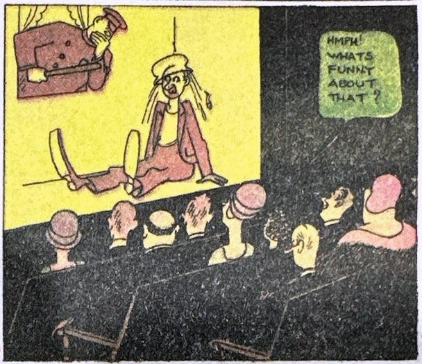
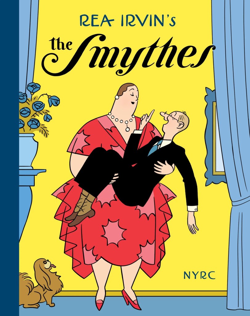
If you let the original art designer of The New Yorker loose on the Sunday comics page, then Rea Irvin’s The Smythes is pretty much what you would expect to get. For six years in the early 1930s, Irvin rendered the foibles and class anxiety of upper-middle class ex-urbanites Margie and John Smythe with impeccable Art Deco taste and reserve. Could we get anything less from the creator of Eustace Tilley, the monocled, effete and outdated New Yorker magazine mascot who appeared as the inaugural cover in 1925? Irvin was also responsible for the design motifs and even the typeface (“NY Irvin”) still in use at the fabled weekly. And The Smythes newspaper strip carried much of that magazine’s class ambivalence and self-consciousness, its droll observational humor, as well as its lack of real satirical edge. The Sunday feature ran in The New York Herald Tribune from June 15, 1930 to Oct. 25, 1936. It was among the most strikingly designed and colored pages in any Sunday supplement, even if its humor may have been too dry for most readers. Beyond the Trib, The Smythes only ran in about half a dozen major metros.
With The Smythes, The New York Herald Tribune was looking to burnish their upscale feel. Fortune Magazine’s April 1933 feature on the business of comics recalled the pitch meeting; the full cast of Herald editors and syndicate executives met with Irvin in early 1930 after he had declined their offer to inherit the late Clare Briggs’ popular Mr. and Mrs. strip. The premature death of one of America’s most beloved and well-paid cartoonists had left a hole in the syndicate’s stable. Irvin demurred from the initial offer, perhaps sensing that the fierce banter between Joe and Violet Green was outside his range. Instead, he proposed The Smythes, which seemed to fall within “the Herald Tribune spirit of comedy with refinement.”
More than anything, The Smythes was a unique visual treat. Irvin used an elegant fine line to effect Deco styling that resembled John Held Jr. and George McManus but established its own world. Restraint was the graphic signature that embodied the spirit of the strip. Social class was expressed through the tidy minimalism of sparse living and dining rooms, overwhelmed by capacious chairs and sofas. Ornament was reserved mainly for fashion. And here Irvin savored clothing and posing Margie, the strip’s visual, spiritual and literal center of gravity, the real star of the Smythes. Unlike most cartoon sitcom husbands, John is more of a marionette, a non-assertive waif, lacking shoulders or chin, let alone backbone. Margie is a massive matron that Irvin delights in posing and often destabilizing. Margie in high style stoles and furs, cavorting in fashionable “nature dance” togas, getting tossed by a feisty horse or modeling absurdly wide cartoon jodhpurs are the best parts of The Smythes.
The new Smythes reprint from New York Review Comics understands the mainly visual appeal of the strip. Editors R. Kikuo and Dash Shaw have selected and presented more than 120 representative Sunday pages in gorgeous reproductions that capture this artist’s use of tonal differentiation, background and restrained use of bright splashes. They highlight Irvin’s masterful use of color, mass and character expression through the tiniest shifts in posture and weight. Margie often seems to put on weight for episodes when Irvin wants to fill half the panel with her voluminous overcoats, brightly colored stoles or bed-sheet sized nightgowns. The twist of her neckless head, delicate lean of her towering torso, tilt of microscopic hands are a language unto themselves.

Embarrassment and social self-consciousness are underlying themes of The Smythes, as one would expect from a member of The New Yorker team. But generally, Irvin eschews gags, punchlines and kickers for mild ironies. As Caitlin McGurk points out in her excellent afterward to this reprint, this art director who helped visualize elite New York literary style was (along with magazine head Harold Ross) a high school dropout. San Francisco born to modest means in 1881, he had a varied journeyman life before settling on art. His late father had been a photographer, while a rich uncle who traded in Asian goods exposed him to Japanese fine line aesthetics. He had artistic ambitions and class insecurity embedded in him by the time he migrated to New York in 1907. After several short-lived newspaper strips, he found his home among the rarified magazine media, where he became a noted Life contributor and eventual art director for Ross and The New Yorker. And while that magazine today is known for its long form journalism and seriousness of purpose, this was not the case in the early 1930s. In cultural circles the time, The New Yorker was seen for what it first tried to be, a light, dry humor magazine, more stylish than substantial.
That wispy, inconsequential spirit is apparent in Irvin’s strip as well. The Smythes’ social class is not always clear, which may be the point. They have a cook and maid. John belongs to a country club. Margie’s socializing and hobbies suggest familiar upper-middle class status anxiety. And yet, John has to hit up his rich uncle to cover the month’s mortgage at one point. The only signs of the surrounding global Depression are occasional hobo and burglar cameos. Most of the humor feels ported from The New Yorker – small ironies and minor marital annoyances. John spends too much time dancing with a younger woman at a party. Margie’s fox hunt dogs stray and raid the local butcher. John surprises a burglar, only to sell him an insurance policy. Margie drags John to a packed party yet complains about taking the subway home because of the crowds. Droll. Very Droll.
In the best strips, Irvin pushes outside his comfort zones into absurdity. When Margie dreams herself into a garden of monster flowers and vegetables, Irvin gets to merge his sense of mass and color with whimsy. And Margie’s thwarted attempts at refinement and cultivated pursuits are golden opportunities to put that massive canvas into comic poses. He takes a rare dip into current affairs in a 1933 strip that puts John into a secret society of fasci-adjacent “Red Shirts” bent on nabbing dangerous “alien” intruders. They get mistaken for porters at the train station. The humiliating twist is enhanced by those blousy, vibrant fields of red shirts that look more silly than menacing. Nicely done.
Despite these wonderful moments. I think it is fair to say that for all of its charms, The Smythes is a beautiful and interesting failure as a weekly comics page. Which is to say they might make better one panel cartoons of The New Yorker sort than 12-panel Sunday progressions. Perhaps Irvin is just too dry and wry for my tastes, but it seems to me the strip lacks a real sense of humor and even an appreciation for the comics page it occupies. Margie and John are more icons than characters. They never develop much personality, in part because they haven’t distinct voices. There is no verbal wit or sense of timing to the exchanges, let alone character differentiation. Irvin’s talent is for small gestures within a static frame, rather than animation and cadence across panels.
The typical sitcom foil of generational tension goes missing here as well, because the two kids, Willie and Maude, are visually and practically ephemeral to the strip. The editors of this reprint limited their selection to the first five years of strips, avoiding the introduction of the zany family Grandpa character in the final years. The rotund, big-bearded Grandpa may have been a last ditch attempt to infuse The Smythes with some comic strip craziness. He was a prankish wag and delusional braggart who does have a distinct comic voice, name-dropping his many royal acquaintances. He introduced some promising chaos to Irvin’s starched collar world. In one strip, Irvin even pokes at the pretenses of his own New Yorker and puts Eustace Tilley onto wallpaper that Grandpa mangles into a Cubist nightmare for Margie’s walls. His interactions with the outside world and within the Smythe family could have developed into something in different hands. But, to be blunt about my reading of The Smythes, Irvin strikes me as an uptown magazine artist who is slumming a bit in the newspaper world without an appreciation for how serialized comics pages really work. He’s visiting a jazzy downtown neighborhood but isn’t really hip to the beat.


A reprints publisher opined to me recently that at this point all of the major comics successes have been reprinted. Now, we are digging into the less popular curiosities like The Smythes, which on many levels both good and bad was unlike anything else in a Sunday supplement. And The Smythes was part of an inter-war period of comics syndication that saw other cultural talents like Ring Lardner, Anita Loos, and Dashiel Hammett, let alone Disney and Fleischer Studios, try for newspaper riches. The 1933 Fortune article that recounted Irvin’s pitch meeting for The Smythes also mentioned that the magazine artist came into the project with a highly inflated impression of a newspaper cartoonist’s salary. Nevertheless, The Smythes is historically important on its own and well worth resurfacing, perhaps more to watch admiringly than to read.
Discover more from Panels & Prose
Subscribe to get the latest posts sent to your email.


Pingback: 2025 Comic Reprints: Rediscovering Lost Classics – Panels & Prose