Buck Rogers and the Steampunk Future of 1930s America

The hero of Buck Rogers was never Buck himself, really, so much as the future itself. And that was fortunate, because neither writer Phil Nowlan nor lead artist Dick Calkins was competent at the actual craft of the comic strip.

No one ever accused Calkins of artistic dexterity. The overall look of Buck Rogers was wooden, lacking in perspective or proportion, barren of expressiveness or even basic blocking of figures within the panel. Limbs often seemed out of scale with bodies and positioned with the naturalness of a marionette. Moreover, Calkins worked with assistants throughout the original artist’s run who reportedly popped in to do different parts of the strip, including some fetching female figures that were disorienting to a reader accustomed to the strip’s unconvincing art.

Which is to say that the limited range of Calkins’ talent pretty much matched writer Phil Nowlan’s narrow narrative reach. The adventure itself lacked character, suspense, pace or setting.

But enough Buck bashing. I’ll save my rant on Nowlan’s many storytelling and cultural sins for another time. In fact, it is the basic badness of the Buck Rogers comics strip, especially in the 1930s, that makes its chief claim on our attention stand out. While other adventure strips of the day like Little Orphan Annie, Dick Tracy, Popeye, Wash Tubbs and Capt. Easy clearly were about their eponymous protagonists and their villainous antagonists, the only compelling feature of Buck Rogers, 2429 A.D. was the future itself. To their credit, everyone concerned seemed on the same page of what the strip really was about. In the 1940s, Dill Syndicate head John Dill reflected that in the late 1920s he was looking for a strip set centuries in the future “in which theories in the test tubes and the laboratories of the scientists would be garnished up with a bit of imagination and treated as realities.”

And that is precisely where Buck Roger’s 25th Century adventure is compelling and fun, when it projects the technologies and lab experiments of 20s and 30s America into the future. And oddly, this where Nowlan and Calkins two dimensional approach to story and art excelled. The flip side of their shared weakness in depicting human depth or expression was a loving attention to detail when it came to objects without a pulse or soul. They had a catchy way of imagining gadgetry of the future. As I detail below they had a pretty good track record of anticipating technologies that would become commonplace after WWII. Many of them, like TVs, robots, and even rocket ships were either in development in some form or were part of the early science fiction ether where Nowlon got his start.

Adventure comics historian Ron Goulart suggests that Calkins’ technical drawing style was indebted to early sci-fi magazine cover artist and illustrator Frank R. Paul, who appeared often in Amazing Stories and Wonder Stories, the main pulp vehicles for early speculative fiction. The story that caught publisher Dille’s eye was Nowlan’s iteration of Buck as “Anthony Rogers” in “Armageddon – 2419 A.D.” in Amazing Stories Aug. 1928. The evolution of that story into Buck Rogers brought a niche genre into the mainstream and became most Americans’ first exposure to the science fiction genre’s ability to imagine a far future. And today it comes off as a captivating steampunk melange of retro stylings for aspirational technology.

When it came to gadgetry, Calkins showed an appreciation for rendering the details of mechanism, materials and surfaces. His horizontal and vertical hatch work across metal surfaces became a signature of most Buck Rogers technology. But his thick line work and flat perspective leant a cartoonish quality to the machine, a touch of Rube Goldberg’s contraption aesthetic that made this future tech feel more imagined than precise.

Drones

It was not too much of a stretch for 1929 Americans to envision a future where wireless communication, TV tech, flight and visual surveillance would merge. But Nowlan and Calkins were pretty spot on in expecting a drone-like device

Buck Rogers, Early Brick Phone Adopter

Buck might be rocking a pre-iPhone Nokia hand brick there. Nevertheless, the 2049 (via 1929) “Radiophone” seems to sense how the two chief inventions of the modern world – radio and the phone – were destined to merge.

“Self-Developing Ultra-Violet Prints”: Instant Photos

Buck Rogers was especially good at understanding how multiple technologies would complement one another and find new uses over time. Here the vision of high def televisual transmission blends with a self-developing photo process that anticipated the first Land camera in 1948 that introduced consumers to the concept of self-developing photos. The basic idea of instant images, had been developed in more cumbersome formats as early as 1928.

Surveillance Video and TV

Surveillance via TV technology is a major element of the Buck Rogers future. In this case Detecto Television uses hidden cameras across the Mongol empire to help a rebel faction plot insurrection.

Spyware

Nowlan seemed to understand that as all technology gained more power through wireless communication they would become subject to hacking and spying. Phone wiretapping was invented in the 1890s and became a common law enforcement tool during the Prohibition era of the 1920s. Nowlan simply projected the basic concept onto the communications mainstay of 2049 – the Televisor.

Steampunk Military Industrial Complex

Nowlan and Calkins were most captivating when the former dug into his sci-fi toolbox and the latter married cartoon illustration with futuristic blueprints. They loved to stop the action, blow apart typical panel breakdown and just ogle over the spec sheets of tomorrow. Above, they outline the rebel Americans’ rocket ship cruiser, complete with functional details like “spring landing skids“ that helped us imagine the blueprint brought to life. Nowlan and Calkins’ vision of rocketry seemed effective enough to inform the designs we meet in the movie serial versions of Buck Rogers. Fish-shaped cruisers skidding to a stop on their bellies were a mainstay of the sci-fi serials of the 1930s.

Calkins seemed to take special personal pride in these illustrations, which reflect much greater care and attention to detail than he showed elsewhere. This respect for machinery may have held over from the artist’s WWI experience. He often reverted to signing the strip “Lt. Dick Calkins” and at times adding “Air Corps Res.”

“Iron Man” Origin Story

Perhaps the finest Calkins and Nowlan geek out comes with “Iron Man,” their remote controlled robot soldier. They devote what would have been a three panel progression to a panoramic illustration of the device’s specs and functionality.

MAD Looks at Politicized Comics: 1969

By the 1960s American newspaper comics had gained a deserved reputation as generally banal and innocuous pop culture, prime targets for satire. In April 1969 MAD Magazine took aim at the generally apolitical nature of most strips by imagining a world where comic strips actually reflected their culture. With art by Bob Clarke and script by Frank Ridgeway, “If Comic Strips Covered the Issues of the Day” has Superman coping with air pollution, Dick Tracy adapting to police brutality concerns and Mandrake the Magician’s already-racist depiction of his assistant Lothar turned into an even more troubling notion of Black American fantasies.

Past Tomorrows: Back to the Buck Rogers Future

The 1969 moonwalk sparked both a wider interest and new respect for the science-fiction genre and tons of reflection on the ways speculative fiction anticipated contemporary tech. References to our realizing a “Buck Rogers” future flooded the media zone, and Chelsea House published in late ’69 one of the earliest oversized reprints of classic comics, The Collected Works of Buck Rogers in the 25th Century, introduced by Ray Bradbury writing about “Buck Rogers in Apollo Year 1.”

I was age 11 at the time, and had my own fleeting dalliance with sci-fi that drew me to this Chelsea volume at the local library and helped start a much deeper, longer love affair with newspaper comic strips. But an unusual source of comics fandom came into my house at the same time – a trade advertisement for high quality paper stock from the Warren Paper company. Some background. My father was a commercial artist with his own small ad agency in Northern New Jersey. We received at the home office a ton of trade magazines and ads. The S.D. Warren Paper Company promotions were far and away the smartest, most alluring trade marketing I have seen, then or since. To demo the print effect of their premium paper stocks, they created these lush, deeply researched pieces of content marketing that dug into topics like magic or the history of the circus, etc. I recently came upon the one Warren promote that remains etched in my memory – the 1970 celebration of how the Buck Rogers strip imagined accurately the gadgetry and transformative technology of the future.

The one-piece fold-out opened first onto that gorgeous splash above, with the classic Dick Calkins portrait of Buck in mid battle. These are the kinds of magnified newspaper comics images that helped the 12-year-old me into a love of the form. The line art of Calkns, Chester Gould, Will Eisner are among the first classic artists to captivate me. The art style of Buck Rogers felt at once primitive and technical. Calkins did not have a strong of perspective or even anatomy. Most of his figure positions look stiff rather than dynamic. And yet he brought to ray guns and flying ships a dreamy precision that made them live, perhaps even more than his humans.

The Warren promo folds out above to a panorama of comparing old Rogers panels to modern innovations like instant cameras, jet packs, surveillance satellites, monorails and more.

This wonderful look back to how the past imagined its future was all in the service of showing off S.D. Warren’s “Lustro Offset Enamel” paper stock, a product name that itself sounded a bit like a cartoon invention. Still, you can’t argue with a content marketing campaign so well done that an 11-year-old remembers it fondly 50 years later.

Dick Tracy 1932: The Glorious Weirdness of Chester Gould

Chester Gould’s imagination was as relentless as it was strange and even strangely mundane. His four decade run of Dick Tracy was distinguished by his signature villain grotesques, striking graphic violence and often arch-conservative politics. Reviewing Tracy’s first year of strips lately, I was struck by a few scenes that both veered from the strip’s eventual form but also practiced many of its regular notes. In the image above, for instance, Tracy pumps himself up for the coming challenge of bringing down his first major nemesis, Big Boy, and rescuing a kidnapped boy. The later Tracy would of course become a rock of resolve that wouldn’t have admitted even this kind of self-encouragement. At this point, even for Gould, Tracy is still human and not yet iconic.

And yet the two-fisted and eccentric manliness of Tracy and many of his pulp fiction counterparts was central to the character from the beginning. And Gould’s politics clearly were already set as early as 1932. Tracy was conceived as a lawman who necessarily had one foot outside police institutions. In fact, before the murder of fiancee Tess Trueheart’s father Emil, Dick was a civilian who had not yet found his calling. He swears upon Emil’s dead body that he will avenge the murder, which sets him on a quick path to becoming a leader among the “plainclothes” unit of the city police department. But his impatience with the bureaucracy is apparent in his unconventional methods and capacity for personal revenge and violence upon his villains. When he finally corners Big Boy, we get a crescendo of police brutality that stretches across several days. It ends with Tracy sending Big Boy crashing through a ships’ cabin door.

The twisted genius of Gould was in having it both ways with Tracy. He professed a deep respect for the law, and Tracy’s straight-backed uprightness was a feature of the strip’s characterization as well as it’s blocky noir style. And yet vigilante justice was meted out both by Tracy and Gould alike. Indeed, his colleagues in the force like Pat Patton and subsequent colleagues are seen as relatively timid and even feminized by their institution in a way that the indomitable masculinity of Dick is not. And the overall violence of the strip is clearly an extension of Tracy’s own vengefulness. The protracted chase of villains on the lam became a part of the Dick Tracy formula, and it was punctuated by the villain’s gruesome torture by nature along the way, often ending in grisly death. Violence for Gould always seemed to be the ultimate social purifier.

By Gould’s own admission, he often made it up as he went along, rarely knowing where his plots were headed and how he would get Tracy out of a jam. And so from its early days the plotting and devices often feel ham-handed, implausible or genuinely weird. His pursuit of Big Boy onto an ocean liner leads Tracy to knock out an innocent staffer to don his uniform and to dress in drag just to get onto the boat and get close to the kidnappers. Less tortured paths clearly are available to his characters, but Gould’s love of novel, unlikely story paths usually wins out.

By 1942, a decade after its launch, Gould’s visual signature for Tracy is fully established. His hawklike nose, perpendicular chin and straight lips are as much a statue as a figure, more chiseled from stone than drawn in ink. And in this self-portrait Gould himself sweats under Tracy’s command. He has created a caricature of law and order, authority and masculinity that would become a lodestone. Al Capp soon would mock his violence and surreal story and villainy. His love of authority and violence, impatience with countercultural trends would make him seem a relic by the end of the run. Yet, as much as Gould himself seemed a straight arrow defender of formal institutions, Dick Tracy itself was grounded in a surreal imagination that eschewed simple realism, broke violently with the propriety of the comics page and took us into very strange places.

Bobo Baxter: Rube Goldberg’s Bleak Screwball

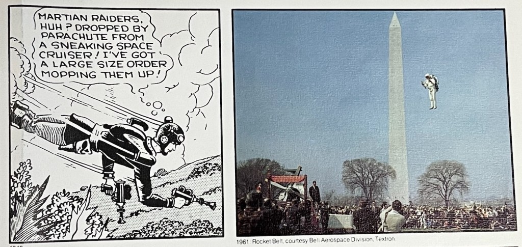
Rube Goldberg (1883-1970) is best remembered for his cartoon inventions, ridiculously intricate mechanical solutions for common activities. These send-ups of modern technology and the romance of engineering appeared under multiple titles and formats across his career, but took most regular form in Collier’s Weekly between 1929 and 1931 as The Inventions of Professor Lucifer Gorgonzola Butts, A.K. His Foolish Question panels ran from the teens in various forms for decades. And his best-known continuous character strip of hapless failure Boob McNutt ran for more than a decade in the 1920a.

But it is in his forgotten small masterpiece Bobo Baxter (1927-1928() that I think we see Goldberg’s array of talents for satirizing the modern world come together into a persistent and satisfying whole. And at the same time Bobo shows how a sad note of alienation often lurks beneath the surface of many slapstick characters.

As godfather of comics historians Bill Blackbeard points pout in the intro to a 1970s reprint of the complete (Hyperion Press, 1977) run of strips, Bobo Baxter represented Goldberg moving (or being forced by trends) away from the gag-a-day format to the continuous characters and situations of other 20s strips like Little Orphan Annie, Bringing Up Father, The Gumps, Polly and Her Pals, etc. He had already made his Boob McNutt Sunday strip into a major hit by introducing recurring characters and continuing storylines. In 1927 he sent the form into a daily new creation, Bobo Baxter. 

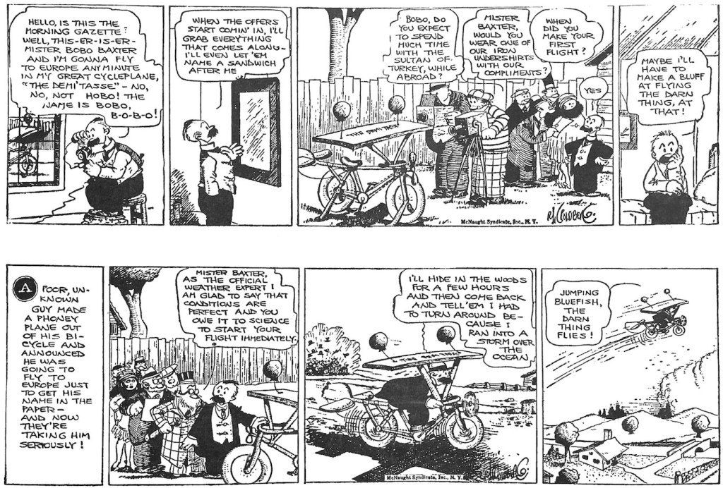
We meet Bobo as an unsuccessful dreamer, envious of the fame and fortune of well-publicized explorers like Admiral Byrd and aviator Charles Lindbergh. So he builds a flying machine out of a two-seater bicycle, prop,  wing and some balloons. He seems as surprised as anyone that it flies, and he dubs the contraption “The Demi’Tasse”, bound for glory by flying across the Canadian border.

Bobo’s fixation on fame, celebrity and the press course through the strip. He is forever courting journalists and dreaming for the headlines he thinks his oddball journey will merit.

The discipline of storyline and continuity seemed to inspire Goldberg’s satiric sensibilities. In many ways the story becomes a picaresque journey through modern American social types and institutions – all of from which Bobo himself seems woefully alienated. 

Bobo himself is pathetically friendless, and a bit of a comic nebbish. At one point early in the strip he mistakenly reserves a table for his entourage at  the pricey Cafe Du high Hat. When Bobo can’t recruit anyone to come with him, he ends up animating a group of mannequins. 

Likewise, Bobo spends the first months of the strip simply in search of a passenger to bring with him. But it is the haplessness of Bobo’s plan that brings him into contact with a pastiche of American types. There is the desperate henpecked husband who would do anything to escape his onerous wife. There is the jewelry thief who is looking to escape with a pilfered pearl necklace. And there is Bobo’s own assistant Nosedive Kelly who is both too obese and anxious to make the flight but proves to be a self-promoting braggart.

Bobo’s encounters with a cast of American characters produces some wonderful moments where Goldberg’s native visual silliness, satiric eye, and critique of mechanisms both technical and social merge beautifully. Among my favorite moments comes when a Nosedive goes for an insurance checkup. “Your blood pressure is 5 pounds over the legal limit,” “Your ears a very badly designed” and “the hinges of your backbone squeak” he is told.

This is prime Rube. “Goldberg is a satirist not of fads and fanciest of rationality,” wrote Gerald W. Johnson in his 1958 review of political cartooning between the World Wars. 

The hapless comic outsider is a feature of modern comedy that deserves further thought. We see this anti-hero (and it is almost always male) in vaudeville, certainly the silent film clowns and in comic duos like Laurel and Hardy, Abbott and Costello.

But the comic strip turns the figure into a genre. Consider Happy Hooligan, Simon Simple, Moon Mullins, Jiggs, Andy Gump, A. Mutt, Baron Bean, Boob McNutt, among others.

In fact for the first two years of Goldberg’s Boob McN tut, each Sunday strip finds Boob trying to off himself 

In his recent, indispensable history of screwball comics, Paul Tumey characterizes Boob McNutt’s early years as black humor that reflected the post-WWI disillusionment of 20s America.

Maybe. I am more inclined to put Boob’s suicidal comedy and Bobo’s desperation for modern celebrity part of a longer tradition of modern comedy and especially the comic strip – the alienated clown. So many of the comic strip’s comedy fops feel themselves somehow on the curb as the great parade of American life goes by.

Indeed it is arguable that the comic strip itself carves this curbside role for us. On a daily basis, we are invited to look over the shoulder of Jiggs, Happy, Boob, Barney, Jeff, Popeye, Abner, et.al at a main cast of characters of which we are bemused – part of but slightly apart from.

In future posts I hope to explore further this idea that the daily comic strip often created for us a light satire of modern American life and styles, types and trends that registered and leveraged a sense of middle class alienation from the very world they were creating.

Just Kids – A Bridge to Peanuts

The suburban kid gang strip Just Kids by August Daniel “Ad” Carter ran 1923-1956, initially as a knock-off of Gene Byrnes’ Reg’lar Fellers. But it evolved into a more contemplative, nuanced projection of adult sensibilities into child characters that anticipated Charles Schulz’s Peanuts. Preceded by earlier iterations, Our Friend Mush, Mush Stebbins, and Just Kids in the teens, it was picked up by Hearst in the 1920s and it remained a bit of a beloved back bencher through much of its run.

Born in Baltimore, the maker of this long-lived strip that depicted kids as thoughtful, precocious adults was himself a victim of childhood trauma. He not only lost his mother at a young age, but was present when she was struck and killed by a streetcar. As a reporter at the Brooklyn Reporter he met Clare Briggs, who encouraged him to submit a strip proposal to a syndicate. Carter finally caught their attention in 1916.

The kid trio centered on Mush Stebbins, Fatso Dolan and Pat Chan represented and interesting multicultural group situated in the new city-suburban setting. It was a direct copy of Gene Byrnes Reg’lar Fellers, which focused on a gang of kids who like much of America migrated outside of urban centers during these post-war years but retained their inner city dialect. These strips were capturing a cultural moment, the growth of city suburbs in the first half of the 20th Century. The migration of city-kid toughness and ethnic diversity to the more sprawling neighborhoods of standalone homes, parks and relative affluence was one of the signal social trends of the modern era and helped reshape ideas of childhood. Interestingly and uniquely, the Pat Chan member of the gang is stereotyped in cartoonish Chinese garb but given a voice that is pure city street.

Nostalgia for a simpler, more innocent era of childhood was a longstanding American trope that found a welcome home in the modern mass medium of comic strips almost from its beginning. Clare Briggs’ countless iterations of one-panel childhood nostalgic sentiment in The Days of Real Sport and When a Feller Needs a Friend in the teens helped establish the light, observational tone of the comic strip genre.

Reg’lar Fellers was more of a gag a day strip with little character development and often cruder art.

But at least in the limited strips I have seen, Carter’s iteration of the suburban kid gang theme was both more story-driven and more introspective and thoughtful than most. In the Nostalgia Press reprint of a 1935 story arc (scanned below), several weeks of cartoons follow the implications of the truant officer breaking his leg. The ramifications and unintended consequences take several turns and the kids come to regret what they started by celebrating.

Not quite as adult-like and philosophical as Peanuts, the Just Kids gang had sparks of disarming maturity and complex feeling, insight and woe. One strip ends with the trio sitting on a log surrounded by inflated exclamation marks, Mush saying, “Let’s just sit here and worry.” In the next strip his mother asks him what he seems so worried about and he replies in a voice that clearly foreshadows Charlie Brown himself by more than a decade, “I guess I’m jes’ worried about LIFE IN GENERAL!”

Not a widely or prominently distributed strip, you can see in Ad Carter’s Just Kids a tone and insight about childhood that bridged the toughs of early comics with the gentle suburban Peanuts after the war. He used short story arcs in the way Schulz did and moved his kid characters towards more adult voices. Schulz, of course, had the brilliantly understood that eliminating adults entirely was key to depicting the maturity of his kid characters, but Carter seems to be on a similar path.

Just Kids had an engaging visual voice. It was more precise than big foot comic style, and had some of the deco stylings of 20s illustration. It looks a bit like Cliff Sterritt (Polly and Her Pals) and Chic Young (Blondie) as if done with straighter lines. He gives his characters an angularity, stooped posture that is established in just a few thin lines. Visually, it feels more refined and light than many of the comics that would have surrounded it on the page. In that sense Carter was moving in the opposite direction from Schulz. He used visual sophistication to suggest the seriousness of child consciousness by removing it from big-foot slapstick stylings. Schulz used a less stylized palette of basic shapes and deliberate minimalism to enhance the contemplative seriousness of Peanuts.

Gould’s Dick Tracy, 1931- 1977

Nearly 25 years ago IDW’s Library of American Comics began reprinting the full run of Chester Gould’s Dick Tracy, starting with the strip’s premiere in late 1931. This week, with the release of Volume 29, the series reached its end, marking Gould’s retirement in 1977. I had been planning to mark this occasion by posting the very first 1931 strips alongside the very last 1977 strips to illustrate the evolution of Gould’s style as well as the decade’s long consistency of his vision. Little did I know that Gould himself would beat me to it. See below.

The first week or so of Tracy locates the origin of Dick’s moral commitment to fighting gangsters in the robbery/murder of Emil Trueheart, father of his new fiancé Tess. Tracy was not a cop by trade, but a young man still finding his way. In the sort of surrealistic moment that would typify Gould’s storytelling and visual style for the next 4 decades, Tracy not only finds his moral mission but becomes a “plainclothes” detective as well as a natural leader for the force within weeks of the strip’s launch. The moment of moral truth is captured in the featured panel at the top of this post.

And here are the final three days of Gould’s reign on Tracy 46 years later.

Between 1931 and 1977 Gould’s style had gove through several evolutionary stages. By 1977, Gould’s ink lines had grown thicker and a bit rounder. His more extensive use of close-ups and medium frames were a begrudging accommodation to the shrinking space allotted to strip artists even by the late 1970s.

Gould invented his hero as “Plainclothes Tracy” in a series of spec strips he sent to legendary publisher Joseph Patterson, who was in the process of building the New York Daily News into a pioneer of tabloid newspapers. Patterson suggested the change of name to the simpler “Dick Tracy” and seemed to understand that Gould’s penchant for violence, grotesque villainy and even sadism mapped well against his vision of the tabloid style. The gorgeously colored Tracy Sunday strip would be the cover wrapper for the Sunday Daily News for decades.

Famous for the brutality of his cartoon vision of crime and punishment, it is revealing that the first panel of the Plainclothes Tracy spec strip is a scene of bondage and torture among thugs.

By the mid 1930s, his signature thick outlines, highly abstracted iconography, extensive use of fields of blacks, and series of bizarre villains were all fully established. The Sunday page below is from 1937 and The Blank adventure.

Dick Tracy holds a special place in my own journey into comic strips. The lush reprint of classic adventures, The Celebrated Cases of Dick Tracy by Bonanza Books in 1970 was one of a trio of reprints that captivated me with the form. It was around that time that I first got hold of Jules Feiffer’s The Great Comic Book Heroes and a Chelsea House oversized reprint of early Buck Rogers strips.

But it was Gould’s starkness in style and story, the extremity of art and character, that pulled me in then and still does decades later. I can think of no other comic strip artist that had such a singular vision. There has always been a peculiar geometry to Gould’s art. His panels alternated between use of deep perspective and no perspective, a weird penchant for flatness and depth. The stances of his characters, especially Tracy and his long inky black columnar legs, was so eccentric and physically improbable. Even though Gould became famous for his love of procedural detail in detection, gadgetry and eventually sci-fi crime-fighting inventions (i.e. the two-way wrist radio), his visual language was minimalist and abstract. His daily strip truly popped from the page of his fellow and able artists because it felt like being dropped into an expressionist daydream.

Gould was as famous for the brutal simplicity of his moral vision as he was for the violence of the action in his strips. The villains were not only surreal grotesques, but they met their end in grisly ways that suggested nature (or God) itself was meting final judgment. The impaling of wartime spy The Brow on an American war memorial flagpole is the best known. But Gould followed a formula with every adventure that moved towards a protracted manhunt and chase of the villain, which usually ended with the rogue’s end often via some strange knot of fate and chance.

Gould himself met a more peaceful end in 1985. The strip’s writer Max Collins and artist (ands former Gould assistant) Dick Locher memorialized him in the same simple, declarative style for which the master himself was known for decades.