
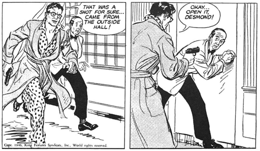

In the first days of Alex “Flash Gordon” Raymond’s post-WWII detective adventure Rip Kirby, it was clear the master was going to redefine the look of comic strip adventure. Day two of the March 1946 launch story speaks volumes about the influence Raymond was going to have on a decade of 50’s adventure style. The panel progression here is so engaging. The first two panels are energized so that you can almost feel the weight of the murder victim slump into Kirby’s arms and instantly change valence of the scene. And that final close up communicates the deadly reality of the situation by bringing us right into the complex reaction to beauty and death. The photo-realism is here, as is the increasing influence of cinematic points of view, timing, and close-ups. And arguably, the next decade would also see in comic strip adventure a turn inwards, toward psychological realism, the emotional lives of characters, that accompanied the more photographic style of the art. All of these elements would be deployed in different ways by Stan Drake in the Heart of Juliet Jones, Leonard Starr in On Stage, Warren Tufts in Casey Ruggles and Lance and John Cullen Murphy in Big Ben Bolt.
Continue readingTag Archives: 1950s
Casey Ruggles: Beauty and Brutality, Fact and Fantasy

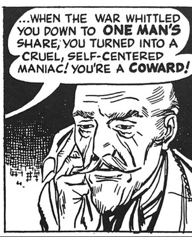
Warren Tufts (1925-1982) was a self-taught artist and historian of the mid-19th Century Westward migration, and he combined both avocations into two of the most compelling and distinct adventure strips of the 1950s. In Casey Ruggles (1949-1954) and Lance (1955-1960) he brought visual and historical realism to an otherwise romanticized vision of the West that flourished in post-WWII pop culture. In Tuft’s West of the 1840s, settlers were as often selfish, greedy, cowardly, incompetent, sadistic and capriciously violent as they were an heroic forward guard of civilization and commerce. Tufts had a mixed view of human nature that allowed all of these qualities, good and bad, to coexist in many of his characters.
More than Mopsy: Gladys Parker Is Back In Fashion

Why don’t we hear more of the marvelously talented, witty, prolific American cartoonist Gladys Parker (1908-1966)? She was the mother of the long running strip and comic book character Mopsy. More than that, Parker was among the better-known cartoonists of the day, in part because she was also a fashion designer to both the general public as well as Hollywood stars. Meanwhile, Parker was a frequent item in the celebrity gossip columns of the 1940s as she dated a noted boxer and character actor.
Why don’t we know more about Gladys Parker? Well, obviously for the same reasons we don’t know more about Nell Brinkley or Ethel Hays or Jackie Ormes, despite the high quality of their work and substantial public profile in their own day? Not only has the comics field itself been overwhelmingly male dominated, but its history has been written almost entirely by men. And yet, as I myself encounter these overlooked artists as I make my way through comics history, I am struck by their singular visions, how different their aesthetic and social perspective were from their male brethren. To miss these women in our history of the medium is to narrow our understanding of the rich creative range the comic strip reached in the last century. Brinkley used color, facial and emotional expression, line, the contours of the Sunday comics page in ways no other artist did in the 1910s and 1920s. Ormes’ racial satire was sharp and blunt at a time when American needed it desperately. And Parker brought the feminine wit of Hollywood romantic comedy into the comics page and merged the aesthetics of fashion with those of the comic strip into a drawing style that was unlike any other on the comics page.
Continue readingTwin Earths: Matriarchy Meets Patriarchy…In 1952

Most media, cultural and certainly women’s studies historians have long understood that the post-WWII era represented a twisted nadir for the representations of women in American popular culture. During wartime, women famously took on more prominent, responsible and even strenuous roles in the workforce than ever before. And once the war ended and the male troops returned, these same women upon whom the home front depended were explicitly urged by ever quarter of American society to surrender these gains for the sake of passing these jobs back to the traditional male breadwinners. There was nothing subtle to this process either. Many women were badgered back into domesticity, often accused of “stealing” livelihoods from returning veterans. Other aspects of popular culture like the the rise of the femme fatale trope in noir and crime fiction, the ditzy blonde bombshell, the irrational, imbalanced feminine figure in thriller genre – all helped undermine the legitimacy of women taking more powerful roles in the post-war “man’s world.”
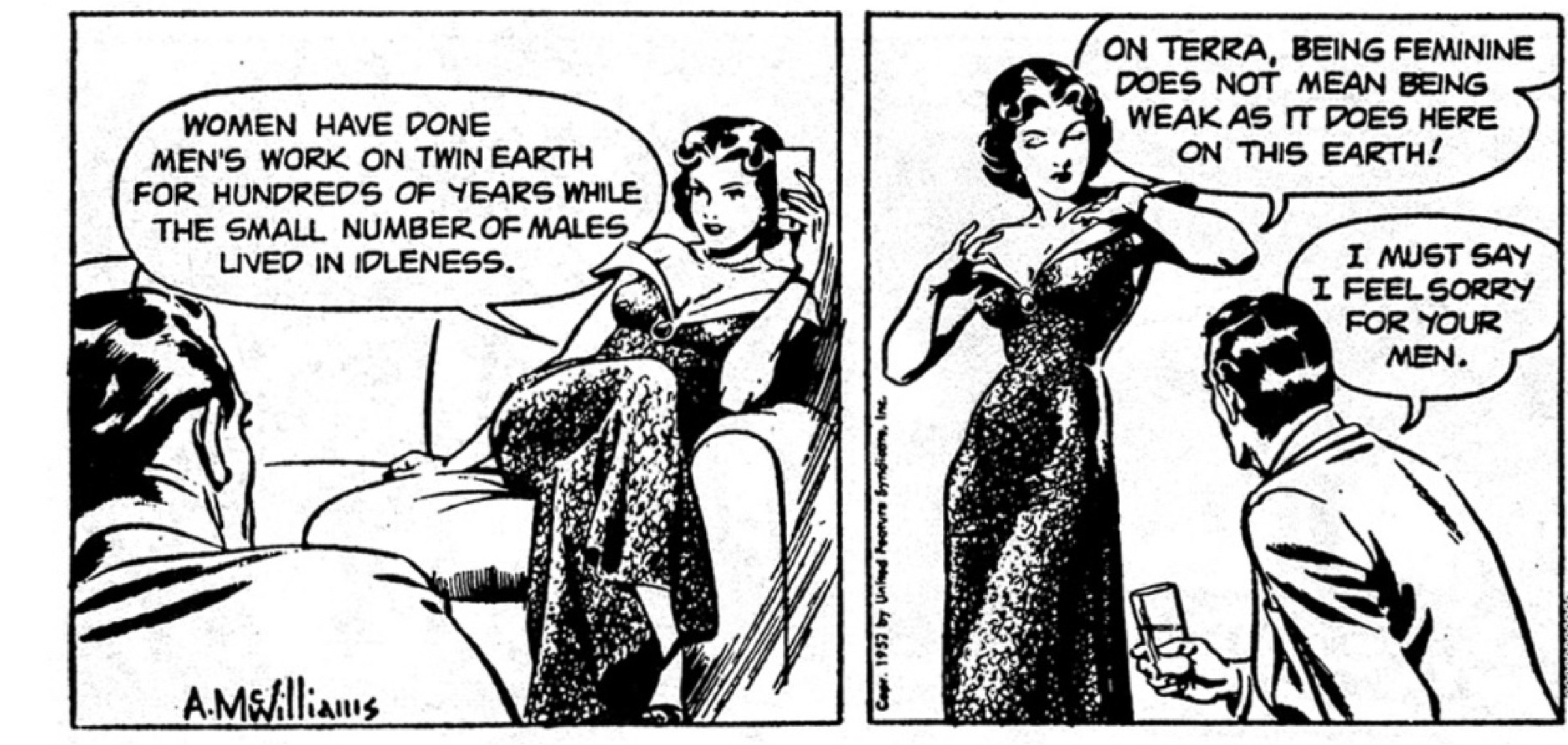
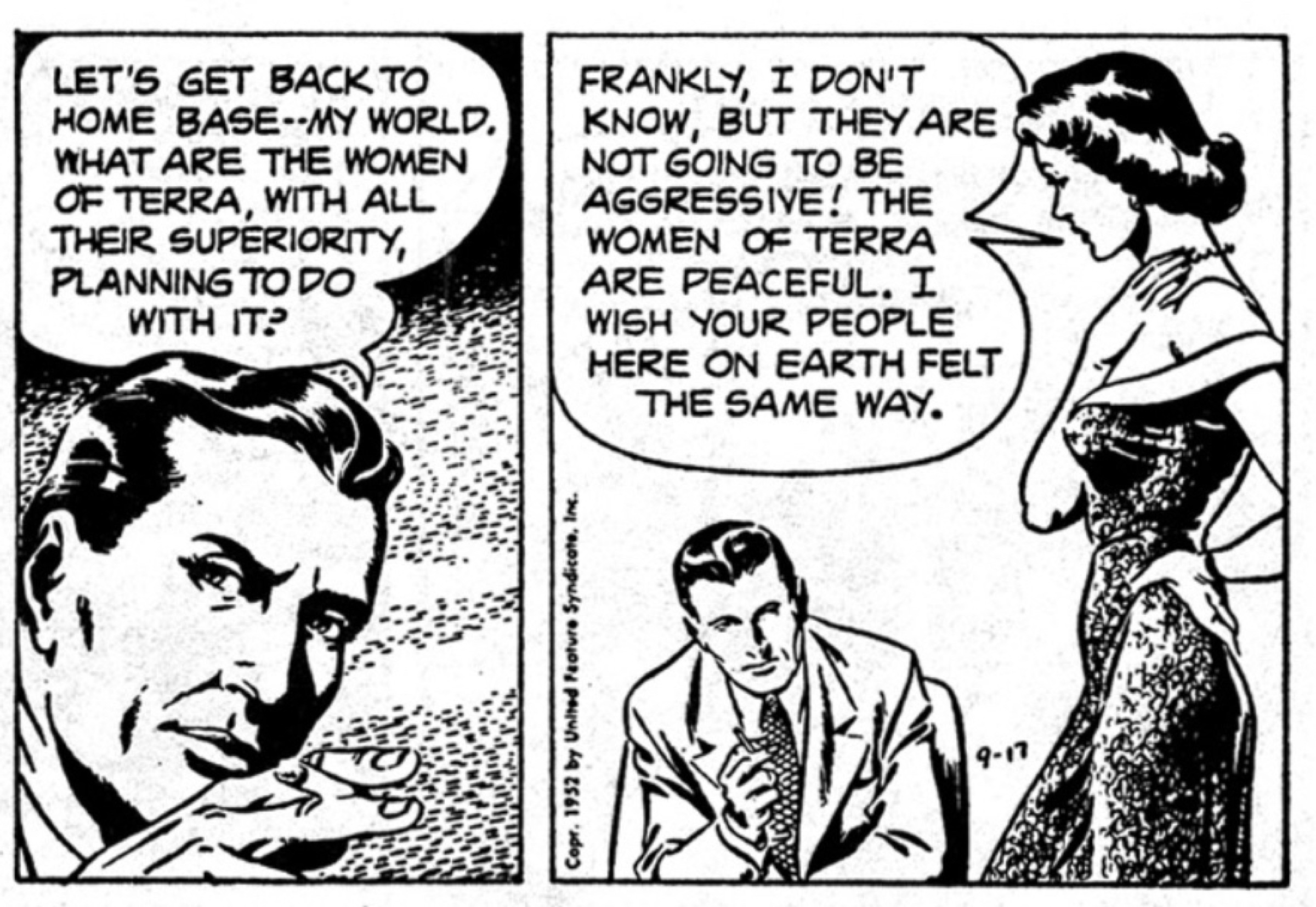
This context makes the premise of the Twin Earths sci-fi strip all the more curious and fascinating. Running from the middle of 1952 to 1963 in dailies and 1953-1958 in a separate storyline in Sundays. When the overlooked strip is remembered at all, it is for some prescient gadgetry that anticipated later everyday tech. To be sure, the writing by comic book illustrator and editor Oskar Lebeck and drawn by comics veteran Al McWilliams was often leaden and unexciting. But Twin Earths was home to some genuinely intriguing and thoughtful futurism that echoed literary science fiction. And as I make my way through the strip’s early years, it is the basic premise of Twin Earths’ divergent social organizations that is most striking. The twin Earth (Terra) is a female-dominated society where a diminishing population of males is retained mainly as idle breeders. The Terran spy Vala infiltrates our earth to ensure this male-dominated planet is not developing its technology towards destructive ends. She pairs up with FBI agent Gary Verth to avoid Communist spies and assassins from her own host planet. The banter between the two, especially Vala’s accusations of masculine aggression (an early take on male “toxicity”?) is a remarkable standout at a cultural moment when most popular culture sought to diffuse, defeat and mock women aspiring to power.


Premiere Panel: Who’s That Stowaway?

October 2, 1955 saw the first Sunday entry for a strip that had been running all week from the Chicago Tribune syndicate. Written by Gus Edson, who also had taken over legendary strip The Gumps, and drawn by former comic book cover artist Irwin Haden, Dondi follows the adventures of of a refugee orphaned by WWII.
Hank Ketcham and The Art of Dennis
Hank Ketcham made it look so easy…and that was the trick. His loose, thick cartoony line seemed to skate across the page. A Dennis the Menace daily feels so comfortable and easy to take in at a glance, as if we are in the flow of Ketcham’s relaxed line. And his imagery is equally easy, almost as abstract as a UPA cartoon (Gerald McBoing Boing, Mr. MaGoo). But unlike the jazzy cartoon aesthetic of the 50s, Dennis the Menace was firmly situated, perhaps petrified, in the iconography post-WWII white suburbia. And Ketcham himself said he aspired for his art not to call attention to itself and almost look not there.

But of course, this kind of easy transparent style was the result of tremendous skill and care. Take for instance this otherwise anodyne daily of Dennis making yet another disastrous assault on his perennial target, the cookie jar. Ketchum’s loose, flowing pen line was much admired by fellow cartoonists because it was at once light in spirit and cartoony but also controlled and precise. He credits Noel Sickles with teaching him how to use a pen more like a brush and relax his line so it seemed to flow so effortlessly.
Consider the sheer economy of this scene, how so few lines establish his figures and setting. He establishes his modern suburban kitchen setting with such selective specificity – refrigerator and cabinet handles are sparse and abstract, but the three storage jars on the counter embody the post-war mid-century modern style. And yet the broken cookie jar is detailed and minute, pulling the eye to the center of the chaos.
I have read some fellow artists praise Ketcham’s mastery of drapery, and here is a great example of using that detail to carry the weight of mother Alice’s reaction. Henry and Alice Mitchell only speak for themselves on occasion in Dennisworld. Most often they are reacting graphically to Dennis’s transgressions in minute details – the positioning of an eyebrow line, body posture, slightly splayed feet. In this panel, we don’t even need Alice’s facial expression to complete the scene. Ketcham positions us at kid level and uses the drape of her skirt and flying kerchief to render the reaction shot.

Hank Ketcham mapped mid-century American suburbia so simply and beautifully. He was a perfectionist with establishing perspective that made you part of the scene. In this early 50s panel, his composition and staging of characters is everything. It establishes the dynamic among characters and separates Dennis from the group in just the way he is emotionally. And Ketcham’s Disney training comes through in the ways each of the adults is animated and characterized individually. Every person in the scene is laughing in a particular way that suggests their own character and backstory. And it was all told visually with that signature loose and flowing pen work that makes a well-planned panel feel effortless. No wonder so many of his contemporaries envied his artistry.

Perspective was critical to Ketcham. He often finds ways to place us in the scene that also involves us in the flow of the action or in relation to a character’s perspective. The panel above underscores his thoughtful use of point of view to heighten meaning. Here Dennis and the gang’s boyish conspiracy feels more intense, intimate, secretive by being set back from the action.
The aesthetic of Dennis the Menace is centered in the brilliant design of Dennis himself of course. First it is important note that Dennis is impossibly small. Compared to the adults around him, this five-year-old is considerably smaller than his age, barely reaches the knees of his distinctly lanky parents. His bunched, oversized coveralls keep him even more grounded and often give him the appearance of a cannonball in motion.. Dennis rarely trips, falls or loses control. It is the physical and human world around Dennis that loses its footing. Adults grimace, recoil in shock or just scatter and lie akimbo in his wake. Ketcham describes Dennis as innocent. But the power of this strip is the way Ketcham embodies that innocence visually. Dennis is pure innocent determination embodied in physics. Either his low center of gravity keeps him steadfast in his attitude or momentum expresses the conviction of his chase or escape.

In earlier stints at the Lantz and Disney animation studios, Ketcham absorbed his strong sense of animated motion and rich characterization. But he also found at Disney and his work on many Donald Duck shorts the visual model for Dennis himself. With his butt sticking out, legs angled back to balance a cantilevered belly out front, Ketcham describes Dennis in one of his model sheets as “not unlike D. Duck.”


Nudism is one of Dennis’s favored modes of expression…and Kaetcham’s. He flees his dreaded bath by careening bare-assed and in flight into the neighborhood. He is not just unselfconscious but truly free. When he stands principled against clothing, butt to the viewer, the open arms and declarative mouth dramatize obliviousness, not shame. The otherwise buttoned down Ketcham somehow finds in nude Dennis a way to celebrate visually a sense of liberation in nakedness that in an unlikely way anticipates counter-cultural ideas a decade in advance.
Which is to say that Dennis the Menace exemplifies what makes the comic strip medium distinct. In its best hands, cartooning is not just an illustrated or dramatized punch line. The artwork embodies and deepens the meaning of the idea.
Dennis the Menace on Silly Ol’ Girls
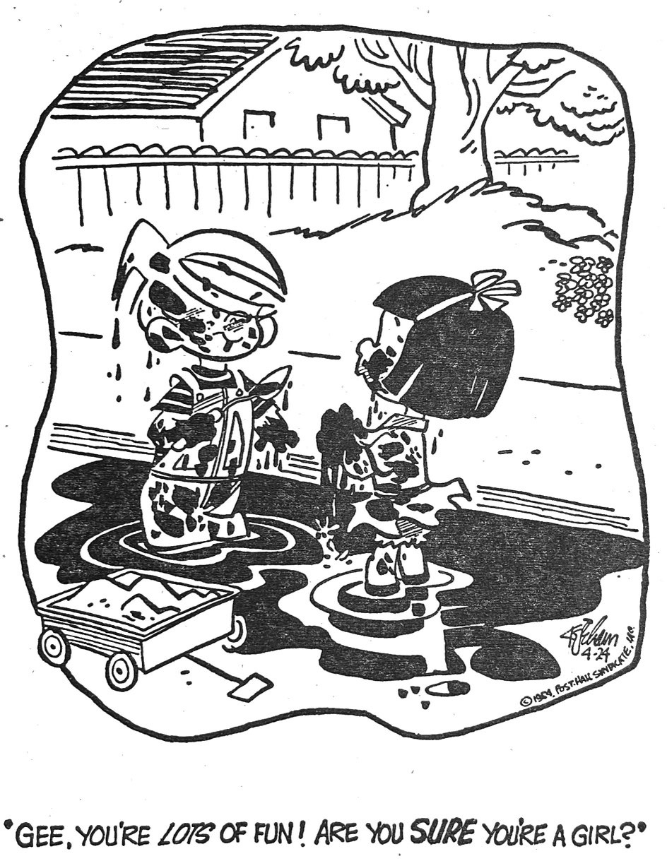
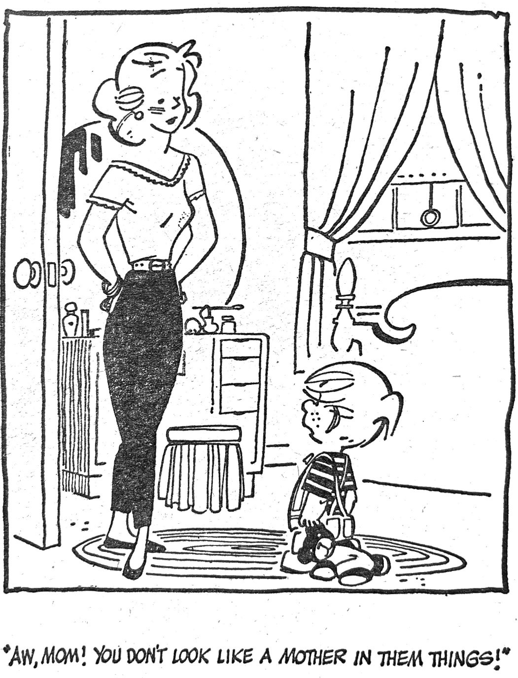
Hank Ketcham says he always found it odd that he spent his life in service to a five year old. But of course Dennis the Menace was never for kids, really. At his best, Ketcham used Dennis as a device for poking gently – ever so gently- at the straitjacket of post-WWII suburban repression and painful social self-consciousness. And Ketcham himself was as straight laced, conventional and revenant as we imagine the Mitchells and their world to be. How else could such a pint-sized hellion find so many lines of propriety to transgress so habitually?
Ketcham’s breathtaking tone deafness to the songs of change singing around him in the 60s especially would surface in a famous episode we will save for another post. But for now let’s enjoy Ketcham at his cleverest, usually in the 1950s, using Dennis as a wry observer of pre-feminist gender typing.
