
I admit to coming late to appreciating Noel Sickles’ artistic prowess and influence. Several years ago I found an affordable but beaten copy of the LOAC volume on the artist and his short, legendary stint on the Scorchy Smith strip in the mid 1930s, though I barely cracked it at the time. Sickles is best recalled by comics historians as Milton Caniff’s friend, studio-mate and collaborator who introduced the more famous artist to the chiaroscuro style that came to define Terry and the Pirates and Steve Canyon. Sickles himself spent but a few years leading his own strip before moving on to a lucrative career in commercial art, magazine and book cover illustration.
Now that I have dug into the LOAC Scorchy Smith reprint, with deft commentary/background from Jim Steranko and Bruce Canwell, I am gobsmacked by how thoughtful a talent he was. Moreover, his trail of influence reaches far beyond Caniff.
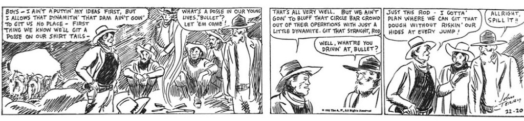
Everything Sickles did was considered and deliberate, starting with the way he slyly transformed the Scorchy Smith strip he inherited from its originator John Terry in 1933. Scorchy was another unremarkable adventure that rode the wave of aviation romance between the World Wars. Smith was a journeyman flyer who was patterned after the transcendent hero of the age, Charles Lindbergh, but seemed to have little character of his own as he fell into adventure after adventure. The artwork was even more featureless, rudimentary and unexciting. When Terry fell ill, in ’33, Sickles was assigned to stand in and directed to mimic the artist’s anodyne style. But as in all things, Sickles had studied cartooning extensively and had ideas of his own about how to innovate the medium. And so, in one of the most clandestine but radical transformations of a strip style in comics history, Sickles slipped into Scorchy Smith a six month trickle of subtle stylistic changes that were designed to get his way without jarring editors or readers.
Terry’s flat and simple line work relied on medium framing of characters with little variation let alone perspective. The text-heavy story suffered from too little action and no sense of visual storytelling. In the first weeks of Sickles’ ghosting of the strip (Dec. 1933) he mimics Terry’s sketchy style, using minimal outlining and mannequin posing.
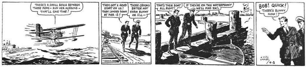
But just a few months into his tenure, by March of 1934, Sickles’ personal imprint and future direction is clear. He seems to be using pulp illustration as a transitional style. The action is more naturalistic and reminiscent of Frank Godwin’s line work in Connie. He is using a lot of straight-lines for shadowing ebbing into larger fields of black and shadow. His panel sequences now propel the action in cinematic ways. He is mixing up his panel sizes and camera perspectives, dramatizing more action and doing more showing than telling in much more economical scripting. And his love of both landscape and machine are becoming pronounced in his aerial ballets.
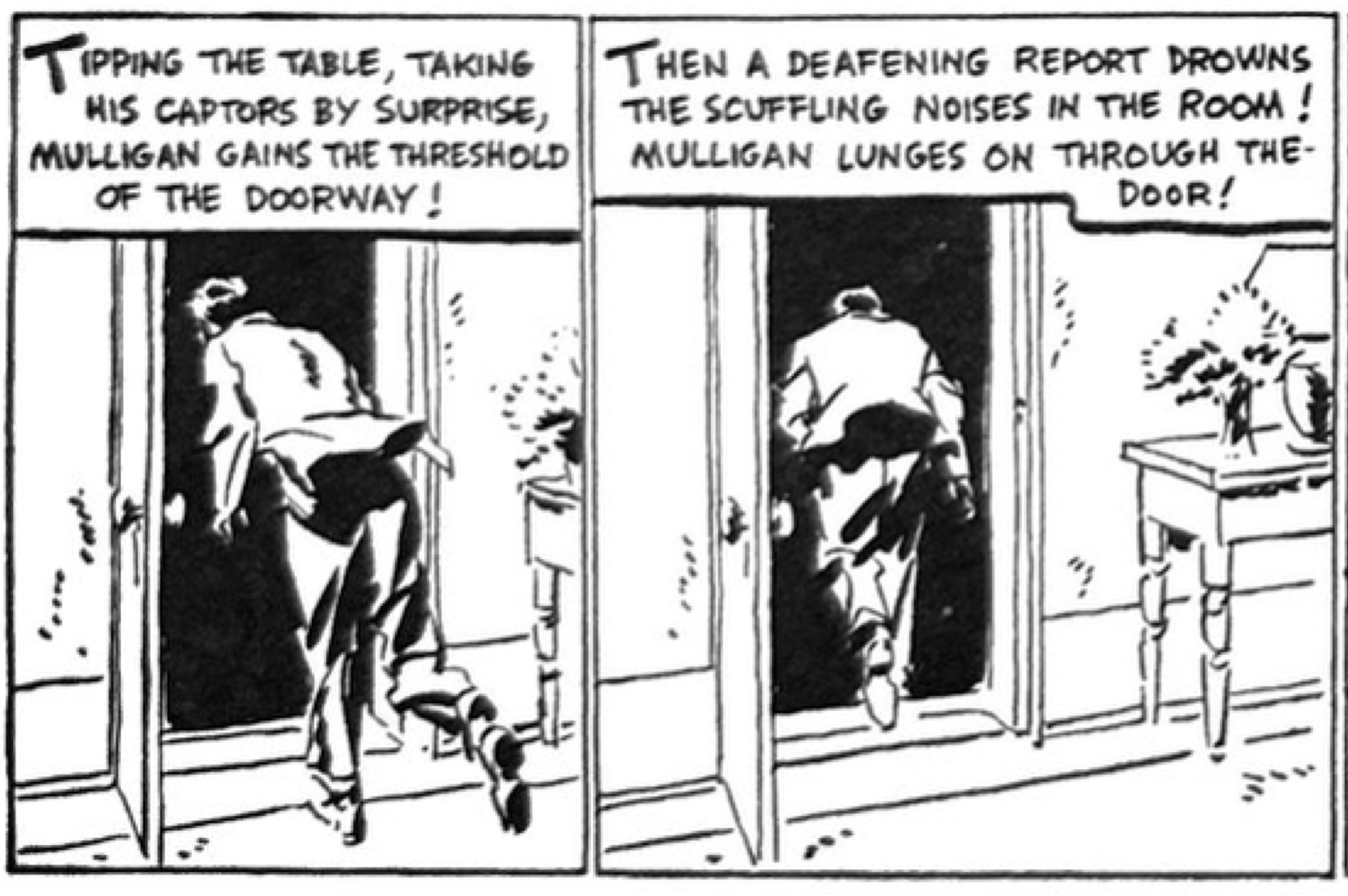
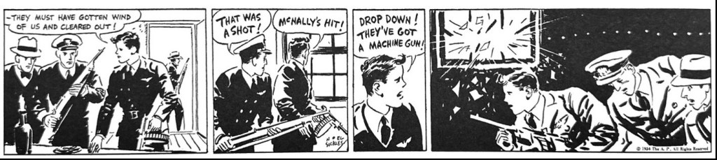
By May 1934, and after Terry’s passing, Sickles is signing the strip with his own name and the radically different direction is unmistakable. His famous transition to chiaroscuro is evident. The use of shadow to define the image, and large swathes of black to balance composition are unlike anything else on the American comics page at the time. Sickles was a student both of European art style and popular film, both of which are apparent now. In the top strip below, the visual drama of the narrow second panel of the two armed men approaching the abandoned cabin, is so engaging and tense. All of it is told with shadow and framing. The changes in perspective, panel size, timing across the four panels is a self-contained narrative in itself. In that top strip, the dialogue is virtually redundant, making explicit what the visuals have already communicated with greater force. Understanding this, Sickles even plays with the lettering to communicate tension more visually than linguistically.
By his own admission, Sickles was not a master of plotting nor characterization. He channeled the simplistic adventure storytelling of potboiler films, especially westerns. He was making the story up as he went along. And he was much more focused on the immediate visual impact of the daily moment. It was all about the action.
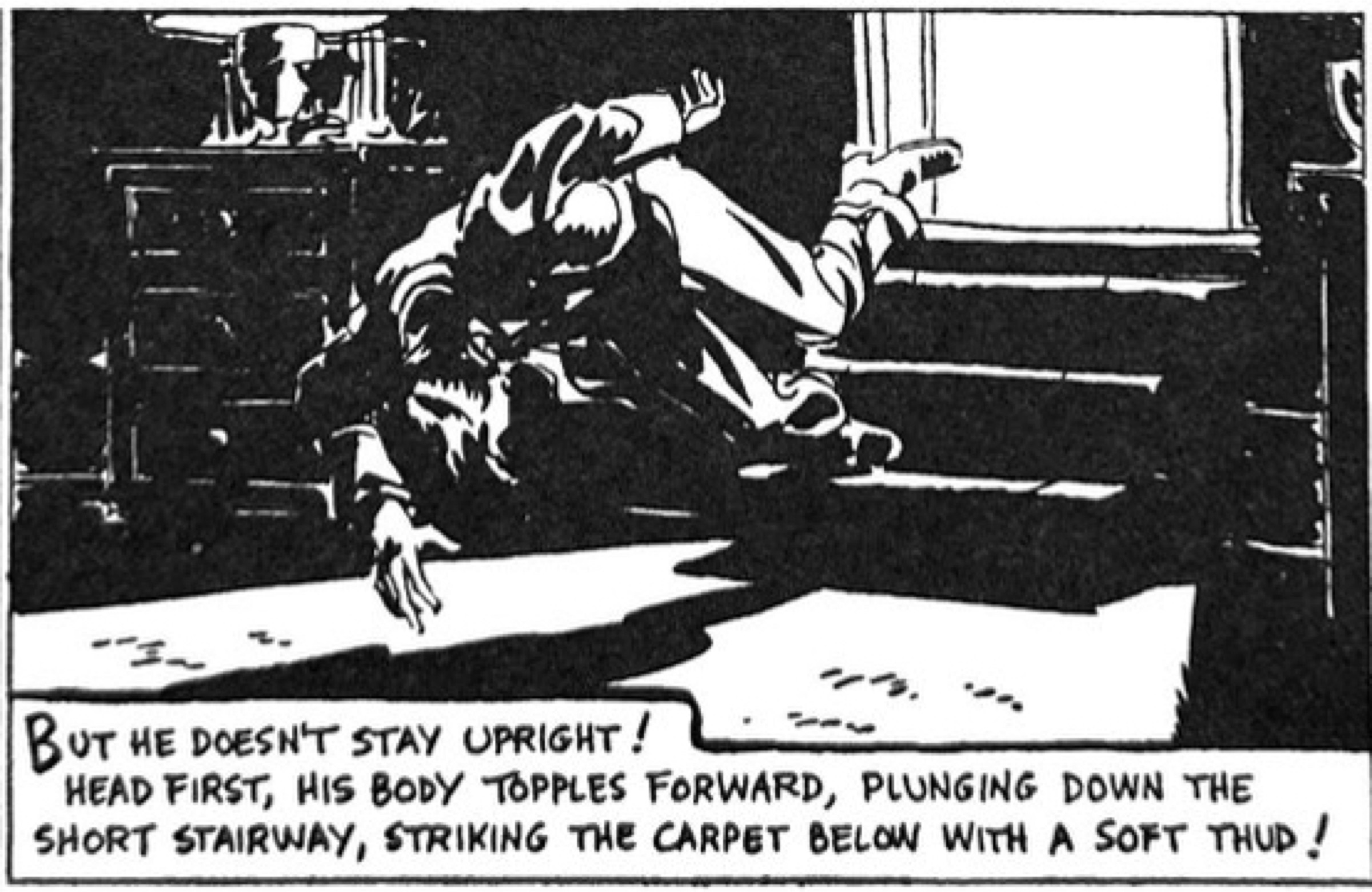
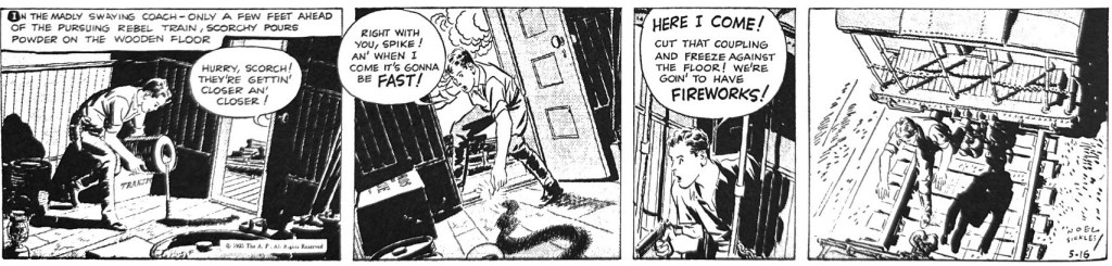
But Sickles was also a restless innovator. Over the next two years Scorchy Smith often looked like a testbed of comic experimentation. In the sequence below, we can see him playing with eccentric camera positioning, tilting the frame, as if to disorient the viewer to convey chaotic action.
The strip would go through periods where he made extravagant use of Ben Day and chemically treated media to add mid-range tones, only to retreat later to spare line work again. And there were periods where his assistants took the reins, usually to poor effect.
By the end of his run on Scorchy Smith, when he handed it over to assistant Bert Christman on Nov. 23, 1936, Sickles was clearly ahead of any peers, including Caniff, in mapping what a visual adventure comic could do. His influence on the next two decades of comic artists is obvious. Just look at the two strip action sequence below and try not to see Alex Toth. Or another perfectionist – Warren Tufts. His aerial action anticipated George Evans in Aces High. Noel Sickles was surely one of the great shooting stars of comic art – seen briefly but casting a clear long shadow.
Discover more from Panels & Prose
Subscribe to get the latest posts sent to your email.

Pingback: Scorchy Smith av Noel Sickles - Rogers Seriemagasin
Pingback: The Maturing of Milton Caniff – Panels & Prose