
John Held Jr.’s highly stylized, fine line cartoons are identified with “The Jazz Age” of Fitzgerald’s 1920s for good reason. His imagery on the covers of Fitzgerald books, in his Oh, Margy and Merely Margy comic strips and especially in his work for the early New Yorker and other humor magazines pretty much defined that decade visually. He found a way toi make privileged youth look even more air-headed and frivolous than they prbably were. It made him enormously wealthy, for a time, and in constant demand. Yet, for all of his identification with modernity, Held was deeply nostalgic. Many of his other illustrated works departed radically from his signature flapper stylings and used instead a pre-modern linocut technique that gouged an image into a linoleum surface to effect a primitive woodcut-like effect. Rob Stolzer recently posted the full run of Held’s Civilization’s Progress series from Liberty magazine (1931-32), where Held contrasted the Gay Nineties with contemporary life by juxtaposin his flapper and linocut styles.
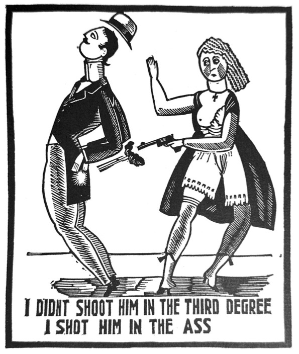
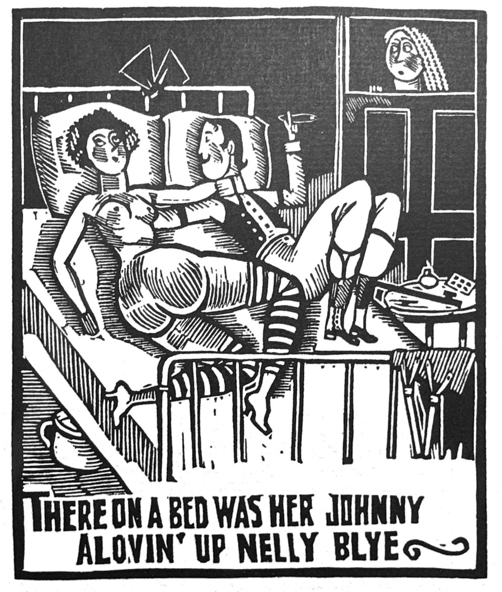
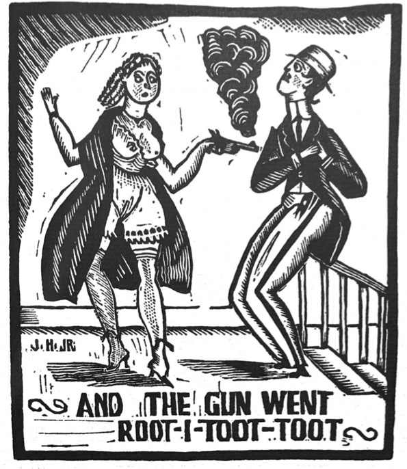
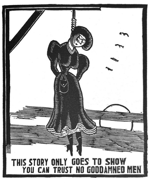
It turns out that Held had been working on his linocut visions of 19th Century America as early as 1915 when he started illustrating a bawdy saloon song, “The Saga of Frankie and Johnnie.” In this light-hearted dirge of prostitution and murder, brothel favorite Frankie becomes jealous of her pimp Johnnie’s carousing, eventually shoots him, and hangs for it in the end. According to Held, the “tale of Frankie and Johnnie, who loved their life away” was told him by “a colored piano player, who was called ‘professor’ in a parlor house.” Apparently, this was a world that the young Mormon Held enjoyed during his youth in around Salt Lake City. Engraving these images during his years of struggle in New York City brought him back to his past “wild free existence in an Inter-Rocky Mountain settlement with my friends the whore, the pimps, the gamblers, the hop-heads, and the lenient police, who used to know ‘The Mormon Kid.’”
The finished work didn’t see the light of day until 1931, and Held’s candor, let alone the rawness of the illustrated song, proved too risqué for general publication. It was privately printed in a limited run, but resurfaced in a 1973 reprint.
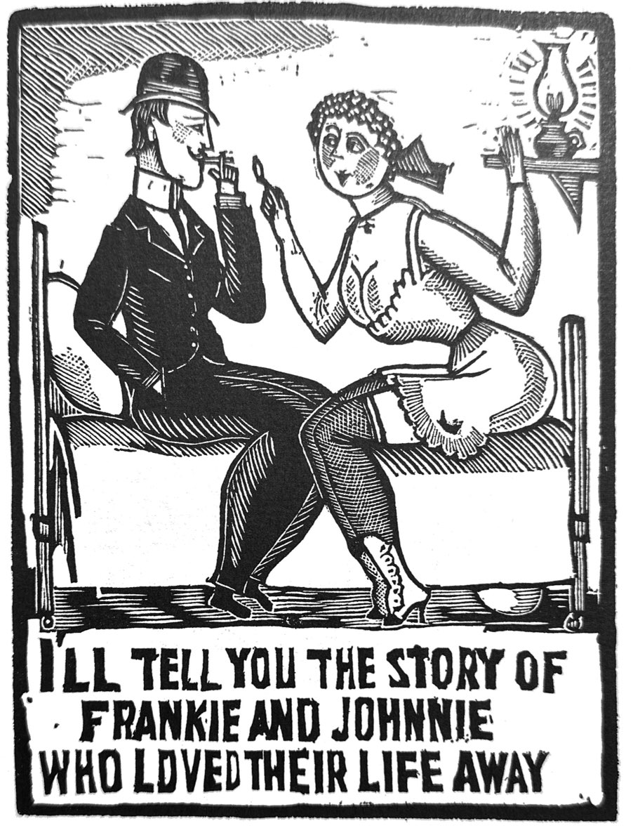
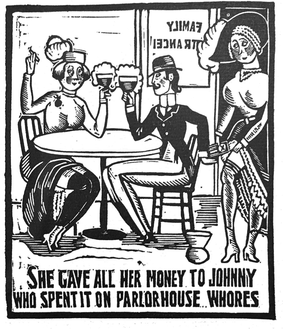
In waxing nostalgic about the gay nineties, Held is really leapfrogging back even earlier by invoking a visual style of early 19th Century woodcuts. These were the more crude designs that preceded modern lithography and illustrated chapbooks, almanacks and the lurid Police Gazette. By reviving this style in 1915, he was anticipating a coming vogue in the 1920s for wordless novels that told their stories via scores of woodcuts. While “The Saga of Frankie and Johnnie” images accompanied the song lyrics, Held’s book matched a feature image against every verse, and he pulled some of the lyrics into the image as well. But the images had a pantomime quality that told the story on their own. Initiated by German artist Frans Masereel, wordless woodcut formats were taken up by Americas like Ward Lynd in particular.
And Held is not invoking this visual primitivism as a mere gesture. He makes excellent use of the form for comic effect. He teases out of each verse just the right line to illustrate in a jaunty way that looks lke visualized honky tonk piano. Not only is is wood cut style miles away from his typical comics work, but Frankie herself is the inverse of the bubble-headed, rail-thin flappers he made famous in the 20s. Her enormous breasts, clothed or not, dominate many of these frames, and he uses shapely legs throughout as signals of a casual sexuality to this brothel world he admired. And his ability to craft an emotive expression out of a few rough linoleum gouges is remarkable. “The Saga of Frankie and Johnnie” merits a full reprint. It is an impressive example of an illustrator sustaining an intricate comic tone mainly through imagery.
Held was a curious character. Despite his enormous success in the 1920s, he became uncomfortable as the visual stylist of carefree, privileged youth. The woodcut style he invoked in Frankie and Johnnie, and deliberately contrasted with his flapper style in Civilization’s Progress perhaps registered that ambivalence.
Discover more from Panels & Prose
Subscribe to get the latest posts sent to your email.
