

Two of my favorite books this year were not about comics specifically but about the larger visual culture in which comics emerged during the first half of the American 20th Century. Christopher Long’s overview of commercial graphic ideas, Modern Americanness: The New Graphic Design in the United States 1890–1940 takes us from the poster art craze of the 1890s to the streamlining motif that flourished in late 1930s graphic storytelling. And Ennis Carter’s Posters for the People: Art of the WPA reproduces nearly 500 of the best posters from the New Deal-funded Federal Art Project of the 1930s. Between the two books we peer into a comics-adjacent history of commercial art and how it was incorporating design ideas that expressed the experience of modernity and absorbed some of the artistic concepts of formal modernist art. Although neither book mentions cartooning per se, their subjects are engaged in the same cultural project as cartoonists – to find visual languages that capture and often assuage the dislocations of modern change.

Designing Modernness
Beginning with the Grolier Club exhibit of European poster art in 1890, new impressionistic and abstract styles of advertising art began migrating to American shores. Developments in lithography had allowed for larger images, bolder, vast swathes of color that artists like Jules Chéret, Eugene Grasset, Henri de Toulouse-Lautrec and others famously used to promote dance halls and events. The first American poster artists like Edward Penfield, Maxfield Parrish and Elisha Brown Bird produced magazine covers and poster sized ads promoting magazines. They used this enlarged palette and canvas to introduce general lifestyle imagery, flattened perspectives and simplified figures to promotional art. Per Christopher Long, they anticipated a distinct American style – a “matter of factness that conveyed cultural rawness and individualism.” And in the 1890s they created quite a poster craze in the US. While ad posters for politics, circuses and vaudeville had been in use for decades, these tended towards realistic illustrative styles within the limitations of wood engraving. With the emerging chromolithography, the public spaces of American cities were coming alive with large splashes of color and abstracted design.
Long calls out William H. Bradley as a pivotal innovator who brought into the commercial design aesthetic Japanese woodcut influences, newspaper illustration, more expressive typography to bring a new artistry to advertising art. But the hero of Long’s tale, Earnest Elma Calkins, emerges at the turn of the century to champion the merger of high art concepts and commercialism. With the 1902 formation of the Calkins and Holden agency, he introduces less direct branding ideas: associating a cartoonish hippo with an oats supplier or crafting a fictitious traveler (“Phoebe Snow”) to tell stories about a railroad service. Other advertisers like Pierce Arrow cars and Coca-Cola are incorporating lush Art Nouveaux and Arts and Crafts design principles as well as shifting the focus of advertising to panoramas of modern American lifestyles. Advertisers are using new visual tools to wrap brands in aspirational imagery. The crass sales pitch is being replaced by the graphic dreams of personal and social progress. Modernity itself is the product being sold.

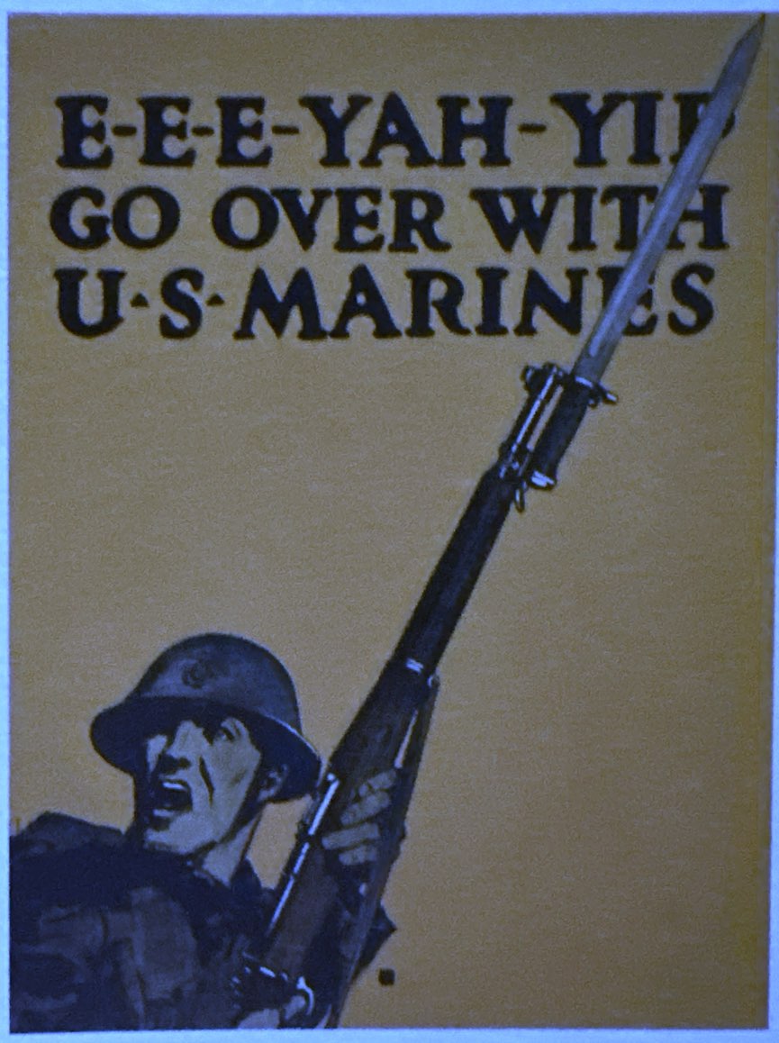

From the striking propaganda posters during WWI to the streamlined landmark of the 1939 World’s Fair Trylon and Perisphere, Long demonstrates how innovative commercial design crafted an icononography of modern life – ways of presenting the objects and experiences of the American century that spoke principally from images rather than text. The Art Deco rage of the mid 20s accelerated a move towards reductive imagery, experiments with composition and typography. An imagery of progress and abundance were seen in everything from bold billboards revering a straw hat to romanticized auto tires.
Mass production and consumption were endowing everyday objects with an aura of larger meanings. This was a boon to graphic design because it allowed higher minded artists to dislocate everything from fashion frocks to oranges to chewing gum from real life. They become floating design objects. Harlem Renaissance masters like Aaron Douglas added jazzy and African tropes, increased abstraction and reliance on geometries. By the time we get deep into the late 1930s, we see a pop modernism emerge in industrial design, especially streamlining, and the extremely reductive imagery of WPA poster art. Dorothy Waugh created stunning posters for the National Parks Service that rendered naturalistic American landscapes with bold coloration, contrast and abstraction. Like the modernism of high art, a sleek, paring down of imagery is moving design further from representation.
While many of these ideas are migrating from European commercial trends, and many emigree artists, Long contends that there is a distinct “Americanness” here. American commercial design continues to emphasize salesmanship, persuasion, and ultimately a persistent need to find meaning in the everyday world.

In the end, Long is not as persuasive on these last points about “Americanness” as he might have been. More direct comparison with European and Russian poster art might have helped draw those distinctions more explicitly. Likewise, finding connections between these higher design concepts and the larger visual field of American advertising art, American Scene painting, cartooning, movies might have helped tease out the “Americanness” of it all. But on its own terms, Modern Americanness is a beautifully curated set of images and insights on evolving ideas about design and how they idealized modern change.

Selling the New Deal
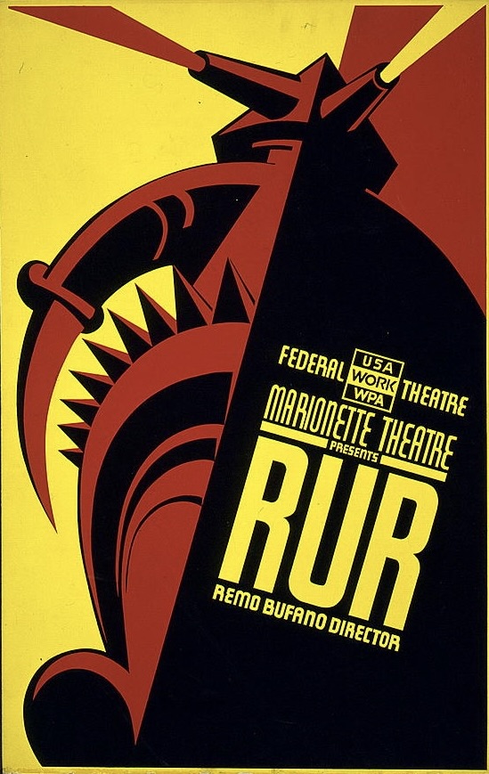
If Long’s book has an ambitiously broad embrace of pop art history, in contrast Ennis Carter’s is the deepest of dives into a moment. Between 1935 and 1943, the Federal Art Project, part of the larger WPA (Worker Progress Administration), provided government support for a range of arts efforts. Across those years, its Poster Division papered America’s public spaces with over 35,000 designs in millions of copies. It was an unabashed promotional, even propagandistic effort addressing everything from toothbrushing to workplace safety, conservation to state tourism and theatrical promotion. Much of this work was neither preserved nor recorded. The Posters for the People book selects nearly 500 examples that the online project has been collecting and cataloging for over 20 years.
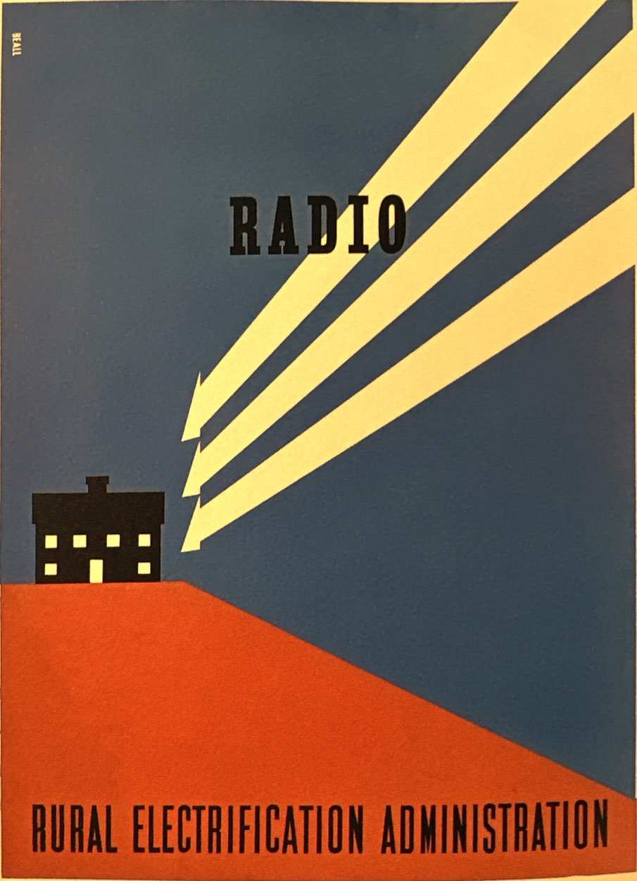
In many ways, this WPA art represents the culmination of the modernist design evolution Chris Long outlines. These are visions of American life that have been reduced to icons. There are no faces in WPA art, only generalized, flattened 2D proxies of worker, child, dancer, mountain, skis, etc. Powered by the new silk screening print process, they relied on equally abstracted swathes of stark pure color.
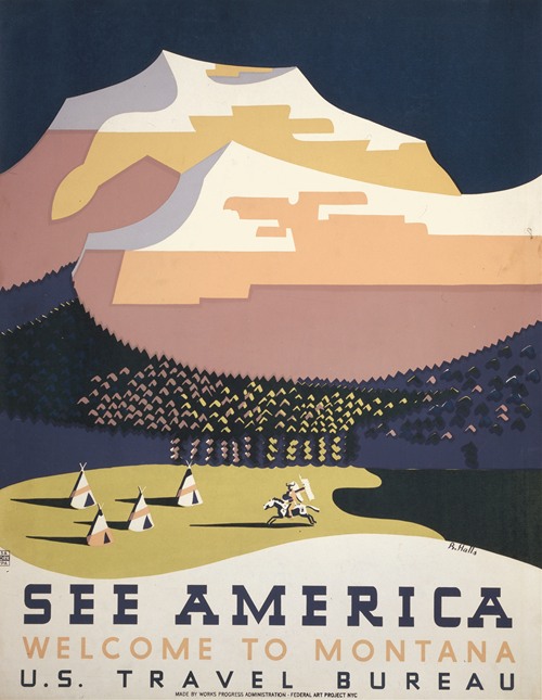

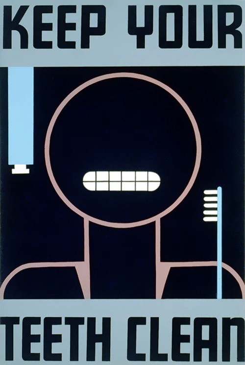
Artists leveraged this highly abstract, modernized aesthetic to hijack attention in a crowded public mediaspace and communicate concepts immediately. A poster for dental hygiene reduces the idea to high contrast circle-head, geometric teeth and toothbrush icon. Workplaces become visual symbols of faceless muscular force, gears, assembly lines and smokestacks but rendered with dynamic motion and deep perspective. Destination travel imagery envision America as human encounters with the limitless vistas of pristine landscapes. America is advertising itself to itself as a triumph of modernity. As Carter notes, these posters offer “such a hopeful and positive view of America.”
And some gorgeous, thoughtful work emerges from this program. While the specific artists responsible for many of these posters remain unknown, this book indexes the attributable art so that we can track standout talents like Richard Halls, Dorothy Waugh, and Charles Verschuuren. Halls was a master at layering silhouettes and muted fields of color to create theatrical posters that drew you in with insight about the work. Verschuuren syncopated shapes and eye flow in ways that captured your eye. And Waugh’s majestic National Parks art blended abstraction and photo-realism, humanism and nature in beautiful harmony.
Good liberals like myself were raised to romanticize all things associated with FDR and his New Deal. At first blush, this imagery feels like visual comfort food as some enduring post-WWII liberal shibboleths get rehearsed here. The dignity of work, union power, partnerships of industry and agriculture, government and business, are all glamorized and fundamental to Roosevelt’s Machine Age idealism. As well, while the strength of ethnic diversity itself is not explicitly argued in many of these images, the value of specific ethnic history and culture surfaces in promotions of the FAP theater work. Black history and Yiddish theater especially are prominent. As well, all of this is wrapped in a benign nativism that was a part of 1930s culture. A key distinction between these WPA posters and, say Soviet Realist poster art, with which they have stylistic similarities, is the absence of collectivist fantasy. There are few if any crowds in WPA imagery. Much like the previous great government-sponsored propaganda project, WWI posters, these images sell collective effort with individualist appeals. Finessing the tension between social obligation and individual autonomy is as American as, well, the Constitution that outlined those competing interests.
Whether these images constituted “posters for the people” is at best arguable. Associating the abstractions of poster art styling and New Deal self-promotion with grassroots cultural movements of the 1930s is problematic in a number of ways. That decade saw an explosion of interest in America’s folk roots, oral histories of slavery, documentary photography of Dorothea Lange and Walker Evans, American Regionalist art and public murals that actually did celebrate a collective American identity. While many of these efforts were similarly funded by the WPA, I am not sure we should conflate this poster art with them.
Taken as a whole, and across a range of categories like health, work, leisure, hygiene, I am left with mixed feelings about an iconography of industrial, machine age idealism that emerges here. It is all well and good to celebrate their design aesthetic as somehow “modernist” and “progressive.” But the art is also faceless and by design lacks individuation and humanity. The upbeat optimism of these images can also be seen as a staggering denial of the hard reality Americans were experiencing even into the late 1930s, challenges and pain that other forms of art were exploring. The WPA posters were at heart propagandistic and uninterested in nuance or insight. The New Deal vision here is more top down than bottom up – shiny happy people working diligently, keeping clean and healthy, enjoying their prescribed leisure weekends with theater and travel. And it is a highly rationalized life in the service of an emerging industrial/governmental megalith. If a lot of this abstract imagery would echo into the conformist ethos of the 1950s, it is because this poster art was also visualizing the logic of modern mass society. Faith in science, industry, government and consumerism as drivers of progress is the real product for sale here. A generation later, an American counter-culture would start questioning that logic and even start mocking this imagery. Consider the stylistic distance between these images of America and Robert Crumb’s. When Crumb and his fellow underground artists reached into the American past for inspiration, they did not grab modernist design ideas. Instead, they sensed in the messier, vulgar styles of E.C. Segar, the Fleischers, and Herriman a resistance to the look and values of mass society design.
Long and Carter’s books are two of my favorite pop culture books of the past year because they inspire further and different scrutiny of popular art. They are narrow peeks into a modern visual culture of the 20th century that requires a wider-angled lens. Modernist design styles like nouveau, deco, streamlining or the radically reductive abstractions of WPA poster art do not define the graphic landscape but are parts of much more diverse and discordant visual culture. Machine Age streamlining of the mid to late 1930s existed in the same visual field as bigfoot screwball comics and Fleischer Studios cartoons, the Regionalism of Thomas Hart Benton and Reginald Marsh, the sentimental illustrative realism of Norman Rockwell, the documentary naturalism of photographers like Lange, Evans and Gordon Parks. Seen with that lens, visual culture is not any one dominant style so much as contested space. There may be a reigning set of styles or values and meanings, but they are often challenged by, perhaps even shaped in response to, resistant styles. Perhaps the look and feel of most comic strips in the 1920s and 30s, abstract but grounded in a representational style (what I would call “bigfoot realism”) was a visual relief from the reigning styles in film, advertising, magazines? Perhaps visual styles in one area of everyday life are responses to other realms, which may be part of their appeal. Culture is not consensus but a conversation.
Discover more from Panels & Prose
Subscribe to get the latest posts sent to your email.

Pingback: Recovering Hank: America’s Anti-Fascist Hero – Panels & Prose