Gross Exaggerations: The Meshuga Comic Strips of Milt Gross
I would consider this oversized collection of the zany scribbles of Milt Gross a companion volume to my favorite book of 2019, Paul Tumey’s Screwball. It further revives our appreciation of artists like Rube “Boob McNutt” Goldberg, Bill “Smokey Stover” Holman and Gus “Sherlocko” Mager whose fame has faded as their madcap gag humor fell out of style. With The Sunday Press’ Gross Exaggerations: The Meshuga Comic Strips of Milt Gross we get a sustained immersion in a single artist who was the face of madcappism through the 20s and 30s in strips like Nize Baby and Count Screwloose. As the full title suggests, the book underscores Milt Gross’s cultural contribution of bringing Yiddish language, dialect and humor styles into mass media, perhaps in ways that no other more “serious” medium could. Peter Maresca’s Sunday Press continues to impress with its use of multiple critics to surround each of its reprint volumes with several contextual lenses through which to appreciate the art.
Milt Gross was widely known to 20s and 30s Americans, and frequently reprinted. But you haven’t seen him like this, arguably at his “Grossest.” The 13×17 scale gives us full Sunday pages as they were experienced. I found myself appreciating Gross’s use of implied action between panels to drive the humor and heightened sense of pace. For this alone I am grateful, and it helps make the case for this class of reprint. As well, the reproductions are as impeccable as they are instructive. They reveal the deliberate and functional quality of Gross’s seemingly frantic line work.
But this immersion in his work also surfaces Gross’s satirical eye. While many of the domestic family strips of the 1920s gently poked at the gender, sexual and generational politics of post-war life, Gross blows up the family unit altogether and pits all members in perennial warfare, with the inept, resentful pop in the lead. Gross brings into the 1920s the tropes of the first decade of bad boys in comics. Most strips end with a spanking or the threat of violence, and mama advising her husband, “not the head, Morris.” Moreover, Gross kept his strip and its comedy steeped in the frantic energy of the city when his peer comic artists were moving to the growing American suburbs. And Count Screwloose flees the asylum weekly but only to witness the inanities of everyday “sane” America. This is enough to send him back to his more lreliably delusional pals in the hospital by nightfall.
Gross Exaggerations is a welcome invitation to revisit a master of purposeful screwballism and consider its artistry.
It is way past time to review and highlight some of the noteworthy books for comic strip mavens in the last year. For nearly a decade, as an editor at media trades Media Industry Newsletter and then Folio magazine, I did annual roundups of books of special interest to print media professionals. Historically significant comics reprints always played in my mix. Following the diminishing fortunes of the magazine industry in recent years, MIN merged with Folio, which itself folded into oblivion in late 2019. And so I moved the 2019 roundup here to Panels & Prose. I never got around to doing a 2020 edition, because, well, 2020. So over the next week or so I will be calling out my faves from last year and so far this year that I think furthered our understanding of comics history. Today we start with the one title in the bunch that nudges beyond the usual focus of this site on newspaper and magazine comics. But the magnificent legacy of EC is too important a milestone in the American comic arts to exclude.
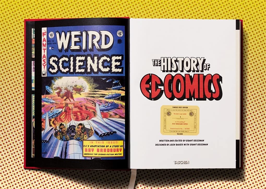
The History of EC Comics
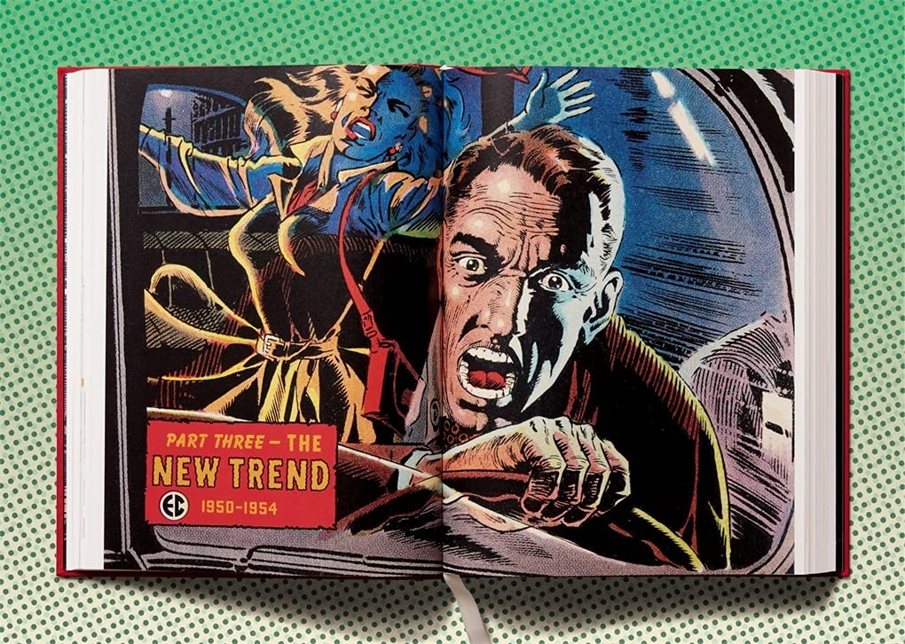
The annual cinder block from Taschen for comics fans is Grant Geissman’s The History of EC Comics, a massive reflection on and reprinting of the greatest collection of comics artists in history. William Gaines’ EC horror, war and crime comics was the home of Tales from the Crypt, Weird Science and Frontline Combat. Like all Taschen books the sheer scale allows Geissman to pour in full story reprints, some in original art, memos, office photos, even contracts that help bring to life the familiar history of this incredible stable of talent. It is hard to go wrong with a book brimming with Jack Davis, Wally Wood, Harvey Kurtzman, Johnny Craig, Al Feldstein, Will Elder, just to name-drop a few. Falling into these artists at 14×18 scale is a revelation, even to lifelong fans like me. The book also has an end section reproducing every EC cover where many of these artists hit their peak. Kudos to Geissman’s curatorial skill.
The text history is not as compelling. I think Geissman’s rendering of Bill Gaines’s father, comic book pioneer Max Gaines, is quite good. It has telling detail and foreshadows the psychic burden Bill carried. Otherwise, however, Geissman defers to others for the scant aesthetic evaluations of all this great artistry he has assembled here. Nor is there much about the tropes, themes, attitudes and visual conceits that a more curious and creative interpreter might tie to the zeitgeist. Tashen’s other recent XXL titles on Krazy Kat and Little Nemo, both benefitted greatly by Alexander Braun’s critical acumen. Appreciating and distinguishing among comics styles was central to EC’s success, because publisher Gaines and editor/writer Feldstein meted out the freelance work according to whose style fit the story. This layer of interpretation is missing here. Instead, the history and ancillary images are guided by a collector’s penchant for later market value and rarity rather than aesthetic or cultural significance.
Nit Picky? Not for a tome that is priced and positioned as definitive. Sure, one wishes that such a visually generous and lush, let alone expensive, book on EC was a full-throated celebration and genuine interpretation of its artistry. We’ll settle for this.
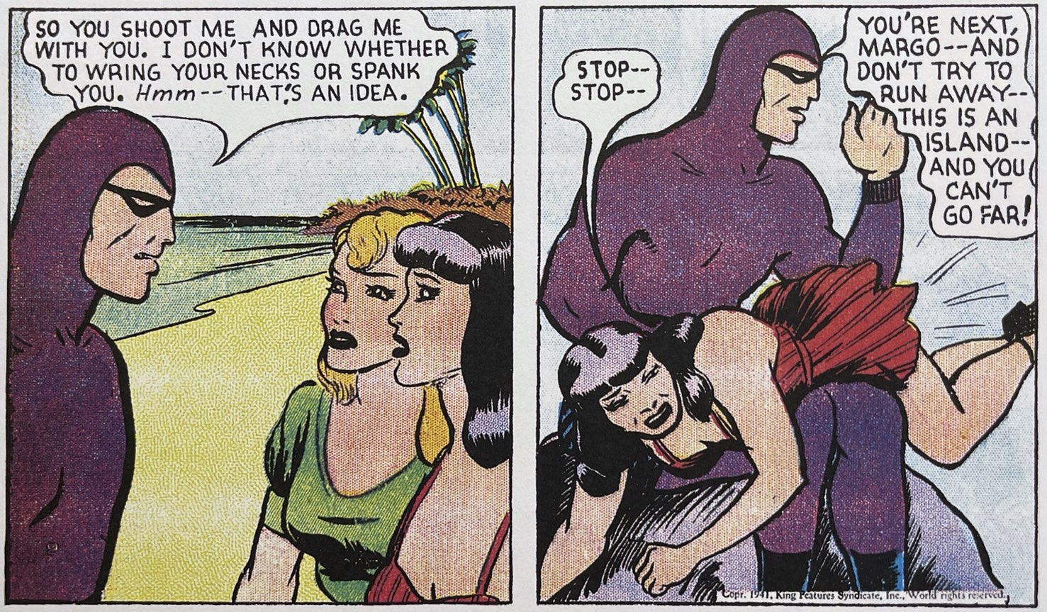
Putting a full grown man in a skin-hugging bodysuit, hood and mask is bound to raise a few hints of offbeat sexuality. I have no idea if Phantom creator Lee Falk knew precisely what he was doing when he introduced the form-fitting costume to pop adventure in 1936. Some of us will never forgive him. But it is clear that the sheer eroticism of The Phantom strip was clear from the start. And “sheer” is the operative word. As I pointed out in an earlier post, the mysterious avenger was not the only one to trot about the globe in skivvies. Artist Roy Moore missed few opportunities to drape in gauze (barely) Phantom gal pal Diana and a steady line of sadistic dominatrix villainesses.
Not to put too fine a point on it, but for all of his pre-super-hero human talents, The Phantom got bound and whipped by women at a shocking rate. Sado-masochism and titillating cheesecake were hardly new to mass media in the 1930s, of course. The Phantom probably drew more from pulp magazine adventure tropes than any other strip of the time. Its eccentric masculinity and leggy, dominant women, not to mention a risible colonialism, were conventions of the print pulps. But no other daily comic strip I have seen kept an erotic sub-text so close to the surface.
The Phantom is a special case. Sex is baked into the premise and origin story. This is an extravagant revenge fantasy, reaching back 400 years, in which a nobleman swears to avenge the murder of his father at sea by the hands of “Singh pirates.” He dedicates the son of every future generation of his family to fighting piracy of every kind. And so the “the ghost that walks” takes on the mythos of immortality. Of course, the subtext of the origin story is that each generation of Phantom needs a willing wife.
The animating appeal in pulp adventure really is the male ego itself Just about all aspects of the narrative aim at buttressing an heroic male fantasy that apparently needs all the stroking it can get. But as with all pulp heroism, it starts with a two-fisted, iron-willed, he-man dripping a masculine prowess that is not only turned up to 11 but immediately apparent to any woman in the general vicinity.
The number of pulp magazine column inches spent gushing over the raw and daunting power of our hero’s fists, determination, sex appeal, endurance, brains, speed, stare, will, etc. is astonishing. Well-tuned to male adolescents (and the arrested adolescent in the rest of us) the testosterone opera of pulp adventure always seems to belie the fragility of the male ego. No amount of flattery ever seems enough.
Of course the sultry villainess falling for the sexually irresistible hero was a common trope of mid-century male adventure, and it certainly was familiar to comic strip readers. The theme was central to many of Milt Caniff’s Terry and the Pirates, and Will Eisner’s The Spirit, whose heroes had tortured relationships with a range of recurring femmes fatale. But in Caniff’s much more masterful hands, these plot twists often became opportunities for some remarkable psychologizing. Eisner used the convention as sites for clever banter, inuendo and the Spirit’s comic cummupance at the hands of famously jealous girlfriend Ellen Dolan.
In Lee Falk’s hammier hands, however, the fawning villainess and cheesecake tropes descend into high camp. Which is great for me, because if it isn’t clear by now, I am not a fan either of Lee Falk or the costumed hero. Falk’s storylines in both Mandrake and The Phantom lack inventiveness and genuine suspense. Ray Moore’s artwork in the Phantom dailies can be involving, albeit a good imitation of the Alex Raymond style that the syndicate was imposing on all of its adventures in the 1930s. I find The Phantom best sipped by the panel rather than eaten by the storyline, mainly because it heightens the campy excess that is the strip’s best feature.
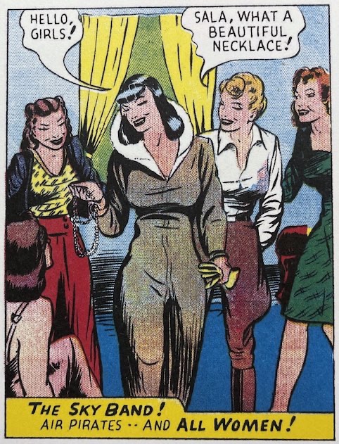
When The Phantom launched a weekly Sunday storyline in 1939, Falk revisited the Sky Band of female pirates he introduced in the dailies earlier. Led by Scala and assisted by Margo, the Band has all of the sexual elements we need: The Phantom repeatedly captured, bound, beaten and saved from certain death by besotted women pirates; villainesses falling and then competing for our hero; female deception, seduction, conniving, etc.
In the world of male pulp adventure, a hero needs to be as steel-willed as they are, if only to combat the wild incongruities of the female stereotype. The pulp villainess is at once slave to her emotion and archly plotting and manipulative.
But let the images speak for themselves. Or try to. I am not sure if Moore was using assistants for the Sunday work, but the style here is wildly uneven, usually wooden and with none of the Raymondesque brushwork and framing we see in the dailies. What we do get is a cornucopia of pubescent fantasy. The legs are long and plentiful, and somehow they manage to walk on sandy shores in stilettos. And the fetishes just keep coming: hair-dragging, cat-fighting, even spanking.
Rightfully, Falk’s Phantom is seen as an historically important transitional figure. His costumed figure and allusions to supernatural abilities bridges the male prowess of Doc Savage, The Shadow and The Spider in pulp adventure to the genuine superhero genre that Superman was soon to engrave on popular culture. But he also brought into the daily newspaper from the adult pulps a surprisingly consistent sexual subtext, if not outright fetishism. For all of the Falk and Moore’s many weaknesses, we can thank them for sexing up the comics page.
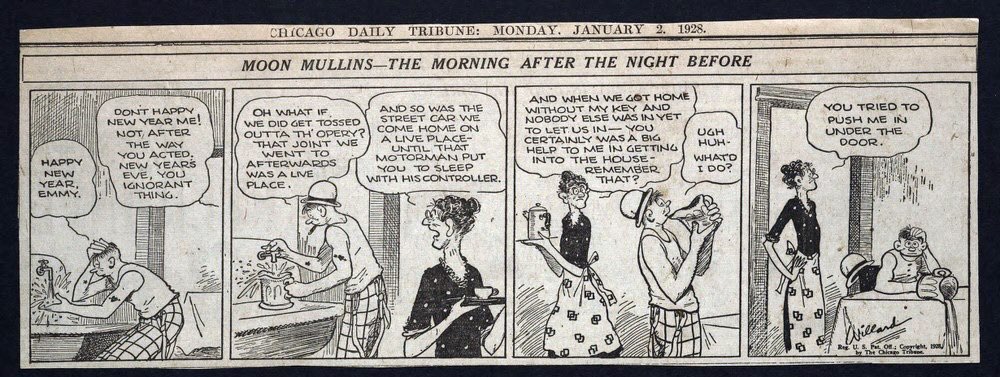
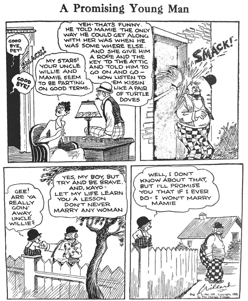
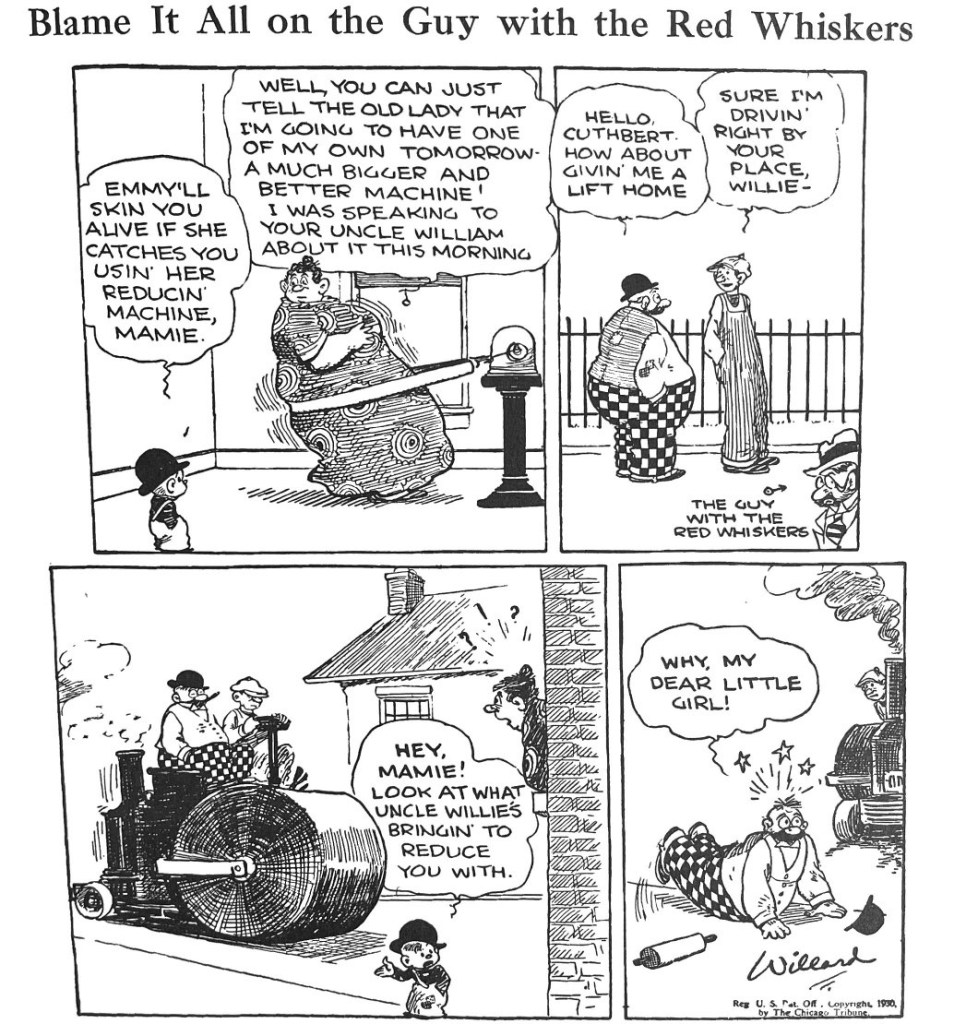
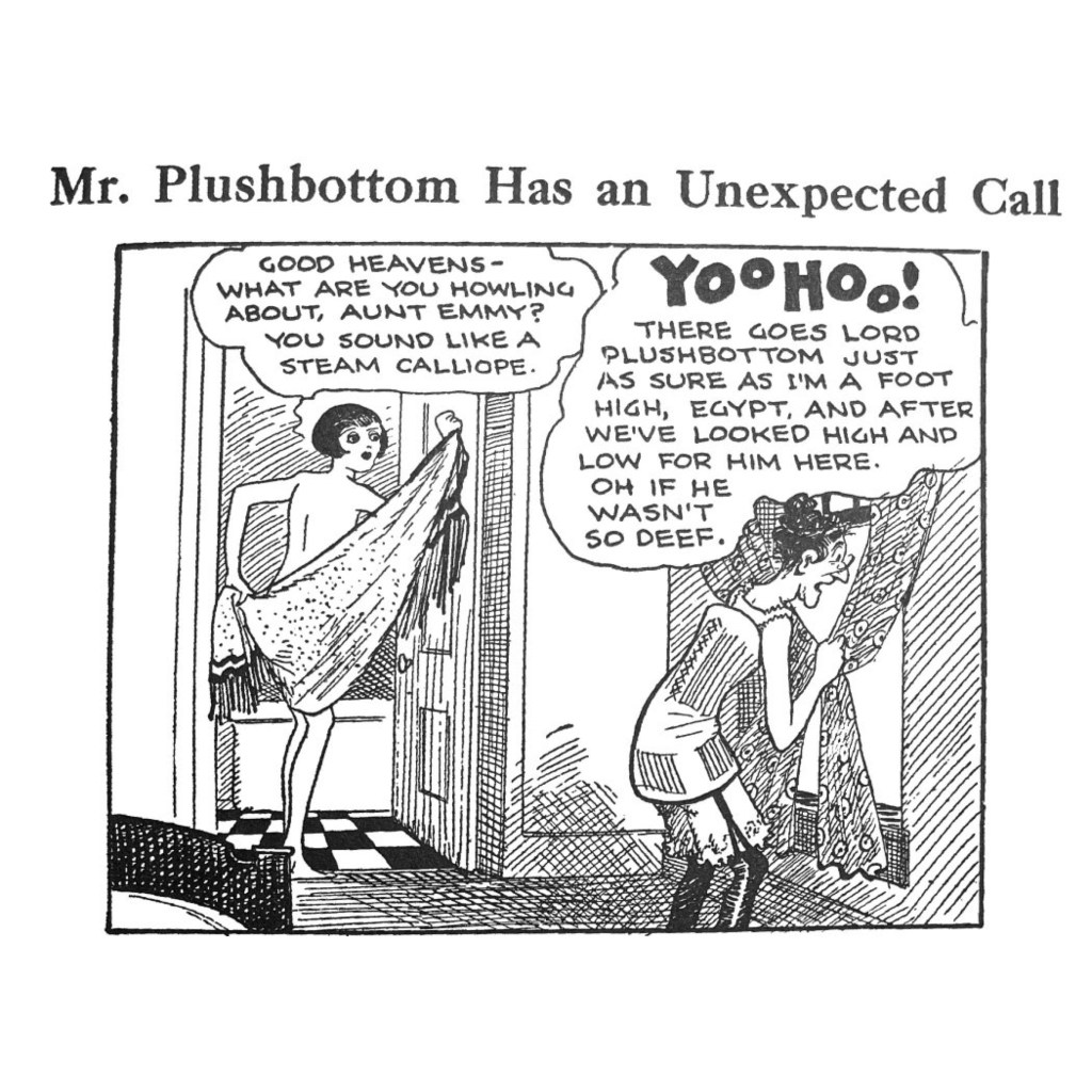
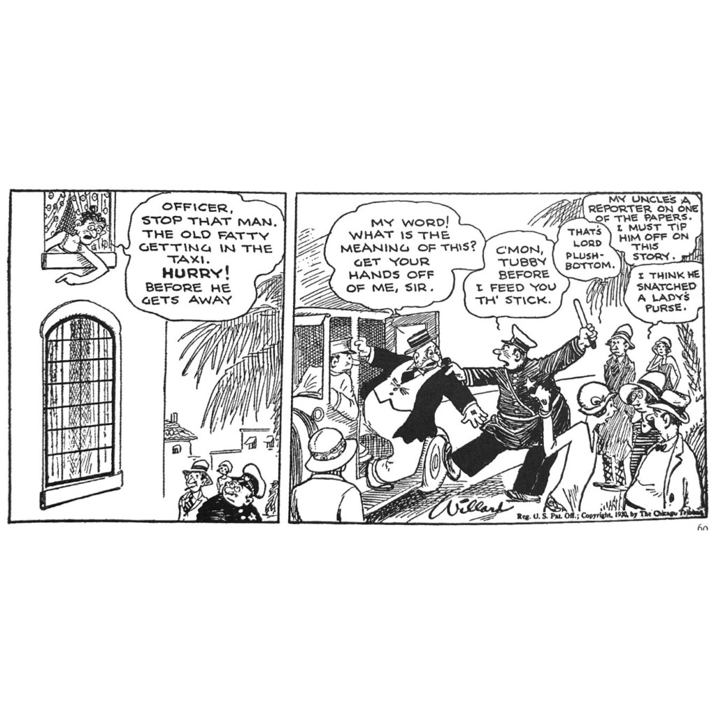
He was a “banjo-eyed” former boxer whose life’s work seemed to be avoiding a life of work. Frank Willard’s Moon Mullins (b. 1923, Chicago Tribune syndicate) was a boarding house situation comedy, where Moon and his little brother Kayo schemed, loafed and tussled with a like-minded cast. But what distinguishes Moon Mullins in my mind is the authenticity, affection and artistic talent Willard brought to a strip that tugged against the middle class fantasies of 20s American culture. While much of the comics page moved towards gentler domestic comedy in the 1920s (The Gumps, Bringing Up Father, Gasoline Alley, Polly and Her Pals, et. al.) Moon’s world was an alternative America that was relentlessly mean, self-interested, devotedly unproductive.
Moon Mullins’ visual signature blended caricature nicely grounded in physical detail. He assisted Billy DeBeck, whose Barney Google was another strip about socially marginal characters, but he had a more naturalistic style. The run down neighborhoods and well-worn rooms of Moon’s world come through in cross-hatched corner, splashes of broken wall plaster, the stray broken fence slat. His characters are weightier, individualized and expressive of inner qualities. Moon’s wry, laconic approach to life lives in his usual posture, relaxed, disinterested.
The gangly, bespectacled boardinghouse owner Emmy Schmaltz is as tightly wrapped as her ever-present bun. Her figure recalls Segar’s depiction of Olive Oyl but without irony. The absence of sex-appeal is genuine, even if her hunger for a man throughout the 1920s drives her own scheming comedy.
The sloppily stout Uncle Willie and his equally massive wife Mamie are models of domestic disharmony, usually resulting in Willie taking a kitchen implement to the head and being tossed from the house.
Willard had a deft sense of comic strip cadence, with a great ability to advance an episode yet tell a complete story in just three or four daily frames. In the sequence above, part of a 1931 road trip to Florida, Emmy is trying to get Lord Plushbottom’s attention. The usual sit-com tropes ensue: miscommunication, misapprehension, confusion. Premise, activation and gag all take place within three panels.
Willard had a special talent for slapstick timing, usually on display in the Sunday gag strips. Like the best slapstick silents, he used careful panel editing and cadence to capture the flow of unintended cause and effect. The strip above is a good example of how tired tropes feel fresh and funny mainly from the way Willard times his action and layers into them the sit-com notes of misapprehension. Or, in the strip below, Willard blends some of the dark scheming of his characters, Emmy’s creepy faked suicide plot, with a beautifully rendered birdshot-to-the-ass scene – from weirdly dark to classically comic in three panels.
It was Willard’s great comic sense that gave him license to portray an unsentimental vision of marginalized America in ways that were uncommon to the hapless but good-hearted domesticity across the rest of the comics page let alone the idealizations of American life in the rest of popular culture. More on this in the next post.
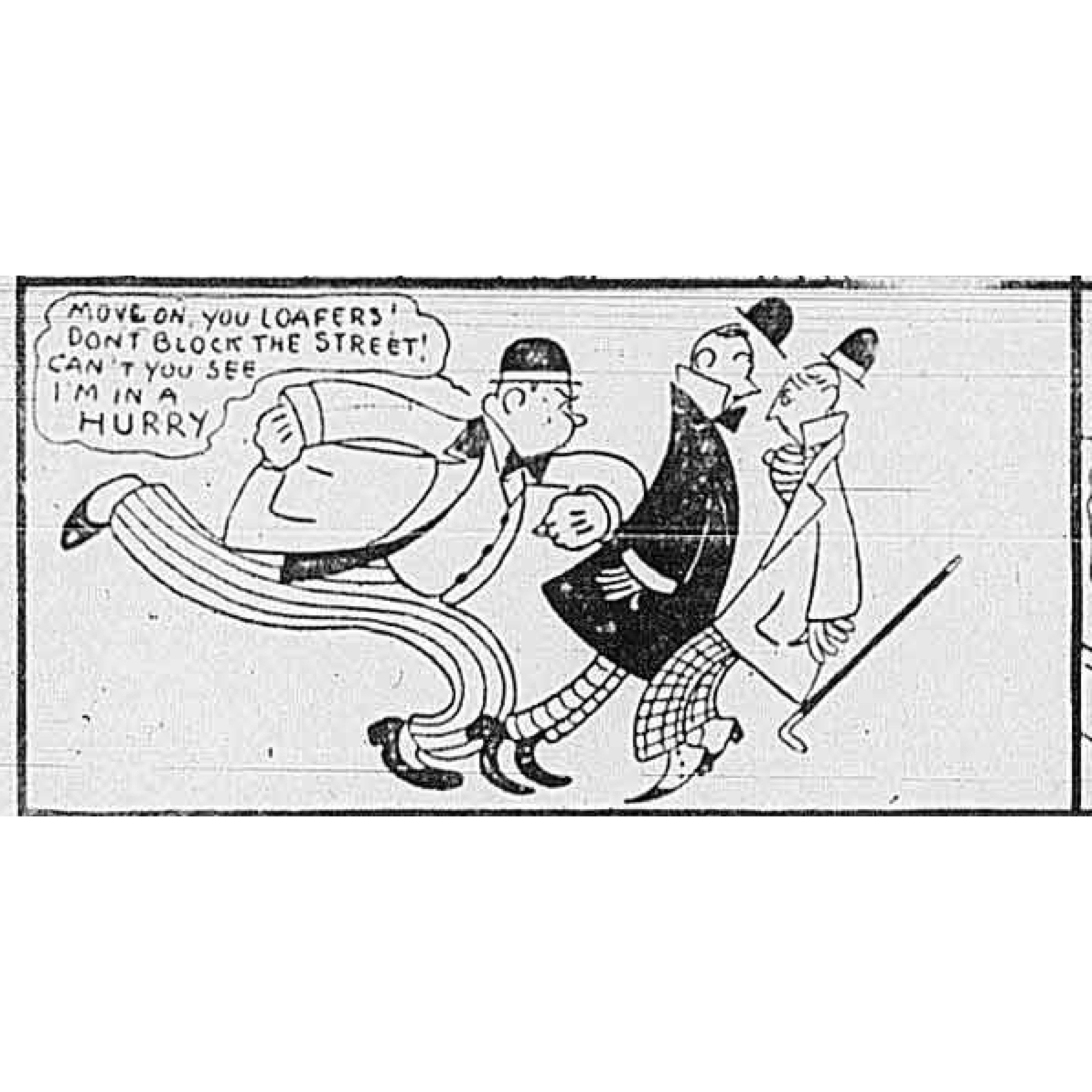
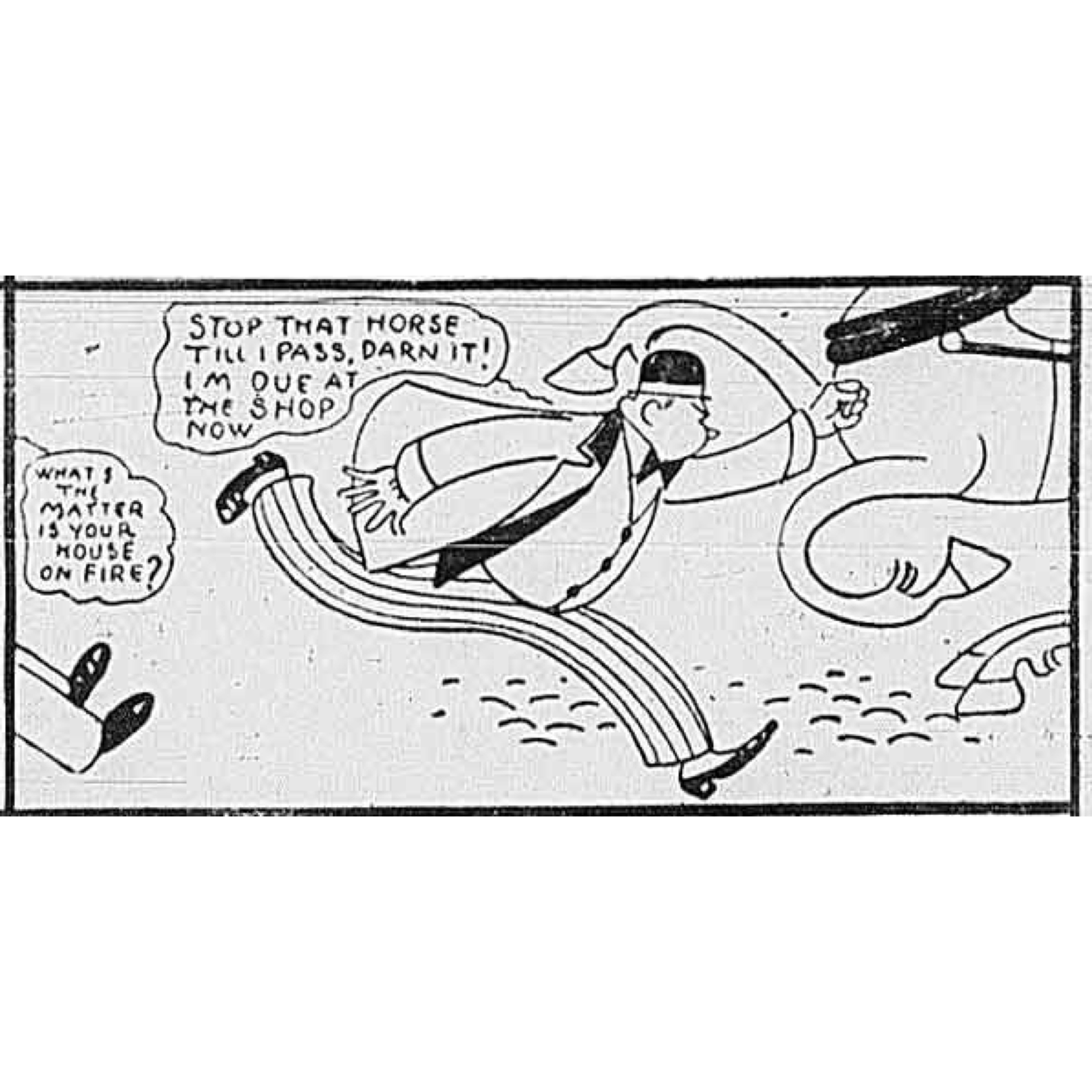
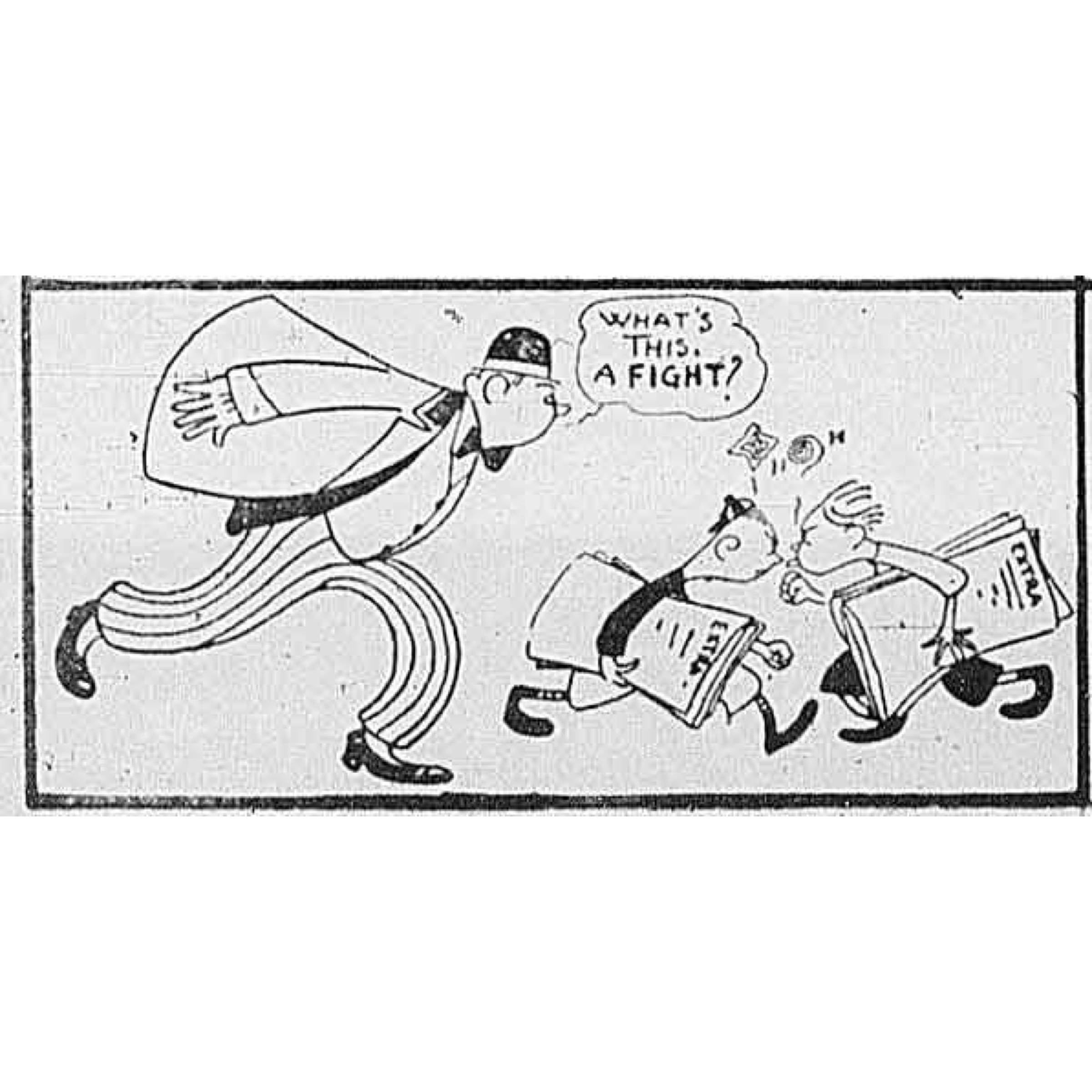
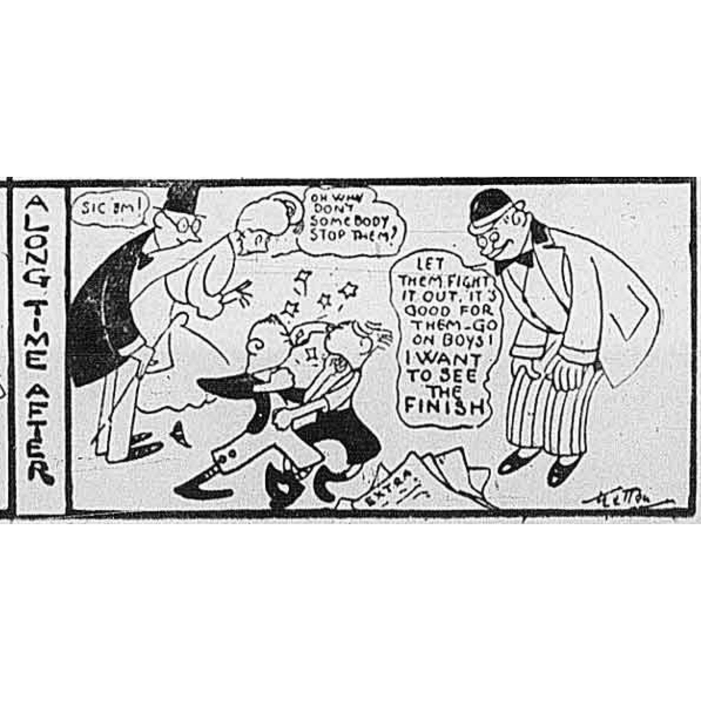
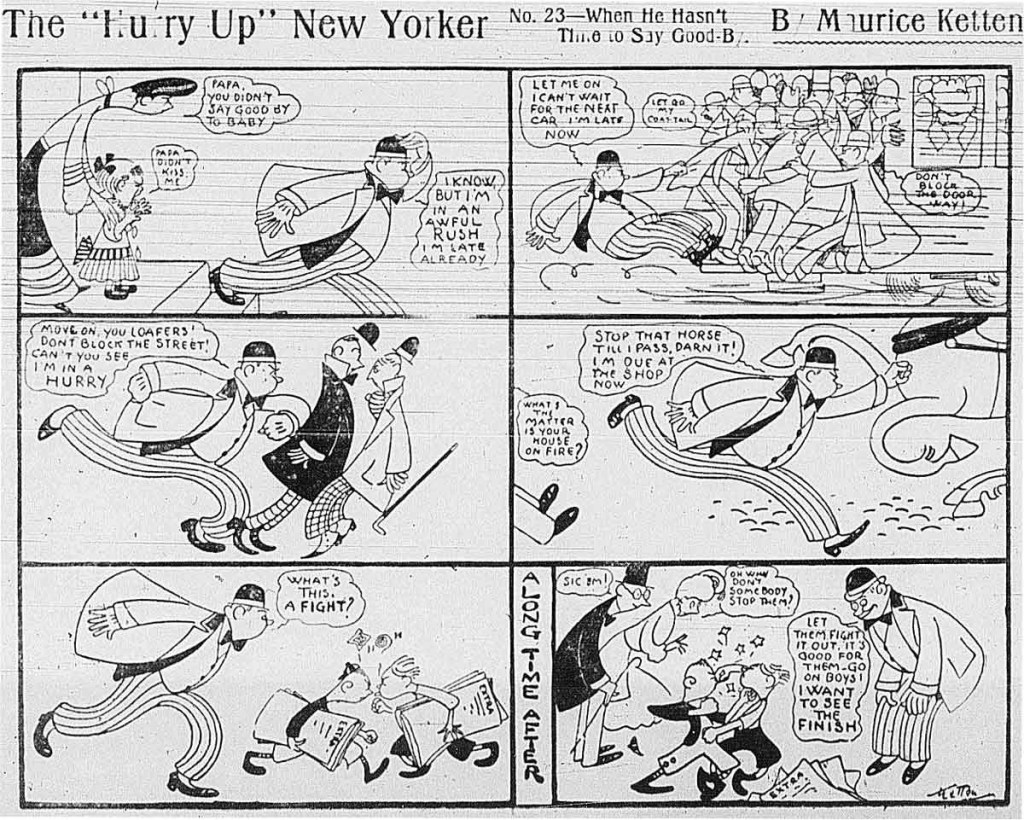
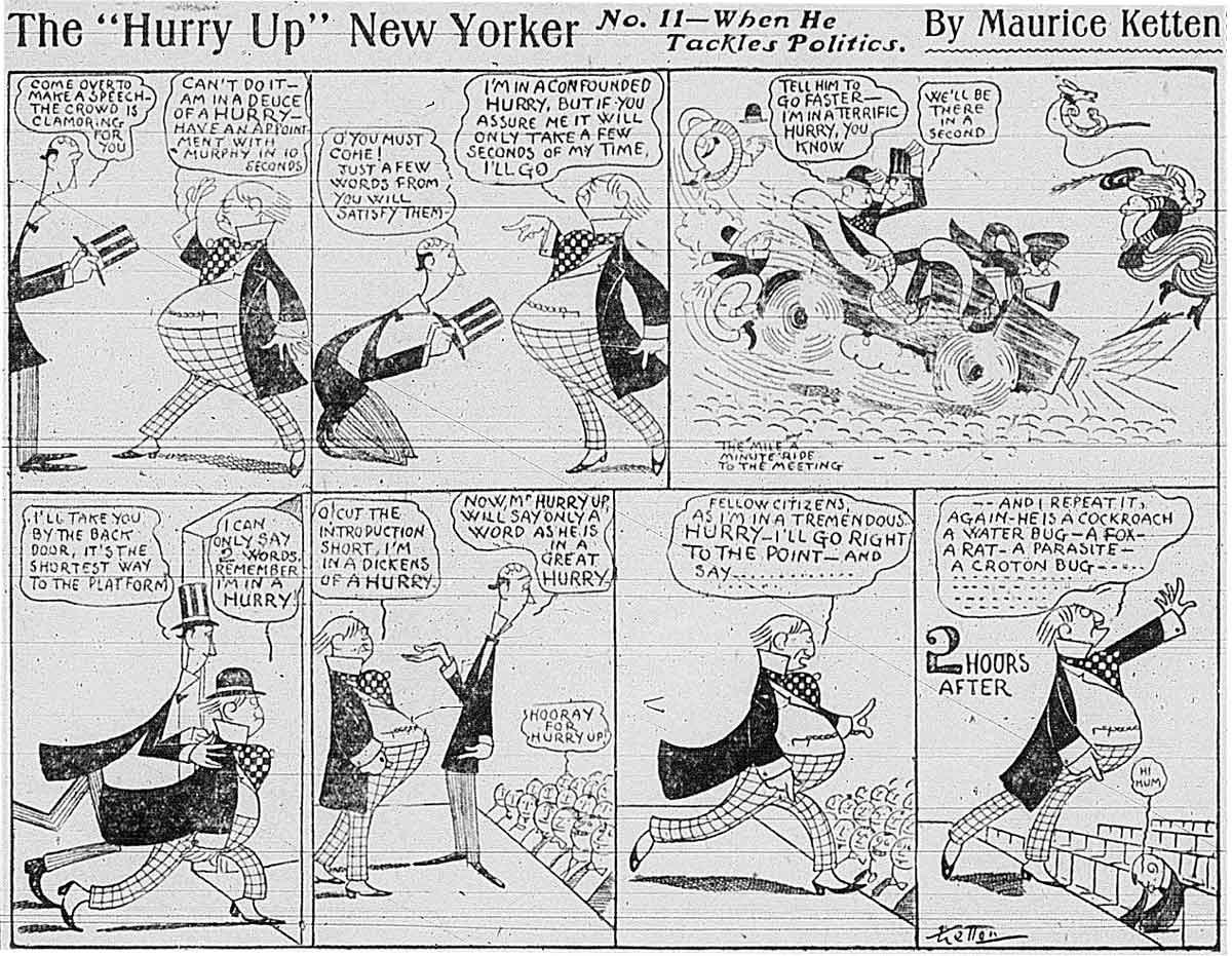
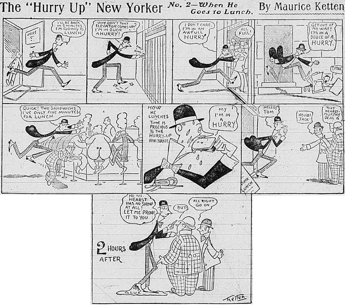
The modern (circa 1910s) middle-class New Yorker pushing arrogantly through family, workers, pedestrians, crowds, even his or her own children – is the simple trope driving Maurice Ketten’s 1906 month-long run of Hurry Up New Yorker in the New York World. Ketten projects this trait onto a range of characters, male and female, across the brief run, but reiterates a core hypocrisy as the central gag. The final panel sees the harried and busy urbanite suddenly finding the time to watch a street fight, monitor a football score, gossip with a friend, watch a fire.
The basic insight about Hurryupism is as relevant today as it was then – the pomposity (and hypocrisy) of the urban striver and using the appearance of busyness as a bit of ambition-signaling. It is the kind of personality tic that comics have always been especially good at satirizing.
But it is Ketten’s visual style that makes this series so entrancing. His rubber-legged characters, his even, thin art nouveau line, the forward bends and slopes of his figures all embody the motion, momentum, sleek modernity of the city itself. The visual style is so expressive of a certain modern sensibility itself.
The kinetic energy of his style and its urban expressiveness is clear in the way it courses across the half-page layout. What a lovely use of arcs across forward-moving figures. check out the way he uses a clutter of bent legs to depict a clot of humans at the train car door. Or the way the arcs of the rushing businessman is echoed in the two men he bumps during his heedless rush. And I love the elastic legs of the startled horse in the following panel. Ketten typifies what I consider one of the core appeals of the comic strip in its first two decades; so many of its artists caricatured the new city experience in ways that helped map out that unfamiliar experience for many Americans. They offered ways of seeing and making sense of that environment.
It is not surprising then that Maurice Ketten was a pseudonym for Florentine emigre Propser Fiorini who was more than familiar with the modernist art styles he echoes here. Fiorini studied art at the École des Beaux Arts in Paris, France. Coming to the U.S. around 1906, according to Lambiek’s index of comic arts, he started experimenting with a range of comic ideas for Pulitzer’s New York World and would eventually become better known for the long running Can You Beat It? (1907-1934).
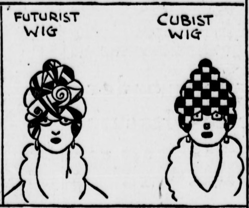
And Ketten/Fiorini’s understanding of modern art styles was made clear in a clever one-panel he did during the 1910s lampooning European art movements.
The Hurry Up New Yorker is one of the many fleeting experiments in comic arts in this first decade of the form, but it brings some fresh perspectives on the urban and personality tropes that characterized so much of early comics. Like many strips in this second decade of the form, it is a single joke repeated regularly. The most popular strips of the day riffed on a weekly or daily basis on a single gag: the Katzenjammers’ prankishness, Happy Hooligan’s well-meaning haplessness, Mr. Jack’s infidelity, Buster Brown’s impishness, Sammy’s sneeze.
In this case, however, Ketten’s strip addresses two of the ways comics reflected on modern culture and change – the city and individual character. As I have argued in other posts about Walt McDougall and his city visions, R. F. Outcault and The Yellow Kid, and Winsor McCay’s use of the urban environment of the day, the fabulous popularity of the comic strip lay in part in its unique power to interpret the experience of the new urban setting. Likewise, early strip artists were preoccupied with deciphering the social types that comprised the city crowd. And so we see so many strips that focused on specific types, personal foibles, obsessions, behavioral tics. forgetfulness, sneezing, infidelity, frugality, braggarts, grumps, henpecked husbands fueled many of these one-gag strip ideas.
Props to the indispensible Barnacle Press site for collecting the Hurry Up New Yorker strips. You can see more of the run here.
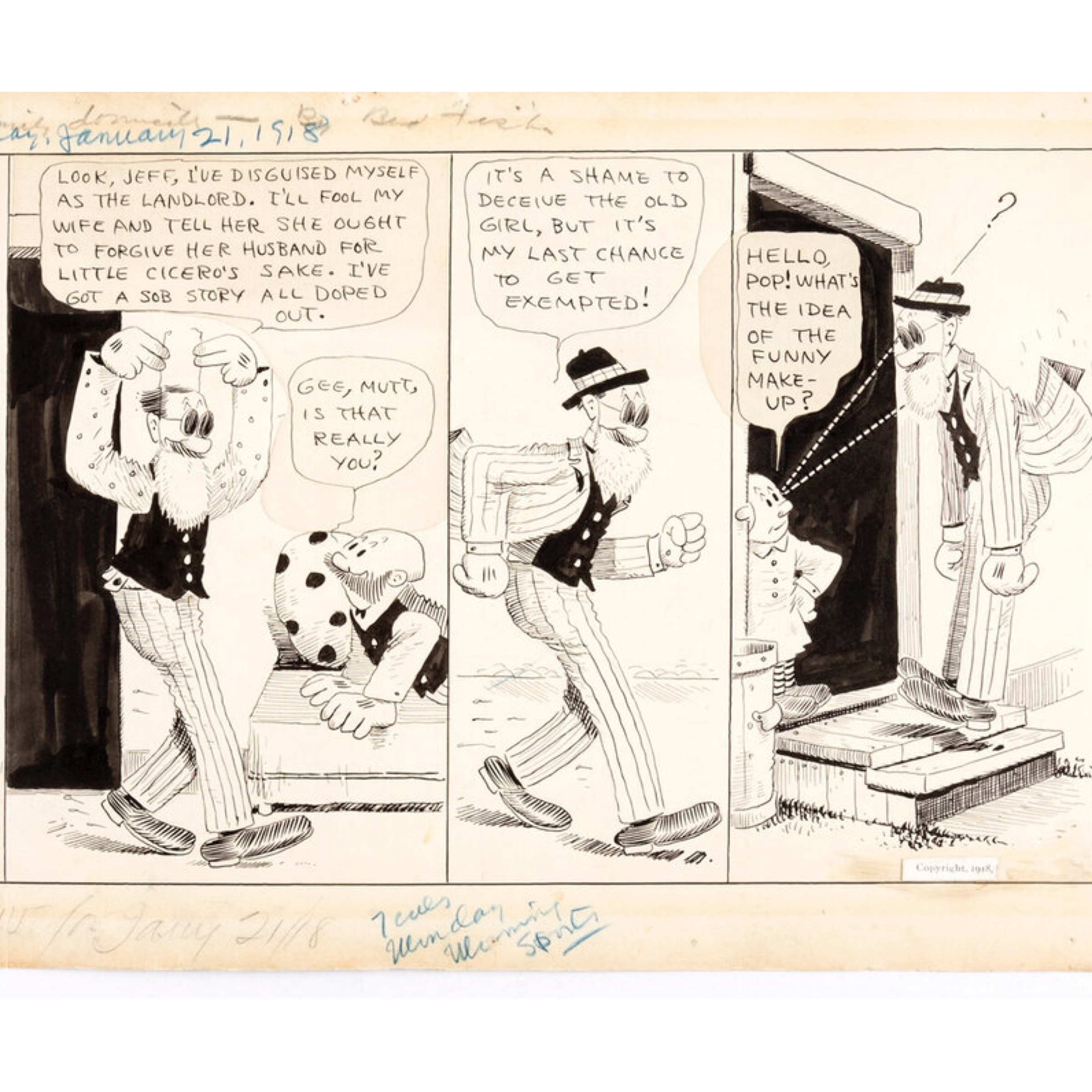
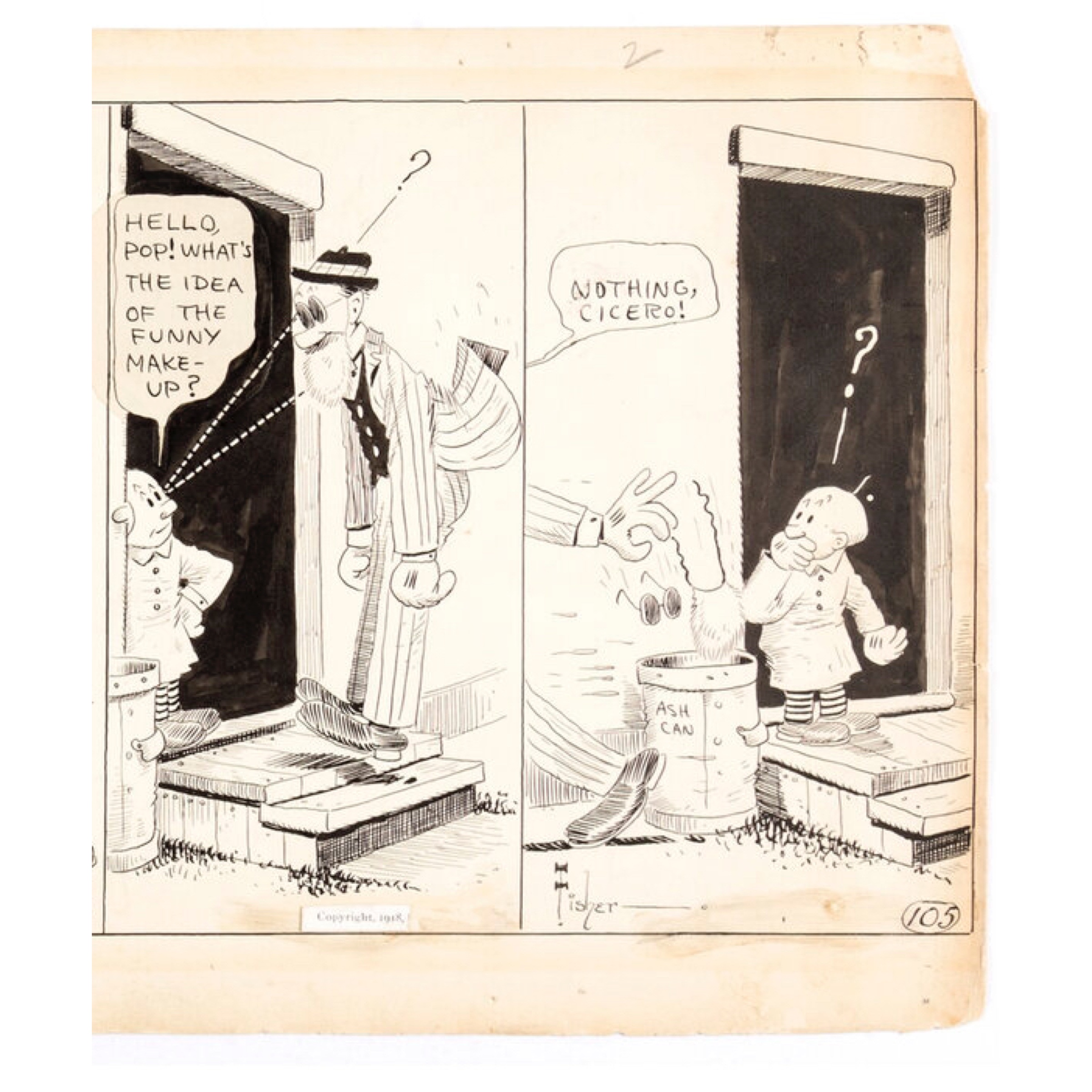
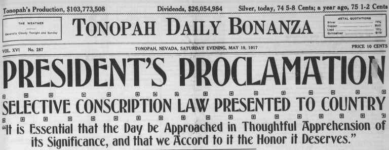
When Woodrow Wilson and Congress formally declared war on Germany in 1917, many Americans remained lukewarm on involvement. Volunteers for getting gassed and shot in the muddy trenches of the French front fell far short of goals. More persuasion was needed. And so Congress invoked the draft with the Selective Service Act that men to register for a draft lottery. Bud Fisher’s Mutt and Jeff registered continued ambivalence in this Jan. 21, 1918 strip in which both characters muse on draft exemption strategies. For Jeff this involves reuniting with his estranged wife.
This is a great example of what critic Gilbert Seldes meant when he cited the unique grittiness of the comic strip. The rest of America is gearing up a massive propaganda machine to whip up patriotic fervor for a dubious venture. In the world of Mutt and Jeff, however, self-interested scheming, the stuff of humanity, is a given. At their best, newspaper comics offered counterpoints to all of the news that preceded them in the daily newspaper simply by localizing and personalizing the political and civic coverage in the rest of the news.
This strip is scanned from Fisher’s original art. More on Mutt and Jeff’s first meeting here.
The great, woefully under-appreciated American culture critic of the early 20th Century Gilbert Seldes remains my own North Star of pop culture criticism. I could go on forever about this guy, and almost did. I started researching a biography of him and his critical legacy, but Michael Kammen beat me to it with his fine 1996 evaluation of Seldes’ life and work. Still, my own appreciation of Seldes’ open, democratic spirit of criticism is a bit different from Kammen’s, even if I didn’t feel at the time that the world needed a second book-length study of the man. I explored some of those ideas in an essay Tom Heintjes kindly published in Hogan’s Alley No. 6 in 1999. It is reprinted below. I will also post soon Seldes’ original take on Krazy Kat and the comics generally from 1923’s The Seven Lively Arts. Almost a century later, I still think Seldes’ early observations about the unique aesthetic and cultural qualities of the comic strip remain indispensable to anyone trying to appreciate the form. – Ed.
The Critic That Walks By Himself
The longtime and often lonely historians of the American comic strip have enjoyed an embarrassment of riches in recent years. What with centennial exhibits, commemorative postage stamps, some truly luscious reprints of seminal work and even—God help us—occasional academic scrutiny, the comic strip form seems poised to assume a place among the “respectable” mass media. But assembling the history of any medium, including the comic strip, requires more than rediscovering its primary documents, however fun that may be. A rich chronicle of an art form must also recount how the medium integrated itself into people’s lives, how it was understood and debated. In America, such a history must begin with the first thoughtful and genuinely critical celebrant of the modern popular arts in general and of the comic strip in particular. He was more responsible than any single American for getting common readers and other intellectuals to think about the comics that they enjoyed. Gilbert Seldes (1893-1970) was the father of comic-strip criticism, and his insights about the form represent an alternative, albeit now largely overlooked, path in the serious appraisal of our national pleasure.