Why don’t we hear more of the marvelously talented, witty, prolific American cartoonist Gladys Parker (1908-1966)? She was the mother of the long running strip and comic book character Mopsy. More than that, Parker was among the better-known cartoonists of the day, in part because she was also a fashion designer to both the general public as well as Hollywood stars. Meanwhile, Parker was a frequent item in the celebrity gossip columns of the 1940s as she dated a noted boxer and character actor.
Why don’t we know more about Gladys Parker? Well, obviously for the same reasons we don’t know more about Nell Brinkley or Ethel Hays or Jackie Ormes, despite the high quality of their work and substantial public profile in their own day? Not only has the comics field itself been overwhelmingly male dominated, but its history has been written almost entirely by men. And yet, as I myself encounter these overlooked artists as I make my way through comics history, I am struck by their singular visions, how different their aesthetic and social perspective were from their male brethren. To miss these women in our history of the medium is to narrow our understanding of the rich creative range the comic strip reached in the last century. Brinkley used color, facial and emotional expression, line, the contours of the Sunday comics page in ways no other artist did in the 1910s and 1920s. Ormes’ racial satire was sharp and blunt at a time when American needed it desperately. And Parker brought the feminine wit of Hollywood romantic comedy into the comics page and merged the aesthetics of fashion with those of the comic strip into a drawing style that was unlike any other on the comics page.
While it goes without saying that Hal Foster was a much more buttoned down, stiff and restrained adventure artist than the ebullient Alex Raymond, he had his moments of gratuitous cheesecake. Here, from some 1939 sequences, Prince Valiant strips down for some manly bathing.
Hal Foster was never shy about pouring on the bloody swords, celebrations of battle, corpse-coated fields of war. In fact some foreign markets censored the strip when they felt Prince Val’s love of war crossed the line. But showing skin? Not so much.
Even comics aficionados barely recall the very popular aviation adventure strips of the late 1920s and 1930s, perhaps because, well, they just weren’t very memorable. Tailspin Tommy, Scorchy Smith, Smilin’ Jack, Flyin’ Jenny, and Skyroads, to name a few, were definitely of their time, tapping into the most romantic technology of early 20th Century – aviation. The wild tales of WWI air battles, the triumph of machine and human endurance in Charles Lindbergh’s solo crossing of the Atlantic, the mystery of Amelia Earhart’s disappearance fueled film, pulp magazines, and even popular science journals with an admixture of human spirit, adventure to far off lands and technical jargon that many audiences, especially boys, ate up. The strips captured that blend. Many of them were created by pilots who brought their love and knowledge of flight to the strips. Much of the art was unremarkable. Noel Sickles’ work on Scorchy Smith was a legendary exception, and Russell Keaton had a polished and breezy style in Flyin’ Jenny. For the most part, however, aviation cartoonists were more in love with the planes than their own characters, and they tended to focus effort and attention on the planes themselves.
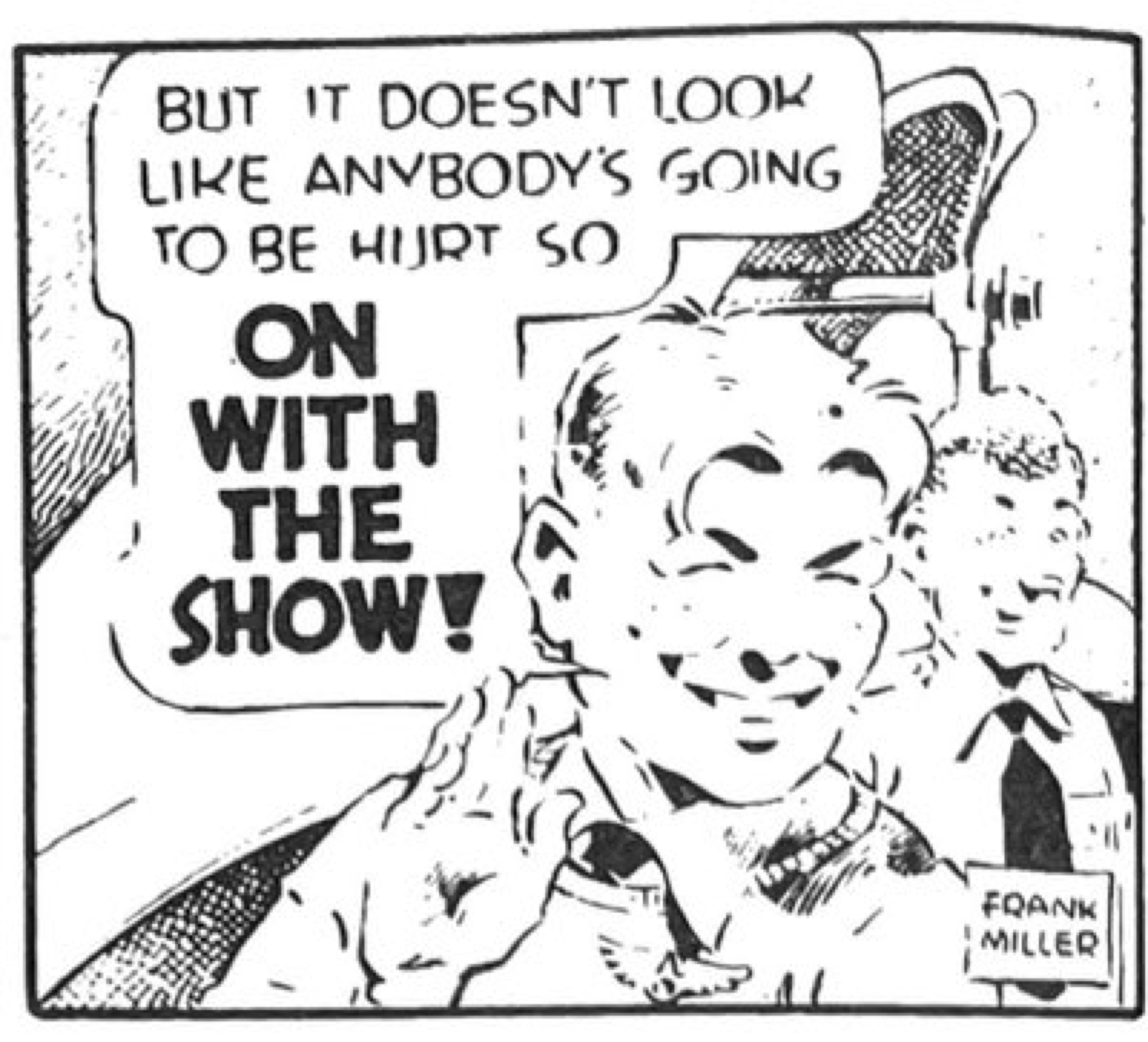
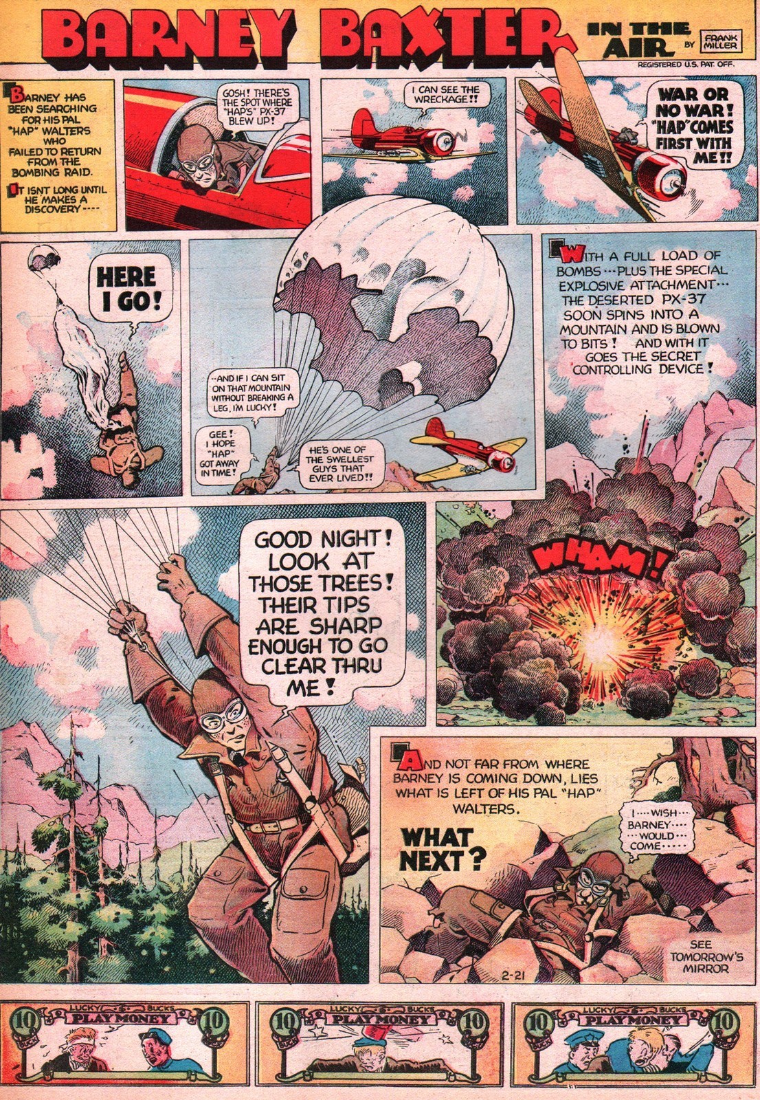
Frank Miller, however, brought Barney Baxter in the Air (1935-1949) a special whimsy to the genre both in his characterizations and line work. From the Art Deco/Machine Age feel of his lettering to the rounded nature of his figures, everything about this strip feels sophisticated, considered, modern . His faces are comprised of a few deft dabs of ink. The upholstered texture of his people and objects are somewhere between big foot cartooning and classic adventure realism. And this allows him to bring his style to either extreme as it fits the scene. It reminds me of (or foreshadows) Rick Geary, whose style I also love. Miller is adept at using a variety of panel framings to keep the eye energized across the progression. His narrower close-up panels call out important moments of gesture or expression. And he has such a stylized way of rendering shadows in a pointillist style. It all adds up to a visual signature that light, witty, and yet functional as a vehicle for adventure. The feel is similar to Capp’s Li’l Abner.
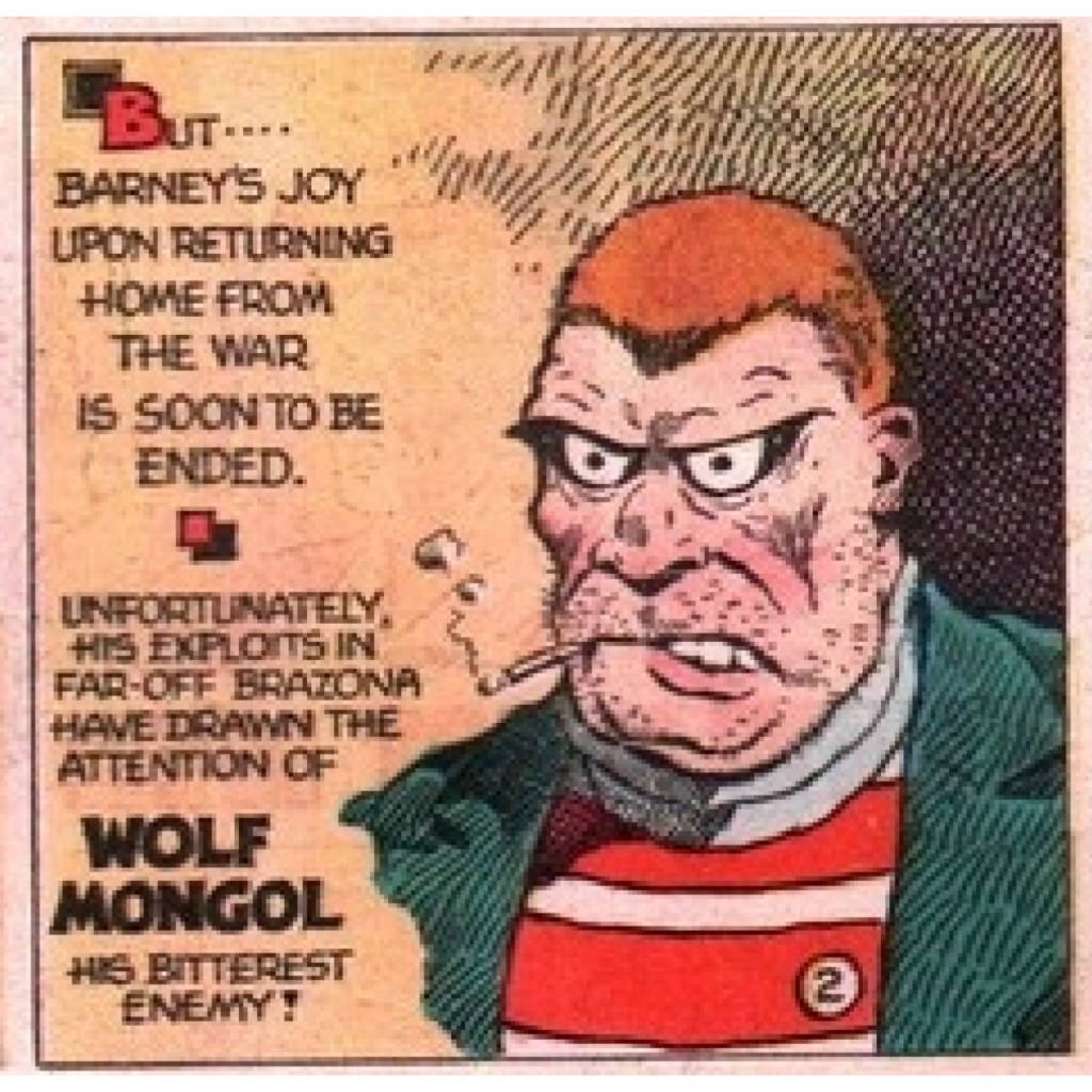
His skills often came together in some truly creepy villains.
Miller lavishes attention and invention on his Sunday pages. He is breaking frame, manipulating panel shapes and sizes with the kind of energy we usually associate with McCay, King or Sterrett. The detail and color in his rocky backgrounds are just wonderful for establishing setting. He maneuvers our point of view radically from panel to panel to bring us into the scene by circling us around it. And just look at that open parachute as the visual centerpiece of the whole layout. If that isn’t an homage to McCay, I don’t know what is.
Frank Miller, obviously not the Frank Miller of later comic book fame, ran the strip throughout its 15 year span and until his premature death in 1949.
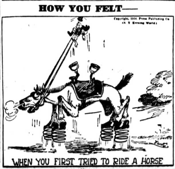
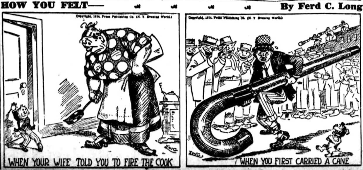
I don’t know who this Ferd. C Long was, nor how long the engaging “How You Felt” strip ran. But it captured me instantly as a great example of early cartoon experiments that explored some of the unique qualities of the new medium. The great team at Barnacle Press, who nobly harvest every scrap of early comic strips they can, gathered these. Like many strips of the day, it took up a simple single conceit – in this case using visual exaggeration to capture a feeling. The result is a fantastic surrealism that communicates in a singular way a range of small and common responses to the world.
Comic disharmony between Jiggs and Maggie over their social climb was the central joke of George McManus’s Bringing Up Father for over four decades. For all of McManus’s fine sense of humor, he banged that one note across four panels six days a week and a full page every Sunday. To be sure, he layered in nuances of class and generational conflict. Jiggs was a hod carrier who struck it rich, never adjusted to his own ascent, and clashed with wife Maggie and daughter’s ambitions to join the social elite. The dynamic was rich with potential and embodied the experience of millions of American emigrees moving into the modern middle class. But many of the daily strips tediously replayed Jiggs’s sneaking out to his former watering hole Dinty Moore’s, embarrassing his family with etiquette transgressions or ducking Maggie’s thrown dishes. These were conventions that American newspaper readers enjoyed hearing for a handful of panels and 30 seconds a day over its 87-year run. McManus, however, was especially adept at maintaining reader interest in the familiar with his mastery of visual style, panel sequencing and timing.
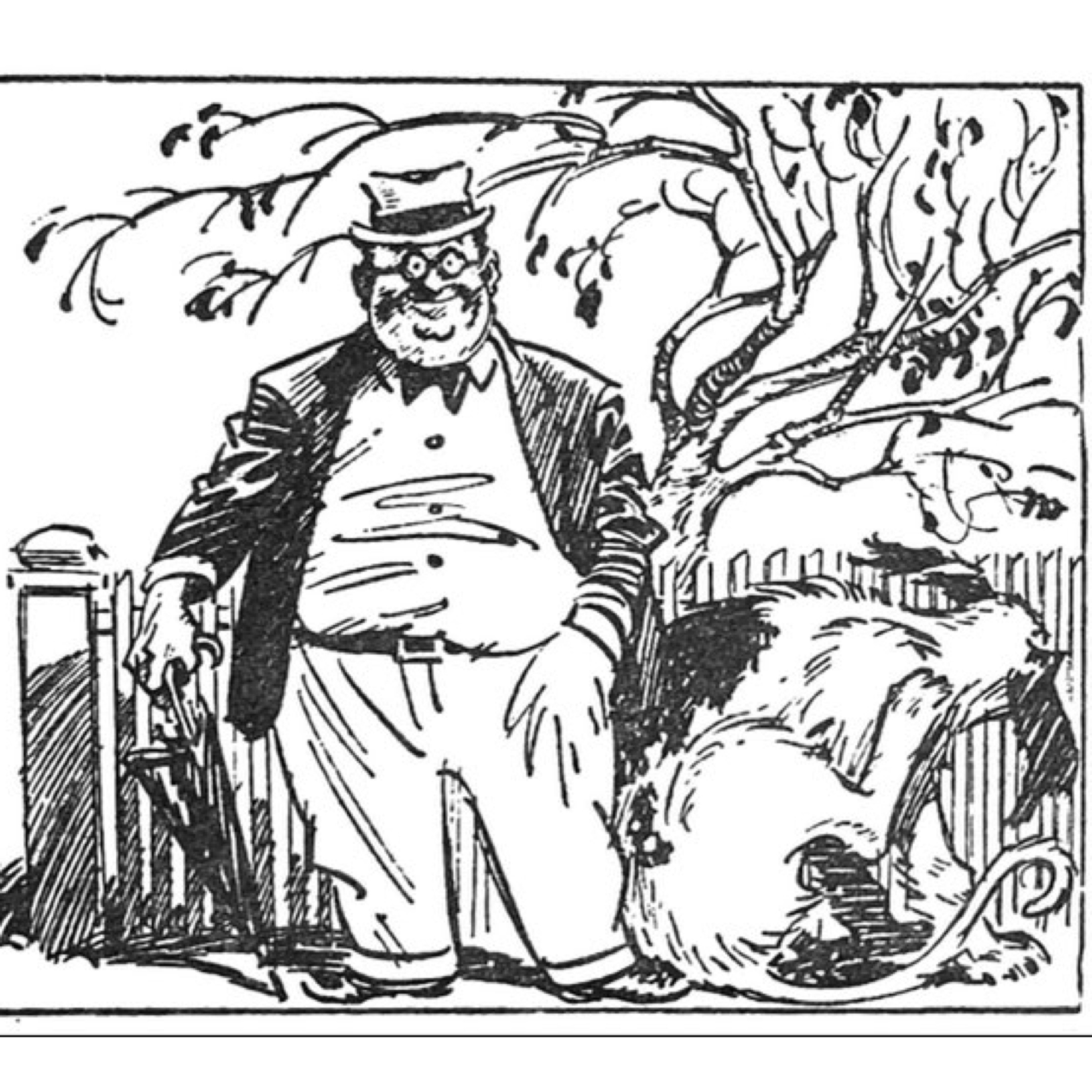
Clifford McBride’s portrait of the affable, accident-prone and corpulent Uncle Elby and his puckish oversized dog Napoleon is one of those great American comic strips that are about nothing. There is no adventure or much of an ongoing storyline to the Napoleon and Uncle Elby strip. Nor are there gags, verbal or physical, really. It is more a strip about everyday mishaps. Uncle Elby is proud of his new white suit, which an affectionate Napoleon meets at the the front door with muddy paws. Constructing a simple tent results in a tangled mess. Napoleon chases a fleeing rabbit, chicken, cat or whatnot (it’s a frequent theme), only to be chased by his prey in the end. Elby mows over one of his dog’s hidden bones, which conks him on the bean. Elby gets out of his car to open the garage door only to have it slam shut before he can drive through.
No, really, the action in the Napoleon strip is that banal and trifling…relentlessly…and apparently by design.
By 1937, Harold Gray seemed to have fallen into an especially foul mood. It was several years into his nemesis F.D.R.’s “New Deal,” which Gray felt represented everything he and his “Little Orphan Annie” disdained: social uplift, misguided do-gooders, institutional authority. From the start, Gray was never shy about voicing his populist perspectives and what he saw as core agrarian values of self-reliance, individualism, and deep suspicion of government bureaucracy of all sorts. His chief scholar, Jeet Heer, has done a much better job than I can here outlining Gray’s vein of Populism and how it ran much deeper than knee-jerk reactionary conservatism. And I have argued in these posts how Gray’s cultural politics were grounded in familiar mid-western traditions and a tension between 19th Century values of “character” and 20th Century notions of “personality. But it is clear that in response to FDR and the popularity of the New Deal Gray got more radical and vocal about his views. And perhaps not coincidentally, the strip grew even darker in the later 1930s.
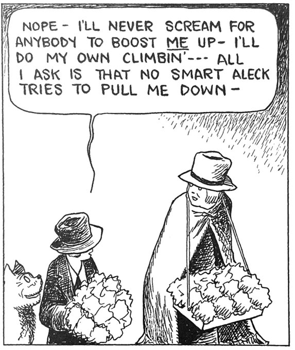
As Here argues in the introduction of the 7th volume of the Library of American Comics reprint series, Annie was always a gritty, street-smart tale, but Gray usually kept physical violence off-panel. Yet, as the strip approached its creative height in 1936-38, that violence started moving into frame. Heer argues that Gray likely was responding to world conflicts, a greater personal sense of mortality as well as competition from more action-oriented strips that dominated the 1930s. I think Gray may also just have been growing angrier and more resentful towards a culture from which he felt ever more alienated. Gray’s moral vision was always as as simple and plainspoken as his drawing style – venal villainy countered by saccharine sentimentality. But it is clear, Gray was getting darker and seeing the world in starker ways by 1936. In fact the lead-up to one of the most jarring bits of in-panel violence in Little Orphan Annie begins with a remarkable Sunday strip on Oct. 8, 1936 that maps the modern world as a perennial “jungle” of predators and good-hearted strivers. As Annie’s newfound friend and flower-seller Ginger, reflects, “But the rules are still jungle – the survival of the fightingest.”
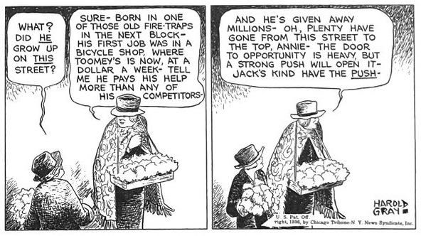
In the coming weeks, Gray uses Ginger as his populist mouthpiece. Annie had always been a chatty strip to begin with, but in these months the moral bromides, punditry and snide asides crowded most panels. Gray clearly had a lot to get off of his chest…about the corruption of politicians and lawyers and their collusion with thugs…about the mixed motives of “uplifters”…about the productivity and generosity of earned wealth…the moral hazard of handouts and unearned wealth. Gray was not a simplistic or sentimental reactionary. He had relatively progressive racial views. And as he outlined through Ginger in these months, his sense of individualism was a principled rejection of the sociological generalizations he saw driving a lot of reformist uplift and welfare. His populist sociology rejects environment as determinative of behavior.
No one ever accused Harold Gray of subtlety. Annie was as much folk punditry as it was an adventure. But he was artful, albeit dogged, in creating opportunities for his avatars to voice another homily. A street fight triggers bromides on rising out of the “hard kindergarten” of the streets. Passersby making an offhanded comment on these city kids not getting a chance in life set up Ginger’s counter-argument about the dangers of unearned advantage. Meeting an old friend lets her reflect on the morality and generosity of earned wealth. And all of this in just three strips.
Gray’s wordiness can divert us from his considerable and evocative graphic skills. He visualizes his principles and arguments that are as clear and un-subtle as his ideology. The street scenes in the Oct. 26 strip above illustrate the teeming diversity, the danger, raw violence of the city as well as the individuality of the humanity he sees there. That third panel depicting the “rushing tide of life” expresses at once a suffocating crowdedness and individuation.
Gray’s visual voice was singular and somehow it succeeded in establishing his mixed view of humanity, society and the cosmos. His laudable human figures were usually solid, husky and well-planted. Annie herself has tree trunk legs that look and feel organically rooted in much the way his friend Chester Gould like to plant Dick Tracy in the frame. It is the visual embodiment of self-reliance and resilience. The infamous hollow eyes of Gray’s cast underscore how little he and many other daily cartoonists relied less on facial expression and more on words, composition and action in a frame to express feeling. Much like Frank King and Gasoline Alley, Annie visualized the plain spoken style of its creator.
While they were very different artists, to be sure, Gould, King and Gray had visual voices that helped define the worlds we were in for those three or four daily frames. That to me is one of the comic strips’ singular aesthetic qualities, to establish diverse and distinct fictional worlds through these signature styles. For Gray it took the shape of bulky, pillowy figures that lived in a 2D world of little forced perspective or even movement. Gray’s characteristic hatch work helped communicate a grimness to his worldview – the persistence of shadows. Arguably, he did not have the stylistic talent or range of many peers. King had a great sense of panel pacing and rhythm, a feel for place and landscapes, he used relentlessly. Gould leaned heavily on his penchant for muscular action, grotesque violence, forced perspective and those vast planes of inky blacks.
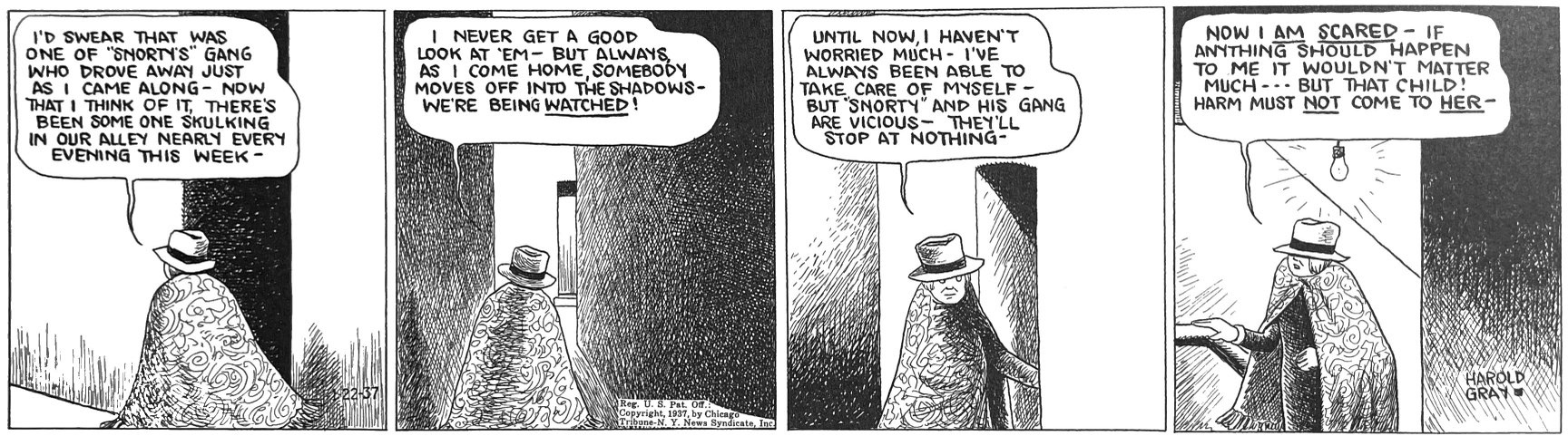
Gray flexed his style sparingly. But he was capable of great visual power. In the run up to the tragic violent death of flower lade Ginger, we get this gorgeous showcase of crosshatched planes, light-source, and cross-cut pace that feels like German Expressionist film.
The local gang of hoods target Ginger because she refuses to pay into their protection racket. Her graphic murder that comes days after the foreboding strip above is a rare instance of a Gray panel exploding in explicit violence.
It is probably best that Gray depicted violence so sparingly. He wasn’t very good at it. But this moment is of a piece with the months of the strip’s immersion in the modern city and its many musings on the modern “jungle.” And it embodied the emotional energy, perhaps even the anger and pessimism that seemed to drive what many comics historians regard as his creative peak in the storylines and characters in the last half of the 1930s.