
Even comics aficionados barely recall the very popular aviation adventure strips of the late 1920s and 1930s, perhaps because, well, they just weren’t very memorable. Tailspin Tommy, Scorchy Smith, Smilin’ Jack, Flyin’ Jenny, and Skyroads, to name a few, were definitely of their time, tapping into the most romantic technology of early 20th Century – aviation. The wild tales of WWI air battles, the triumph of machine and human endurance in Charles Lindbergh’s solo crossing of the Atlantic, the mystery of Amelia Earhart’s disappearance fueled film, pulp magazines, and even popular science journals with an admixture of human spirit, adventure to far off lands and technical jargon that many audiences, especially boys, ate up. The strips captured that blend. Many of them were created by pilots who brought their love and knowledge of flight to the strips. Much of the art was unremarkable. Noel Sickles’ work on Scorchy Smith was a legendary exception, and Russell Keaton had a polished and breezy style in Flyin’ Jenny. For the most part, however, aviation cartoonists were more in love with the planes than their own characters, and they tended to focus effort and attention on the planes themselves.
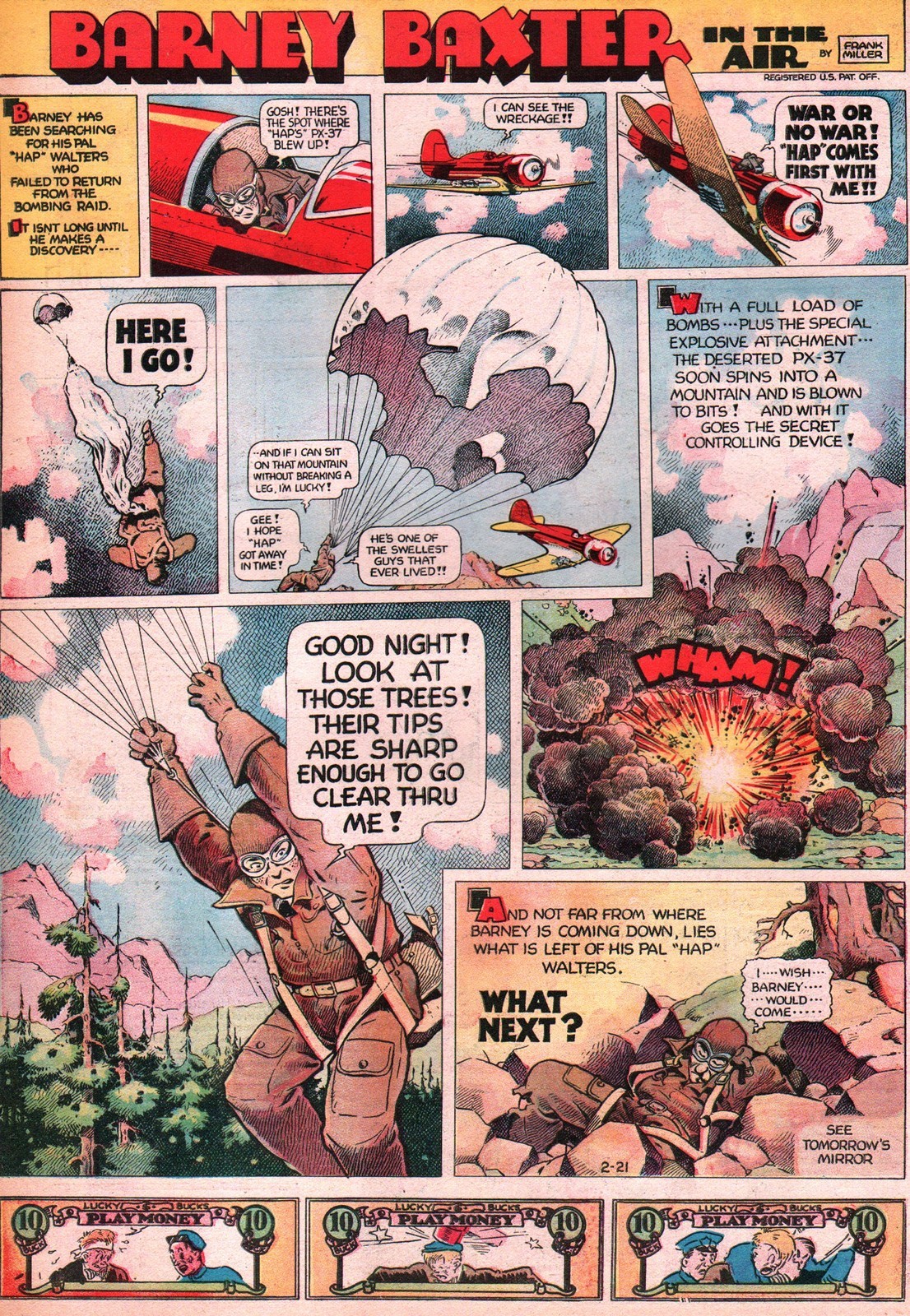
Frank Miller, however, brought Barney Baxter in the Air (1935-1949) a special whimsy to the genre both in his characterizations and line work. From the Art Deco/Machine Age feel of his lettering to the rounded nature of his figures, everything about this strip feels sophisticated, considered, modern . His faces are comprised of a few deft dabs of ink. The upholstered texture of his people and objects are somewhere between big foot cartooning and classic adventure realism. And this allows him to bring his style to either extreme as it fits the scene. It reminds me of (or foreshadows) Rick Geary, whose style I also love. Miller is adept at using a variety of panel framings to keep the eye energized across the progression. His narrower close-up panels call out important moments of gesture or expression. And he has such a stylized way of rendering shadows in a pointillist style. It all adds up to a visual signature that light, witty, and yet functional as a vehicle for adventure. The feel is similar to Capp’s Li’l Abner.

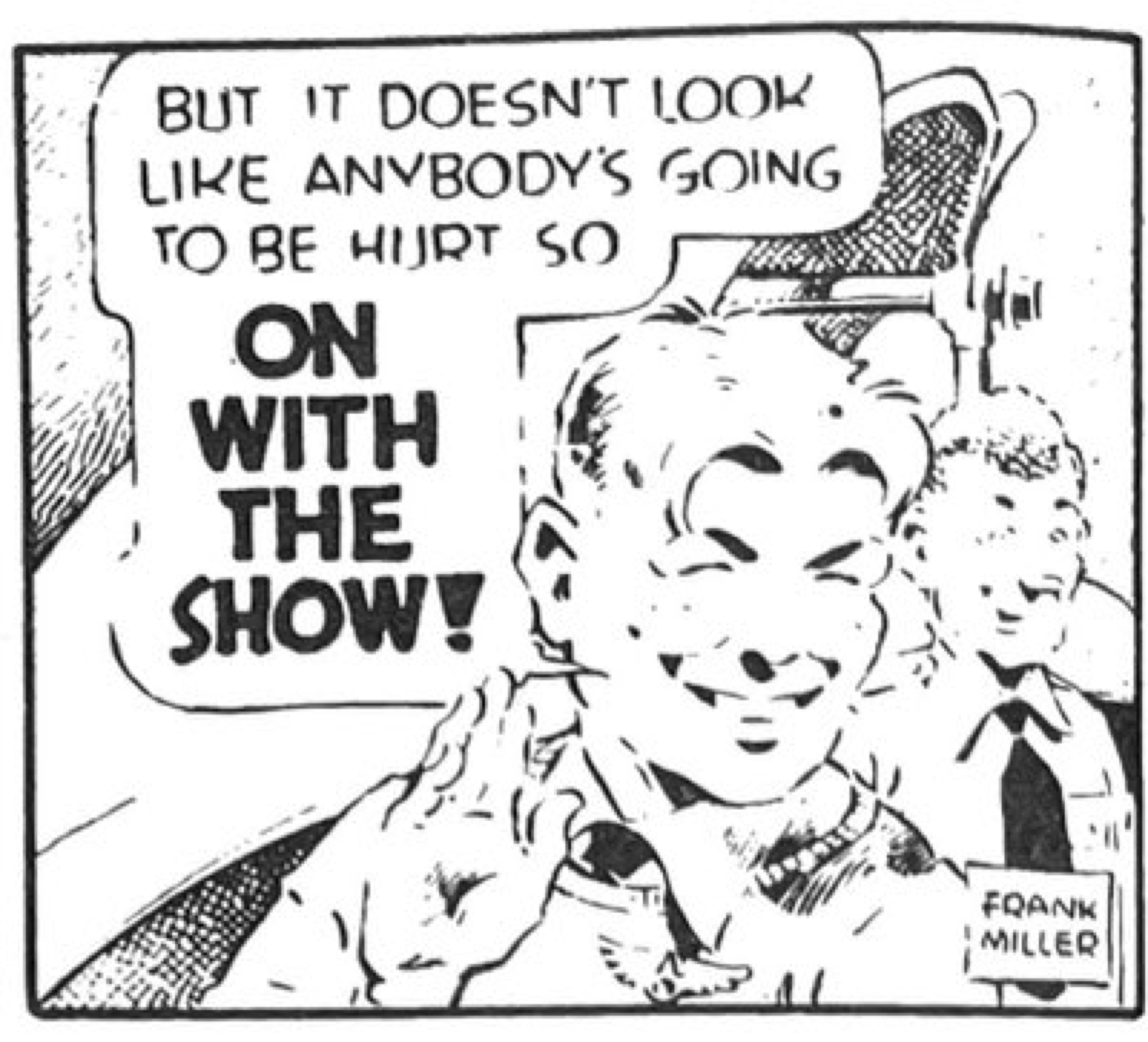
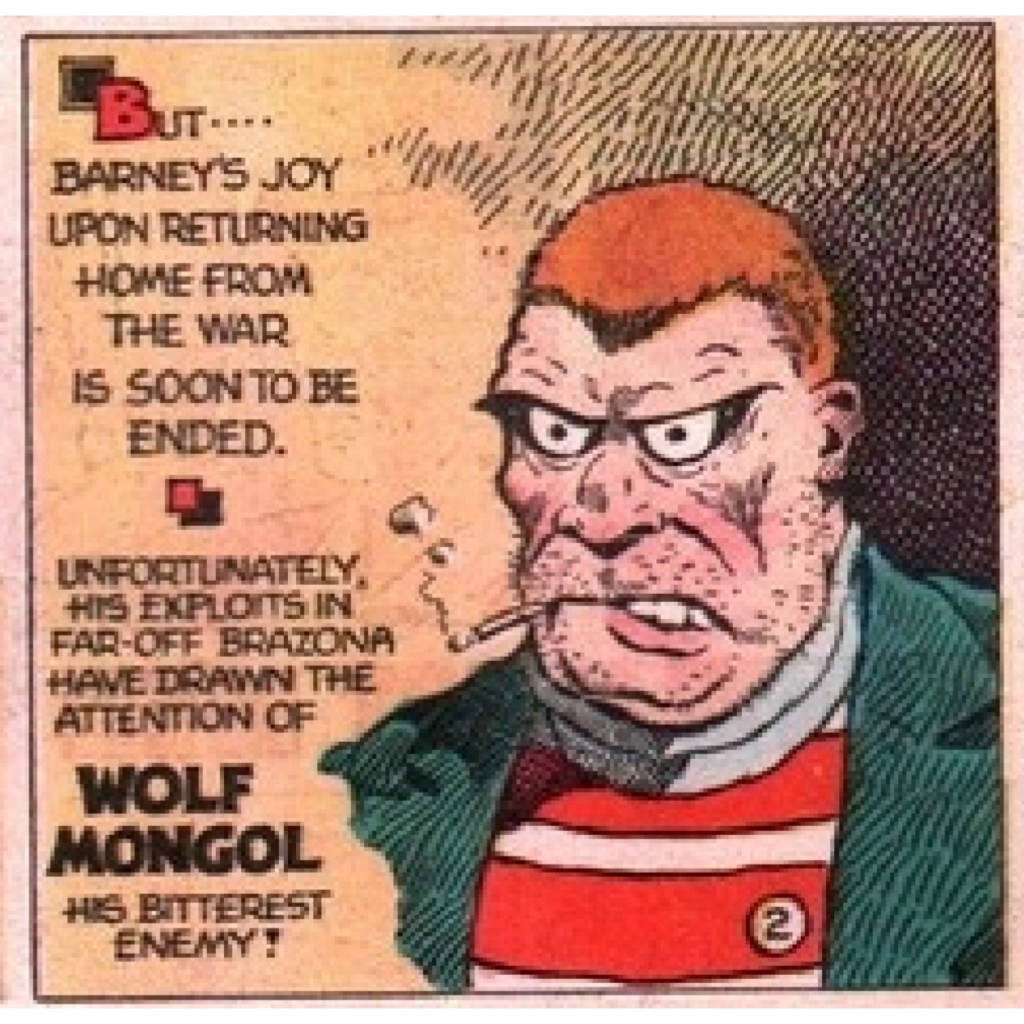
His skills often came together in some truly creepy villains.
Miller lavishes attention and invention on his Sunday pages. He is breaking frame, manipulating panel shapes and sizes with the kind of energy we usually associate with McCay, King or Sterrett. The detail and color in his rocky backgrounds are just wonderful for establishing setting. He maneuvers our point of view radically from panel to panel to bring us into the scene by circling us around it. And just look at that open parachute as the visual centerpiece of the whole layout. If that isn’t an homage to McCay, I don’t know what is.
Frank Miller, obviously not the Frank Miller of later comic book fame, ran the strip throughout its 15 year span and until his premature death in 1949.
Discover more from Panels & Prose
Subscribe to get the latest posts sent to your email.

Nicely researched and written article. Thanks!