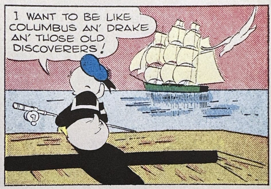
Shelf Scan 2025: That Modern Look

Two of my favorite books this year were not about comics specifically but about the larger visual culture in which comics emerged during the first half of the American 20th Century. Christopher Long’s overview of commercial graphic ideas, Modern Americanness: The New Graphic Design in the United States 1890–1940 takes us from the poster art craze of the 1890s to the streamlining motif that flourished in  late 1930s graphic storytelling. And Ennis Carter’s Posters for the People: Art of the WPA reproduces nearly 500 of the best posters from the New Deal-funded Federal Art Project of the 1930s. Between the two books we peer into a comics-adjacent history of commercial art and how it was incorporating design ideas that expressed the experience of modernity and absorbed some of the artistic concepts of formal modernist art. Although neither book mentions cartooning per se, their subjects are engaged in the same cultural project as cartoonists – to find visual languages that capture and often assuage the dislocations of modern change.

Continue reading

2025 Comic Reprints: Rediscovering Lost Classics

We have already reviewed some of the major 2025 comic reprint releases from major publishers: the reissue of Sunday Press’s Society is Nix, the anniversary celebrations of  Peanuts, Hagar and Beetle Bailey as well as Cathy, and the resurfacing if Rea Irvin’s The Smythes. But this year saw a number of self-publishers bring back everything from Sky Masters of the Space Patrol to Milt Gross. I wanted to devote one round-up that highlights these laudable efforts and the often-obscure treasures they have unearthed.

Continue reading

Does This Zeitgeist Make Me Look Fat?: An Overdue Appreciation of “Cathy”

Across five decades of adulthood, every woman I have ever known was familiar, often intimately, with Cathy Guisewite’s Cathy (1976-2010). Our heroine’s struggles with new and old gender roles, the pressures of fashion and body messaging, diet trends, new tech, workplace culture…and MOM, always MOM, found their way into more diaries, onto more refrigerators and clipped into mother/daughter exchanges than any comic of its day. Tis a pity that so many of us male comics readers passed it over as “not for us” or simply unfunny. Spending a couple of days immersed in the new and most welcome 4-volume Cathy 50th Anniversary Collection ($225, Andrews McMeel) makes clear that Cathy was among the most insightful, witty and intelligent strips we had about the experience of post-counter-culture America. And I could have avoided a lot of stupid missteps with the women in my life if I had paid even glancing attention to Guisewite’s wisdom.

Continue reading

Shelf Scan: Celebrating Peanuts, Beetle Bailey, Hagar and Donald

Before Thanksgiving and the shopping season overcomes us, let’s make sure we start our annual Panels & Prose quick takes on recent books for comic strip fans. The pile of new releases is high and teetering, so let’s break this down into several posts this week and next. Today, we handle the celebratory and anniversary collections involving Peanuts, Hagar, Beetle Baley. For a hands-on look at these books, look for the video “Quick Flip” at the end.

Continue reading

Our Snooty Neighbors: When The Smythes Moved In

If you let the original art designer of The New Yorker loose on the Sunday comics page, then Rea Irvin’s The Smythes is pretty much what you would expect to get. For six years in the early 1930s, Irvin rendered the foibles and class anxiety of upper-middle class ex-urbanites Margie and John Smythe with impeccable Art Deco taste and reserve. Could we get anything less from the creator of Eustace Tilley, the monocled, effete and outdated New Yorker magazine mascot who appeared as the inaugural cover in 1925? Irvin was also responsible for the design motifs and even the typeface (“NY Irvin”) still in use at the fabled weekly. And The Smythes newspaper strip carried much of that magazine’s class ambivalence and self-consciousness, its droll observational humor, as well as its lack of real satirical edge. The Sunday feature ran in The New York Herald Tribune from June 15, 1930 to Oct. 25, 1936. It was among the most strikingly designed and colored pages in any Sunday supplement, even if its humor may have been too dry for most readers. Beyond the Trib, The Smythes only ran in about half a dozen major metros.

Continue reading

Review: Emanata and Lucaflects, Blurgits and Maladicta: Mort Walker’s Lexicon of Comicana

Like the comics art it dissects, Mort Walker’s legendary Lexicon of Comicana is unseriously serious. It is a lighthearted, profusely illustrated breakdown of the visual language of comics, the tropes, conventions, conceits, cliches that artists use to communicate a range of emotions and personalities at a glance. NYRB Comics has reissued this hard-to-find 1980 classic with a ton of supporting material from Chris Ware and Brian Walker. It is a must-have for anyone interested in the medium.

Continue reading

Review: A Few Words on Anarchy: “Society Is Nix” Gets Shrunken Yet Enlarged (Updated)

When the massive 21-inch by 17 inch, 152 page slab of early newspaper comic reprints bruised our laps in 2013, Sunday Press’s Society is Nix was a milestone. First of all, we had never seen so many examples from the innovative birthing years of the medium curated so intelligently, restored so beautifully and scaled to the original experience of the first Sunday supplements. Here we got that familiar crumbling mushroom forest in Winsor McCay’s Little Nemo in Slumberland, but now with the tonal nuance and size McCay intended. The Yellow Kid’s Hogan’s Alley was clear and detailed enough to appreciate all of that background business R.F. Outcault helped pioneer. We could best appreciate the sense of motion, and symmetry of Opper’s signature spinning figures in Happy Hooligan and Her Name Was Maude. And James Swinnerton’s often primitive-seeming linework revealed its expressiveness and intentionality when viewed closer up. Taking its title from a proclamation by the Inspector about the unruly Katzenjammers (“Mit dose kids, society iss nix!”), the book captured the creative freedom of a medium that hadn’t settled yet on a form, let alone a business model. Editor/Restorer Peter Maresca was unrivaled both in his eye for the right exemplary strip as well as his sheer skill in reviving the original color and detail from these yellowed, faded paper. For the last. Decade, Society is Nix remained indispensable for any fan or historian of the medium.

Continue reading