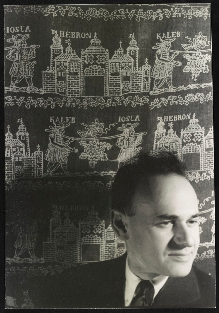
The great, woefully under-appreciated American culture critic of the early 20th Century Gilbert Seldes remains my own North Star of pop culture criticism. I could go on forever about this guy, and almost did. I started researching a biography of him and his critical legacy, but Michael Kammen beat me to it with his fine 1996 evaluation of Seldes’ life and work. Still, my own appreciation of Seldes’ open, democratic spirit of criticism is a bit different from Kammen’s, even if I didn’t feel at the time that the world needed a second book-length study of the man. I explored some of those ideas in an essay Tom Heintjes kindly published in Hogan’s Alley No. 6 in 1999. It is reprinted below. I will also post soon Seldes’ original take on Krazy Kat and the comics generally from 1923’s The Seven Lively Arts. Almost a century later, I still think Seldes’ early observations about the unique aesthetic and cultural qualities of the comic strip remain indispensable to anyone trying to appreciate the form. – Ed.
The Critic That Walks By Himself
The longtime and often lonely historians of the American comic strip have enjoyed an embarrassment of riches in recent years. What with centennial exhibits, commemorative postage stamps, some truly luscious reprints of seminal work and even—God help us—occasional academic scrutiny, the comic strip form seems poised to assume a place among the “respectable” mass media. But assembling the history of any medium, including the comic strip, requires more than rediscovering its primary documents, however fun that may be. A rich chronicle of an art form must also recount how the medium integrated itself into people’s lives, how it was understood and debated. In America, such a history must begin with the first thoughtful and genuinely critical celebrant of the modern popular arts in general and of the comic strip in particular. He was more responsible than any single American for getting common readers and other intellectuals to think about the comics that they enjoyed. Gilbert Seldes (1893-1970) was the father of comic-strip criticism, and his insights about the form represent an alternative, albeit now largely overlooked, path in the serious appraisal of our national pleasure.
It is a shame that Walt McDougall has been overlooked by most comic strip history, because he left a lot of great material behind. While accounts differ over who originated different formats, everyone agrees he was among the first modern political cartoonists for the weekly humor magazines of the 1880’s and 90’s. He was among the first to create Sunday newspaper comic images in color. He visualized L. Frank Baum’s “Queer Visitors from the Marvelous Land of OZ” and penned “Peck’s Bad Boy.” newspaper series. And he was among the first syndicated cartoonists. His autobiography This Is The Life was one of the first lengthy chronicles of the early days of cartoon art as told by a practitioner.
But as I mentioned in my last post on one of my favorite McDougall panels, “Familiar Sights of a Great City – No. 1 The Cop Is Coming,” he was one of many early comic artists to take the new city experience as his subject, “Life in the City as the Countryman Pictures It” makes the country vs. city disjunction explicit.
Here he brings to life the “Countryman’s” caricature of city life. This one rich and very busy tableau serves up many of the age’s fears about the new city environment, and many of them have to do with deception, con games, wealth. Notice the many window signs for mail order houses and by-mail courses, alluding to many such come-ons most Americans knew from the classified ads in the backs of national magazines and local newspapers. At each corner of the panel we see rural folk as our point of identification, wary of the city’s seductions. The streets are literally paved in cash. The street sweeper complains about having to clean up the money. The loca bank is transferring moneybags down a Chouteau through the window. And Mssrs. Rockefeller and Morgan carry their own valises of “Cash” down the left sidewalk. McDougall satirizes the velocity of urban build-out and industry in the Waterstock Bldg that is under construction but advertises rooms ready today.
Starting with the multi-layered crowd-scapes of R.F. Outcault’s “Hogan’s Alley” the comic arts were uniquely positioned to depict the sensations of modern urban life. The full page could freeze the cityscape and let the eye travel across its multiple planes of disconnected action, dialogue and relationships. Film was good at depicting the crowd as a throng – an undifferentiated force. Artists like Outcault, McDougall and later Harrison Cady and Harvey Kurtzman instead used the large panel as a way to find order and sense, or at least meaning, in what otherwise seems like chaos when in motion.
In one sense artists of this crowd style both interpret the new masses and instruct us in how to view the urban world. These images force our eye into the the detail of the crowd, to ferret out the little stories, miniature satires, little in-joke details. They are giving us a powerful vision of how not to see the crowd as a crowd but as a glorious and exciting tableau of many small worlds all somehow going in the same direction.
Also interesting to me is how the image is about subjectivity itself. McDougall is bringing to life a specific fantasy of the new city, using the comic page to dramatize the way a particular part of America caricatures another.
One of the longest lasting marriages in comic strip history began on March 27, 1908 when Bud Fisher’s wildly popular A. Mutt comic strip anti-hero meets a character who soon became his companion until the strip finally sputtered to an end in 1983.
As told by Jeffrey Lindenblatt in the NBM reprint of early strips, A.Mutt had a whirlwind start in the five months from its brilliant inception to the introduction of Jeff. Bud Fisher was a self-taught artist who talked his way onto the the San Francisco Chronicle in 1906. He worked his way up from layouts in the art department to spot illustrations around news stories to regular caricatures in the sports section. Here is where Fisher sold editors on an idea for a daily strip that would top the sports section with betting neophyte A. (Augustus) Mutt’s uninformed picks to win one of that day’s horse races. The next day’s strip would include Mutt’s winnings, losings and mood after the real world results.
First A. Mutt Strip, San Francisco Chronicle, Nov. 1907
A.Mutt was an instant hit, but its Chronicle run lasted only 26 days. The strip attracted the attention of no less than notorious newspaper staff raider William Randolph Hearst, whose rival San Francisco Examiner battled the Chronicle for circulation. As he had done so many times in his “Yellow” newspaper war with Joseph Pulitzer in New York a decade before, Hearst drowned Fisher in cash and the promise of national syndication to lure him to the Examiner less than a month after A.Mutt launched. Eventually Fisher would leave Hearst too for a much more lucrative syndication deal that became a model for decades of lavishly paid cartoonists.
Final S.F. Chronicle A.Mutt, Copyrighted by H.C. Fisher
Fisher’s final A.Mutt for the Chronicle appeared on Dec. 10, 1907, but that last iteration had one very important (and lucrative) addition – “Copyright 1907 by H.C. Fisher.” In Lindenblatt’s telling, Fisher accompanied the artwork to the printing department that day and before the printing plate was struck added that copyright note that led to his being one of the wealthiest cartoonists of his and subsequent decades. Until his death in 1953, Fisher benefited from gushers of revenue from licensing, theatrical and syndication deals that saw Mutt and Jeff on just about anything willing to pay Fisher royalties. There were a number comic strip millionaires during the golden era of newspaper circ wars, but few were as showy and press savvy about that’s wealth than Fisher.
It is under Hearst’s banner that A.Mutt moved quickly away from racing track picks, added Jeff and because a buddy strip that also introduced extended continuities. Alas, the sad anachronistic later decades of Mutt and Jeff strips obscured its earlier, genuinely witty, edgy slapstick years.
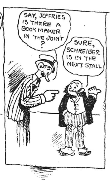
But in its early years the strip was indeed gritty. In fact, Mutt meets Jeff in an asylum, one of many incarcerations for him. This time he meets up with multiple cases of delusional inmates, including a diminutive fellow who fancies himself boxer Jeff Jeffries.
While the strip soon evolved beyond its origin as a sports cartoon, it carried with it to mainstream comics pages the sharp-tongued banter, slang, and snide irreverence that typified much of sport page cartooning. Mutt and Jeff took on politics, lampooned public figures, poked at social pomposity, and even ventured down to Mexico in the 1910s to engage with Pancho Villa.
Mutt was also among the first of a staple for the comics pages – the hapless schemer. Always looking for a buck, failing at the serial jobs he tries, the early Mutt conspires with Jeff (who is usually more flush) just to score a much-needed meal. Well evolved from the early simpletons of comics like F.O. Opper’s Happy Hooligan’ and Ed Carey’s Simon Simple, Mutt was like Harriman’s Baron Bean and Goldberg’s Boob, the American always on the make but falling short, working the angles unsuccessfully at the margins of America’s booming modern economy. The rising middle classes at whom 20th Century newspapers generally were aimed seemed to delight in the misfired ambitions of characters like Baron and Mutt, later Moon Mullins, Bobo Baxter and to some degree Andy Gump. It is a figure that extends into Laurel and Hardy, Abbott and Costello, Chester Riley and Ralph Kramden. Failed ambition is often leavened ironically with empty bravado and inflated self-confidence. It is light satire of America’s core tropes: social and economic ambition, masculinity, mobility, looking for the main chance.
The candor of Mutt and Jeff is in full display in 1918 when the duo scheme to dodge the draft.
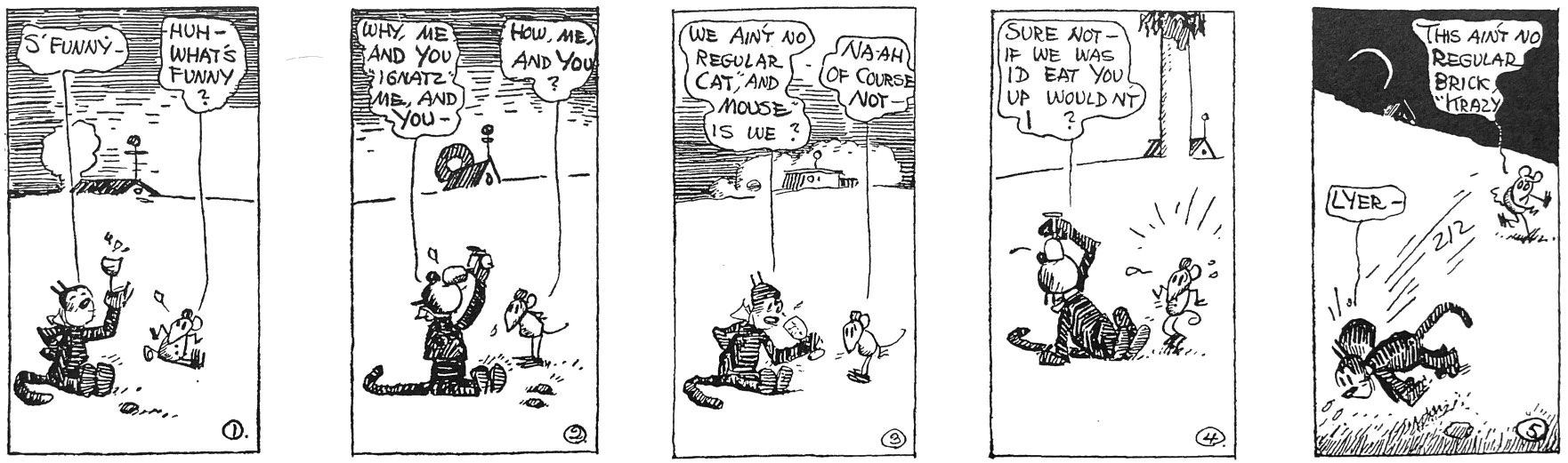
Herriman enjoyed calling attention to the absurdities of his own strip. In these dailies (1919) he also uses his signature device of changing the background landscape from panel to panel. All together Herriman is creating an absurdist space in which Krazy, Ignatz and the Coconino County cast focus on language and interpersonal dynamics.
The unique aesthetic of the comic strip is its ability to create an immersive environment through visual style, composition and character that we fall into for less than a minute a day across three or four sequential panels. Herriman used the full palette available to those panels to ground us in his characters by making the physical environment disorienting and fluid.
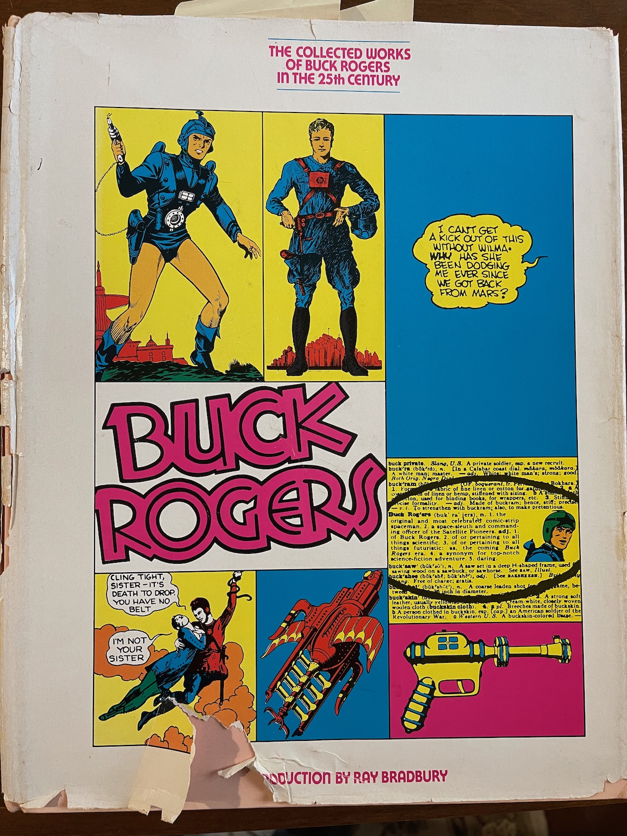
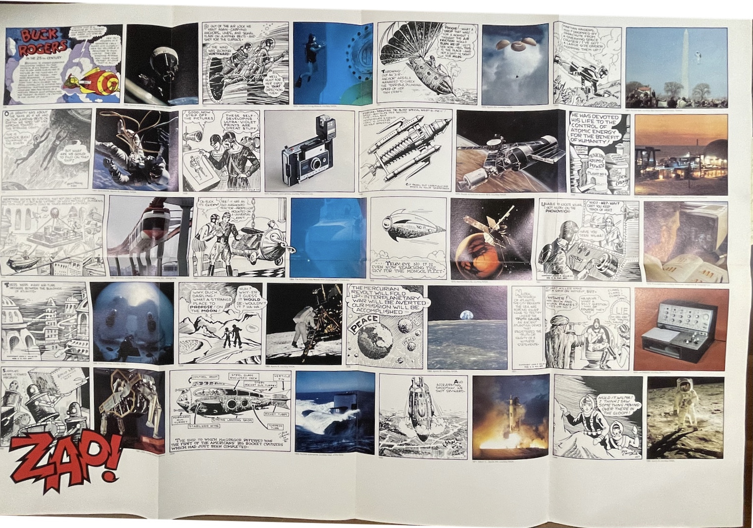
The 1969 moonwalk sparked both a wider interest and new respect for the science-fiction genre and tons of reflection on the ways speculative fiction anticipated contemporary tech. References to our realizing a “Buck Rogers” future flooded the media zone, and Chelsea House published in late ’69 one of the earliest oversized reprints of classic comics, The Collected Works of Buck Rogers in the 25th Century, introduced by Ray Bradbury writing about “Buck Rogers in Apollo Year 1.”
I was age 11 at the time, and had my own fleeting dalliance with sci-fi that drew me to this Chelsea volume at the local library and helped start a much deeper, longer love affair with newspaper comic strips. But an unusual source of comics fandom came into my house at the same time – a trade advertisement for high quality paper stock from the Warren Paper company. Some background. My father was a commercial artist with his own small ad agency in Northern New Jersey. We received at the home office a ton of trade magazines and ads. The S.D. Warren Paper Company promotions were far and away the smartest, most alluring trade marketing I have seen, then or since. To demo the print effect of their premium paper stocks, they created these lush, deeply researched pieces of content marketing that dug into topics like magic or the history of the circus, etc. I recently came upon the one Warren promote that remains etched in my memory – the 1970 celebration of how the Buck Rogers strip imagined accurately the gadgetry and transformative technology of the future.
The one-piece fold-out opened first onto that gorgeous splash above, with the classic Dick Calkins portrait of Buck in mid battle. These are the kinds of magnified newspaper comics images that helped the 12-year-old me into a love of the form. The line art of Calkns, Chester Gould, Will Eisner are among the first classic artists to captivate me. The art style of Buck Rogers felt at once primitive and technical. Calkins did not have a strong of perspective or even anatomy. Most of his figure positions look stiff rather than dynamic. And yet he brought to ray guns and flying ships a dreamy precision that made them live, perhaps even more than his humans.
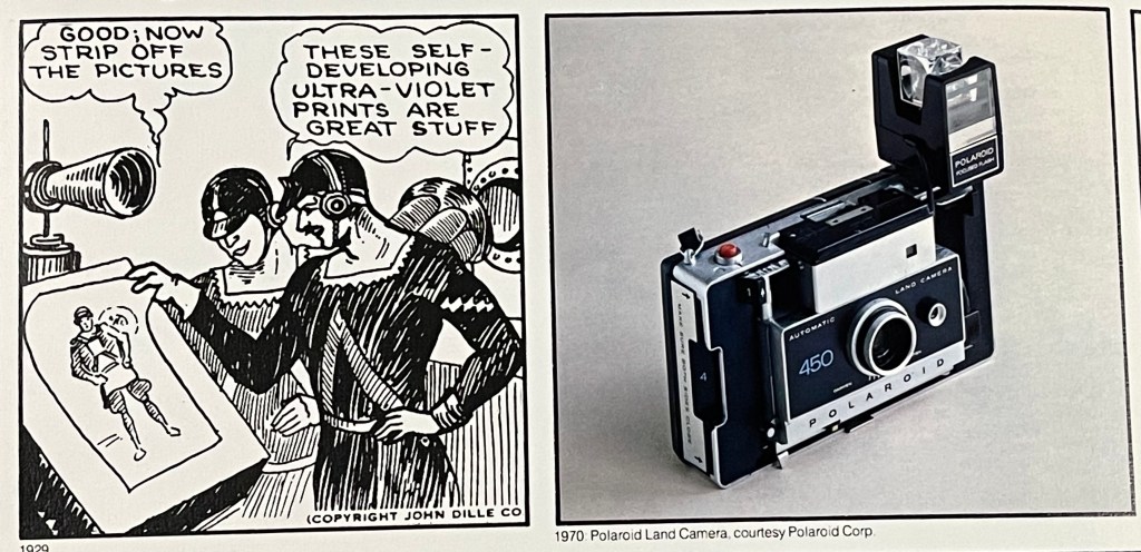
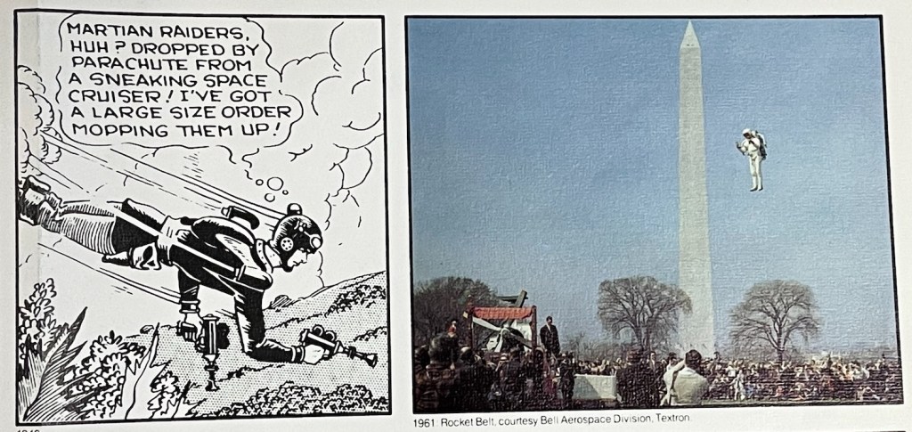
The Warren promo folds out above to a panorama of comparing old Rogers panels to modern innovations like instant cameras, jet packs, surveillance satellites, monorails and more.
This wonderful look back to how the past imagined its future was all in the service of showing off S.D. Warren’s “Lustro Offset Enamel” paper stock, a product name that itself sounded a bit like a cartoon invention. Still, you can’t argue with a content marketing campaign so well done that an 11-year-old remembers it fondly 50 years later.
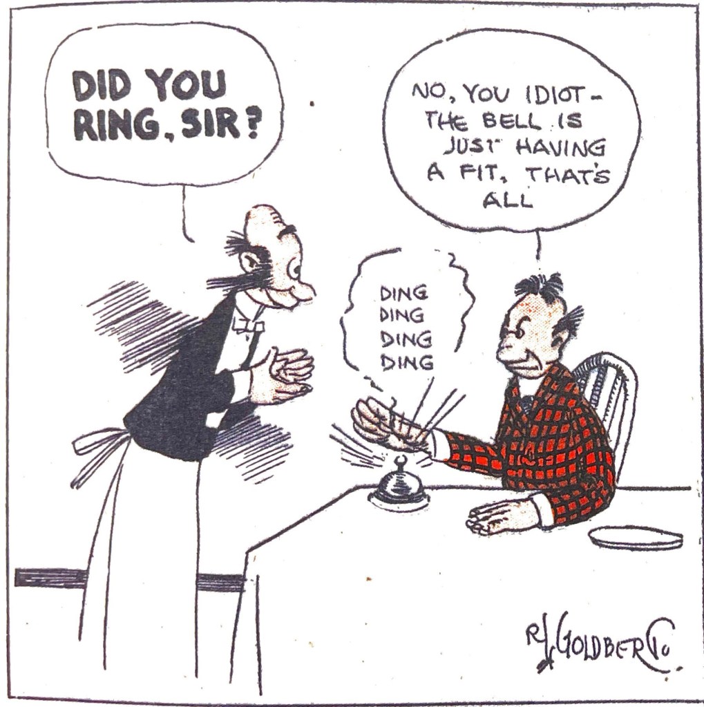
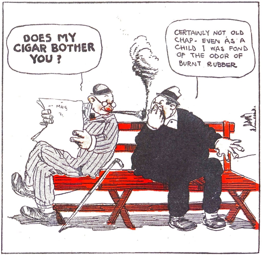
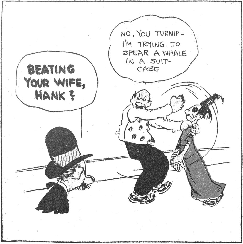
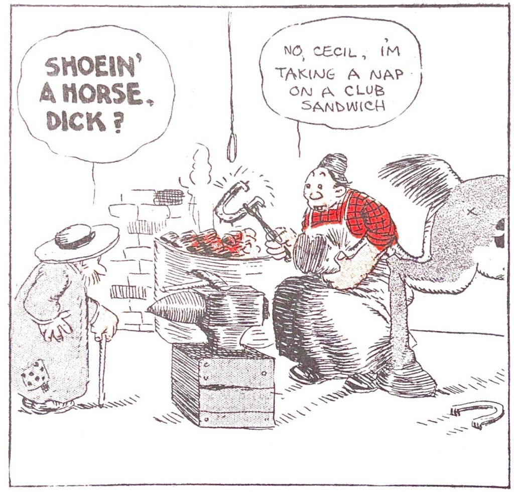
In 1908, Rube Goldberg continued to look for a comic strip series that captured popular imagination. His first Foolish Questions panel that year caught on almost immediately and it became a series in the Sunday Chicago Tribune. Like many strips in the first 20 years of the form’s history, Foolish Questions hinged on a simple gag repeated in every strip. In this case, the surreal silliness of the come-back to the “foolish question” is what gives the strip its energy. But most striking here is how Goldberg’s cranky, abrasive tone could also move into some gritty, dark places. Witness making light of wife beating. This is chilling, even in historical context, to see domestic violence treated this casually in a family newspaper, let alone seen as a site for screwball comedy.
Foolish Question also exercises a common comic strip trope – grumpy rejoinders to little human quirks. From its earliest years, the comic strip form took a light satirical perspective on everyday human foibles and excesses, the tics and social types that rang familiar with readers. Making fun of braggarts, poseurs, women’s fashion, the latest catchphrases or the middle class vogue of treating house pets like children (imagine!) were among the trends early comics artists poked.
In various forms Goldberg continued to answer Foolish Questions as late as 1939. These are from Sunday Press’ excellent compilation.
#9 Charlie Chan, 1938 (LOAC Essentials Vol. 13) by Alfred Andriola. IDW, $29.99
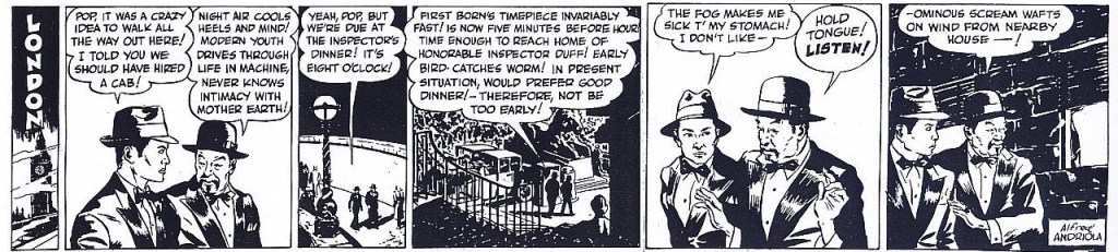
The LOAC Essentials series highlights a full year of classic strips that may not support a full reprint series. And it uses a uniquely narrow format that displays a strip per page for a singular reading experience. It is an inspired imprint from The Library of American Comics that makes accessible many strips that might be lost to history. Charlie Chan had decent locked-room mystery plotting that channeled the popular novels and films. Andriola, who went on to do Kerry Drake strips for years, took his visual cues from Milton Caniff, even if he lacked the master’s rich talents. Modern sensibilities will need to excuse the daily dose of stereotypical Confucian aphorisms, though.
Here is a little bonus I found at the Charlie Chan Family Home site, which has some samples of both the dailies and Sunday strip. The first week of dailies finds Chan and “Number One Son” on the case.