
On 1950s newsstands, EC Comics covers stood out from scores of competitors for the same reason their content did — and has ever since. They told better stories illustrated by better artists who were paid better and supplied with better core material. The cover art of Crime Suspense Stores, Haunt of Fear, Tales from the Crypt, and Weird Science, et. al. surfaced all the irony, comedy, depth of sentiment, believable intensity and, yes, artful gore, that helped make Bill Gaines’s library of horrors both unique and uniquely consistent.
To be sure, pre-code greats like Lee Elias and E.B. Cole, among others, were masterful for a range of other publishers. But more regularly, EC’s Johnny Craig brought noirish style and everyman anguish to a high polish. Jack Davis leavened grisly murder scenes with an irrepressible cartooniness. Graham Ingels applied an oozy dampness and patina of madness to every corner of a page. And Wally Wood’s pristine, obsessively detailed spaceship interiors contrasted romanticized technology against gelatinous aliens that seemed to burst from our collective ID. More to the point, and more so than any other publisher, EC didn’t just shock us into buying the book. The publisher told stories in the space of these static cover images.
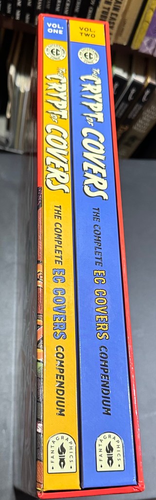
Fantagraphics’ new and unprecedented compilation of every (almost) EC covers ever printed is a remarkable opportunity to watch the is art evolve in masterly hands. Collectors and ECphiles will find tremendous value in this two-volume monster, even with its $150 price tag. The Crypt of Covers: The Complete EC Covers Compendium is a monster: over 600 11×14.6 pages in a box. From the Bible stories and pre-Trend westerns, romances and funny animal books of the 1940s, through the New Trend and later New Direction titles of its peak years, and even into the later book and magazine reprints of the 70s, this is as complete a gathering of EC cover art as we are likely ever to see.
Qualitatively, the package is exceptional. The color rendering and clarity seem spot on. Much of the art was shot from best available covers, printer proofs or even Gaines’s own copies. The printing on semi-matte paper distinguishes line-work and hues quite well yet avoids the oversaturated, high-contrast, and posterized look I have seen in other reprints. Enhanced with a light history and collectors’ notes by EC expert Grant Geissman, the Compendium includes a ton of house ads, cover drafts and alternative versions, an EC timeline (by Jon Gothold), covers indexed by artist, bios and more. Among my favorite extras are Christmas party posters from 1950, in which editor Al Feldstein lampooned EC’s own titles with racy, impolitic and goofy versions. The major omission here is the MAD comic and magazine covers from this period because of rights restrictions. They will be part of Fantagraphics’ upcoming full reprint of Harvey Kurtzman’s MAD work. Still, the Compendium truly surprised me with its comprehensiveness and reproduction quality.
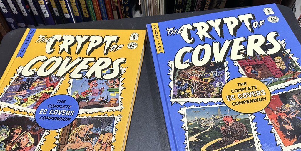
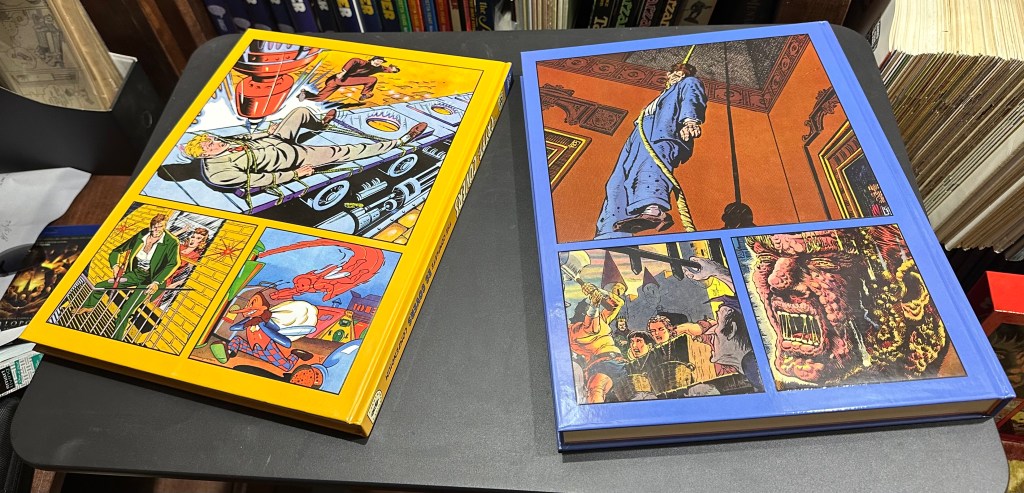
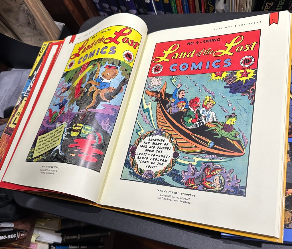
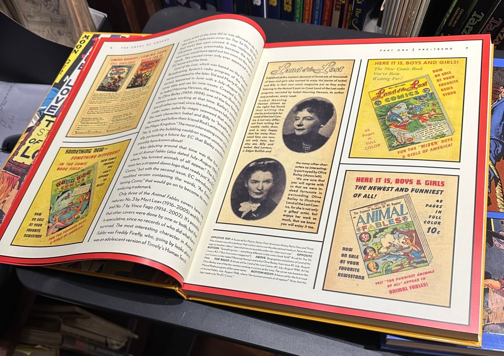
But more to the point, absorbing the full run of covers across so many years, allows one to ponder how the artists, their publisher and the still-young field of comic book cover art were evolving. The first, slimmer volume includes pre-Trend titles. Organized in chronological order by their first appearance, the covers of each title are collected together in full. Many are unusual, like comic strip great Ed Wheelan’s Joke Book Featuring Fat and Slat, which sported a silly bigfoot style. There was the adventure title International Comics, starring hero Van Manhattan (what a great name!), where artist Leo Bachle invoked pulp-magazine conventions: giant-headed villains, grisly torture, and a mad scientist spraying a vial of viruses on a lilliputian crowd. Or Olive Bailey’s images for a Land of the Lost children’s tale where wide-eyed kids adventured alongside anthropomorphic fish (yes, fish!). And we get to see how the various Picture Stories series of biblical, science and history stories struggle mightily to find the most comics-like moment to dramatize their educational material.
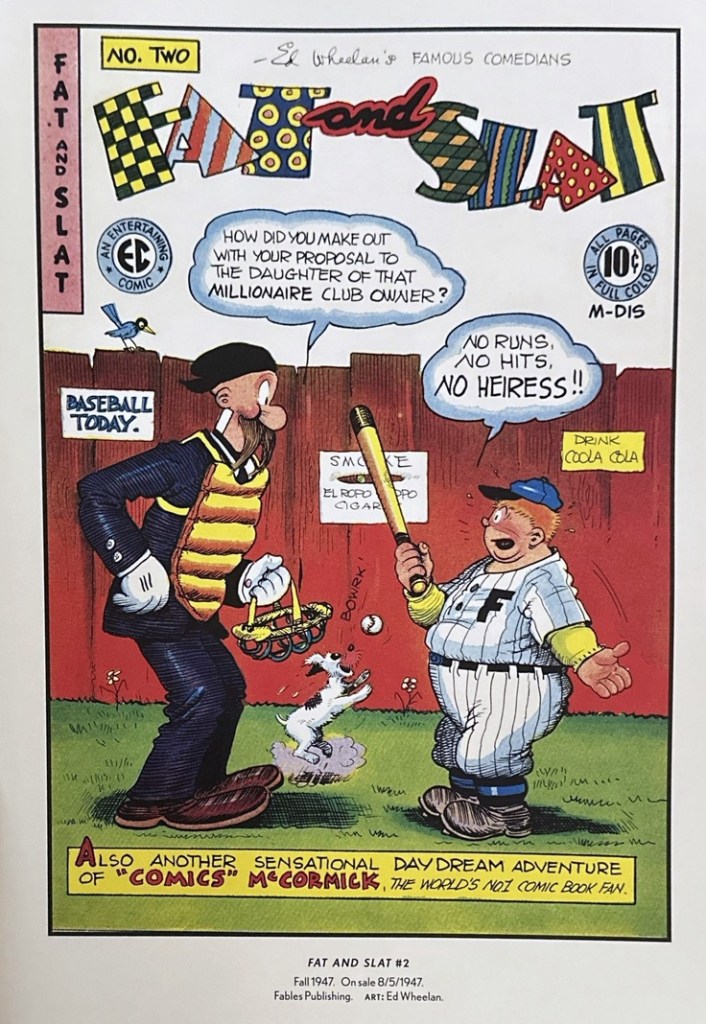
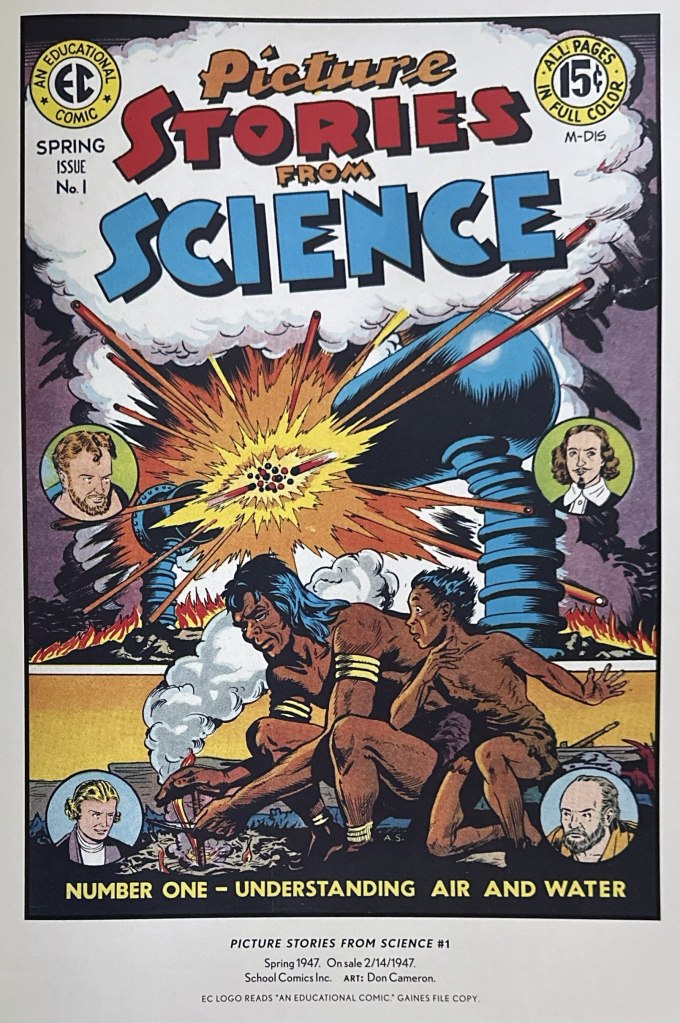
More interesting is watching how the future stable of New Trend greats developed under diverse material. Johnny Craig had a penchant for leggy women and extreme light sources long before he became the powerhouse of Trend covers. Even in a Westen title Graham Ingels was mastering the marginal and background detail that surprised the eye in every cranny of an image.
But of course, the main course for most fans will be the New Trend and New Direction covers that comprise the second larger volume. And this is a feast.
This Compendium never pretends to offer serious critical perspective either on EC or the art of comic cover design. As is his wont, Geissman tends to focus on collectors’ minutiae and offers only occasional flourishes of insight about the art itself. It does strike me as a missed opportunity in such an unprecedented collection not to talk thoughtfully about the object of comics covers generally. Or even from an historical perspective, I was hungry for some background detail on the EC workflow for cover art, the artists’ editorial marching orders, etc.
Taking in hundreds of covers changing over time, the exceptional aspects of EC’s work become clearer, and sometimes surprising. For instance, the most “iconic” examples featured in pop culture history are the most shocking but not necessarily the most engaging. Johnny Craig’s crazed throat-slasher from the perspective of the impending victim in Crime SuspenseStories #16, or his pistol shooting off the crown of a man’s head in CSS #17, embody the kinds of imagery that sparked censorious officials and still draw historians. Most infamous, of course, was the chilling CSS #22 cover of a decapitated woman’s head dangling from the axe-wielder’s paw. Bill Gaines strident, misguided defense of the art’s “taste” before the 1954 Senate Subcommittee remains the most familiar artifact of a moral panic around comics that soon decimated the EC line.
Ironically, these most famously shocking EC covers represented the genre at its least involving and effective, in my opinion. Yes, they performed the first function of a comics cover – to poke through the newsstand noise and grab your attention. But I think other covers were better crafted to keep viewers engaged with tone, mood or actual storytelling.
These fine artists excelled at making conventions of pulp shock more meaningful. Graham Ingels’ oozing detail lurks in the corners of images, while his faces often seem misshapen by terror. Covers like his Haunt of Fear #18 are so dense and dark they beg to be deciphered. Johnny Craig generally emerges as the true master of this genre, often bringing the wit and irony of EC to the front of the book. But he could also infuse common genre tropes with genuine pathos. Vault of Horror #39 views a manacled woman from behind, with just her shoulders visible, and collapsed in resignation. It expresses so simply the emotional depths of defeat. As well, Wallace Wood is most famous for the leggy dames and obsessively etched spaceship interiors. His rich techno-aesthetic engages us because of contrasts, however. The precisely drawn gizmos often get set against a gooey, gelatinous alien that doesn’t seem to come from the same artist’s pen. At their best, EC’s stable was doing more than grabbing attention. They were earning it.
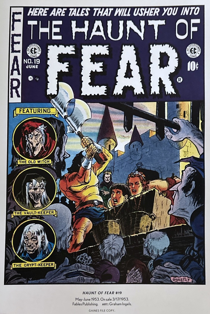
And they often had a key element missing from the rest of 50s newsstand’s gallery of gruesomeness – wit. A woman browsing through her local library innocently draws a book from its shelf only to find a fiend lurking on the other side. (Jack Kamnen, CSS #27). When tandem heads await a dual beheading, then of course the executioner must be wielding a two-headed axe (Ingels, HoF#19). Some artists even played with the new iconography of comics themselves. Craig’s comely, leggy, teary lady on VoH #19 is pining for her absent lover just as she would on the cover of Young Romance…all except for that rotting corpse ironically responding to her desire. That legendary decapitated subway straphanger on VoH #30 (Craig) is made interesting by the range of New Yorkers’ reactions in background, and it is made funny by the “Stomach Upset?” ad in the corner. The covers didn’t just tease the contents. They regularly characterized EC with an unself-serious blend of horror, irony, wit, peril and comedy.
And most importantly, they told stories within the context of a single static frame. In recounting the beautiful Piracy covers by Reed Crandell and Bernie Krigstein, Geissman notes their obvious debt to the great book illustrator Howard Pyle, who invented the look, garb and action of sea pirates. Which is at once true but missing the larger point. In fact, the best comic cover art descends directly from the aesthetic principles laid down in the golden age of book illustration (1880-1930) by American innovators like Pyle and his most famous student, N.C. Wyeth. They brought a new level of emotional intensity and action to classic adventure literature. But this so-called Brandywine School of commercial art also understood how the eye moves across a single image in a way that approximates sequential art. Pyle and Wyeth used splashes of vibrant color, perspective lines, or just physical violence to draw the viewer’s first glance into a picture. But they then deployed angles and secondary hues to guide that gaze across other details of the image, often in a certain order, which unfolded larger meanings. These fundamentals of composition in art often seem lost on comics purists who like to insist that single panel cartoons are not “comic strips” because they don’t rely on multi-panel progressions. In fact, even our view of a single image, if well crafted, is taken in sequentially.
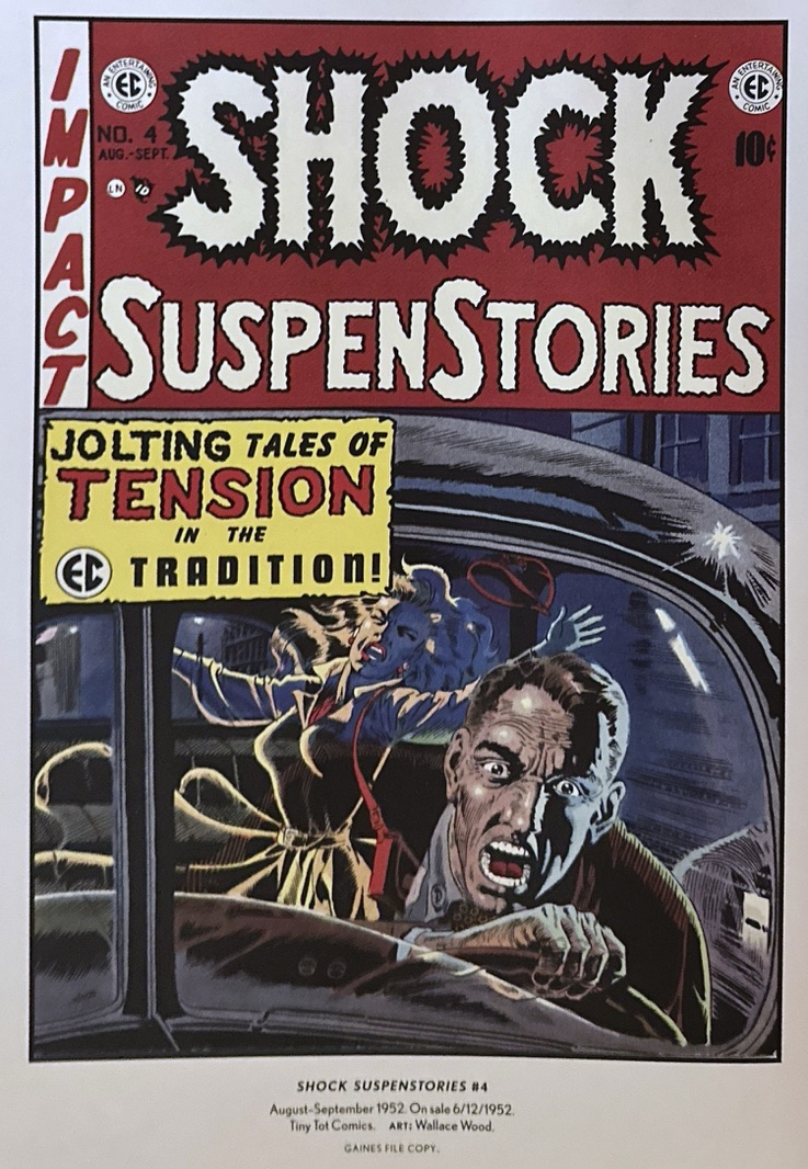
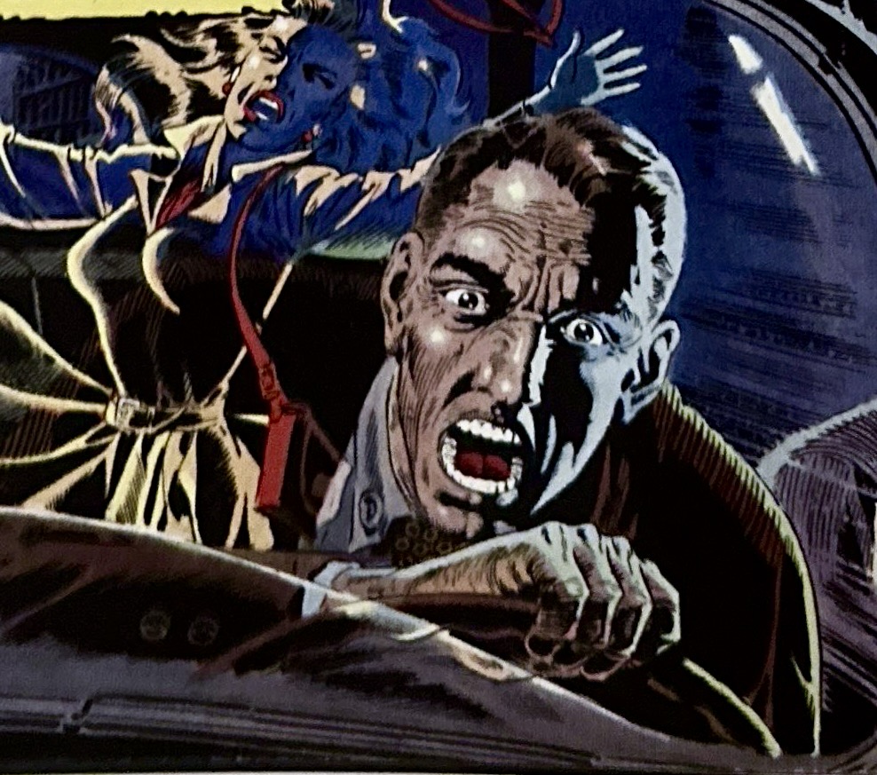
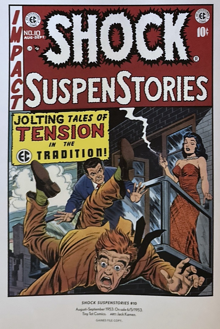
You can see how well some EC artists turned static covers into sequential art. Among my favorites, Wallace Wood’s SSS #4 cover grabs us with the terrified face of a man jutting from the page, whom we quickly see is behind the wheel of a car. But then the feinter reflection of the woman he is about to hit appears off to the side. Al Feldstein’s SSS #9 pulls our eye first to the terrified man on the left manacled to what we then see is the corpse of his partner being gnawed by buzzards. Or Jack Kamen’s multi-layered SSS #10 in which the frantic face of a man falling from a balcony fills the foreground. But then we see in background the much smaller secondary image of the man who pushed him…and finally, in the corner, the diffident woman apparently approving of it all. A love triangle, motive, character and back story are all told in sequence by composition, perspective and sizing.
Crypt of Covers affords us the opportunity to consider the artistry of the comic cover as a genre and to understand more deeply why this particular circle of EC artists laid the templates for everyone who followed.
Discover more from Panels & Prose
Subscribe to get the latest posts sent to your email.

